Chart position — tracked daily by LaunchShots
Screenshot style breakdown
Sampled from 6 of Яндекс Недвижимость. Квартиры's App Store screenshots — background, accent and theme, measured by LaunchShots (not something Apple publishes).
#FCEC5C bg
#DDCF50
#948434 accent
#111111 text
Screenshots



Icon palette
About this app
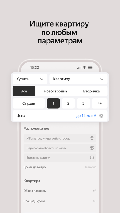
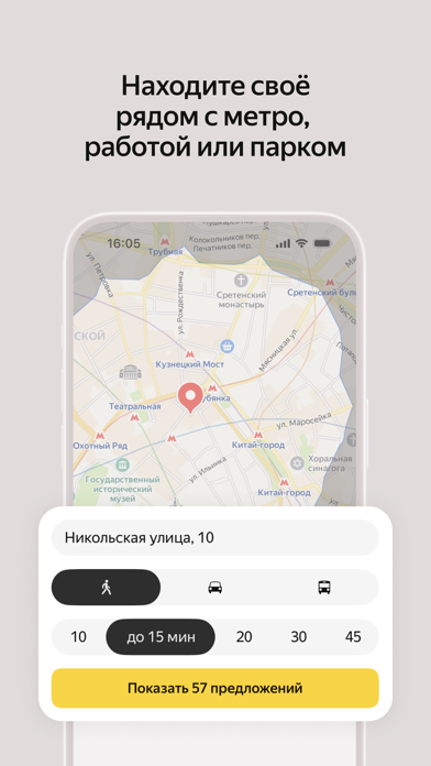
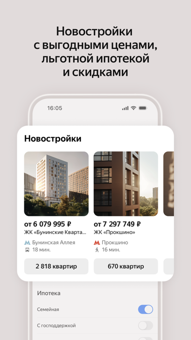
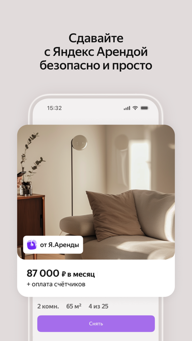
Яндекс Недвижимость — это сервис для поиска, аренды и продажи недвижимости в Москве, Санкт-Петербурге, Краснодаре, Екатеринбурге, Новосибирске и других городах. Благодаря технологиям Яндекса, функциональность Яндекс Недвижимости позволяет приобрести жилье, снять квартиру, продать или купить дом просто, быстро и безопасно. Вот 5 наших преимуществ: • поиск квартир и комнат по параметрам или на карте, • 50 000 новых объявлений о продаже и аренде ежедневно, • подробная информация о квартирах в новостройках, • тепловые карты комфорта жизни в разных районах — транспортная доступность, каршеринг, инфраструктура (магазины, супермаркеты, развлечения), рейтинг школ. • возможность отсеивать квартиры с «уставшим» ремонтом. Приложение поможет максимально быстро и с минимумом усилий разместить объявление, купить или снять квартиру и комнату без посредников, найти земельный участок, загородное жиль…
App details
What you can learn from Яндекс Недвижимость. Квартиры
Every shipping app on the App Store has gone through the same decisions you're working through right now: which screenshot goes first, what caption sits over it, which device frame to show, what color the background should be. The 7 screenshots above are Яндекс Недвижимость. Квартиры's answers to those questions — they're public, they're real, and they made it through Apple's review.
What the numbers say: Яндекс Недвижимость. Квартиры runs a light set where the background shifts from screenshot to screenshot (first shot #FCEC5C) — each image has to stand on its own, so the captions carry more of the story. The accent colour we picked up, #948434, is the one to reuse for badges, arrows and highlighted words if you borrow this look. Hit Use this style to open the editor with these exact colours and drop your own screenshot in.
Notice the first screenshot in particular. It's the one users see in search results and on the product page, and it's where most apps spend their best caption and tightest design. Look at the proportion of background to phone, where the text sits, what one thing the image is trying to communicate.
Want to see how other Lifestyle apps approach the same problem? Browse more Lifestyle apps in the showcase.
Take what works into your own screenshots
Open LaunchShots and design your App Store & Google Play screenshots — pick a device frame, drop captions, ship in minutes. Free, in your browser.
Open the screenshot editor →Apps with a similar look
Closest background + accent colours among the listings we've analysed — useful when you want to see the same palette handled by a different team.