Chart position — tracked daily by LaunchShots
Screenshot style breakdown
Sampled from 5 of 酷家乐设计师's App Store screenshots — background, accent and theme, measured by LaunchShots (not something Apple publishes).
#1C84FC bg
#3B95FC
#AC740C accent
#FFFFFF text
Screenshots


Icon palette
About this app
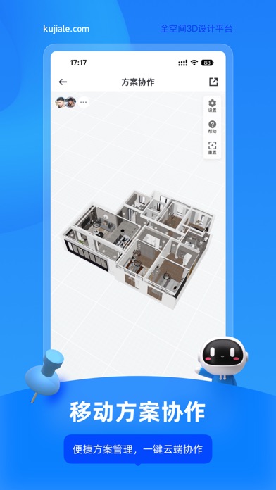
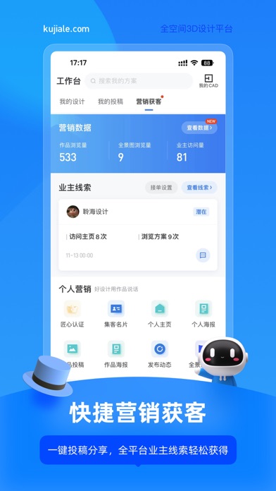
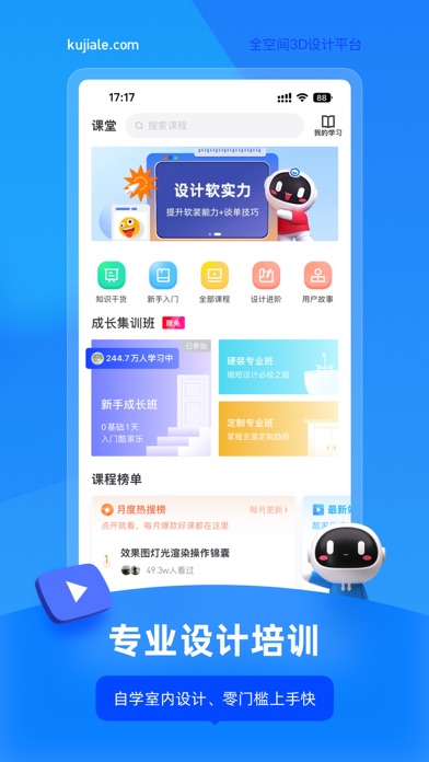
【产品介绍】 酷家乐是全球领先的3D云设计平台,面向家居、公装、建筑、房产等领域,为企业和个人提供设计、营销、生产、管理等一站式解决方案,致力于“用设计让未来生活所见即所得”。 酷家乐设计师 App 集合各领域专家共建装修设计方案,移动工作台提供效果图渲染和 CAD 图纸快速浏览功能,App 端和 PC 端打通,一键匹配户型图,能快速渲染出效果图、全景图和720°漫游图。 设计师可以在这里高效获取行业知识、免费课程,直达海量家居美图,精品案例;还可以边沟通边设计,完成设计订单;也可以和业主在社区交流,快速接单。 【产品特色】 手机出图 App内即可极速渲染,一键生成3D全景漫游效果图 灵感图库 VR家装方案每日更新,全球精选软装设计图,激发设计灵感 营销获客 一键投稿与分享,成为匠心设计师,全平台业主线索轻松获得 交流社区 全新酷+社区,大咖交流、装修锦囊、户改求助零距离 设计培训 免费视频教程,快速自学室内设计技能 海量素材 200万模型任意收藏,支持家具模型替换,设计更尽兴 【用户好评】 第一次使用时感觉是傻瓜式的…
App details
What you can learn from 酷家乐设计师
Every shipping app on the App Store has gone through the same decisions you're working through right now: which screenshot goes first, what caption sits over it, which device frame to show, what color the background should be. The 5 screenshots above are 酷家乐设计师's answers to those questions — they're public, they're real, and they made it through Apple's review.
What the numbers say: 酷家乐设计师 runs a dark set with one background colour (#1C84FC) carried across every screenshot — the listing reads as a single poster when the shots sit side by side in search results. The accent colour we picked up, #AC740C, is the one to reuse for badges, arrows and highlighted words if you borrow this look. Hit Use this style to open the editor with these exact colours and drop your own screenshot in.
Notice the first screenshot in particular. It's the one users see in search results and on the product page, and it's where most apps spend their best caption and tightest design. Look at the proportion of background to phone, where the text sits, what one thing the image is trying to communicate.
Want to see how other Productivity apps approach the same problem? Browse more Productivity apps in the showcase.
Take what works into your own screenshots
Open LaunchShots and design your App Store & Google Play screenshots — pick a device frame, drop captions, ship in minutes. Free, in your browser.
Open the screenshot editor →Apps with a similar look
Closest background + accent colours among the listings we've analysed — useful when you want to see the same palette handled by a different team.