Chart position — tracked daily by LaunchShots
Screenshot style breakdown
Sampled from 4 of 博看书苑's App Store screenshots — background, accent and theme, measured by LaunchShots (not something Apple publishes).
#FCFCFC bg
#DDDDDD
#A40C0C accent
#111111 text
Screenshots
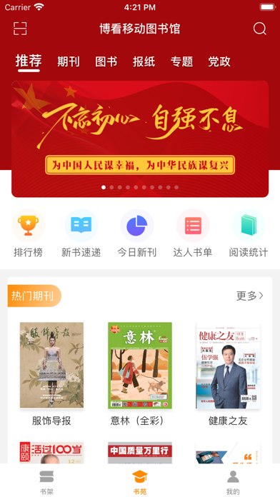
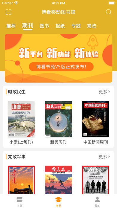
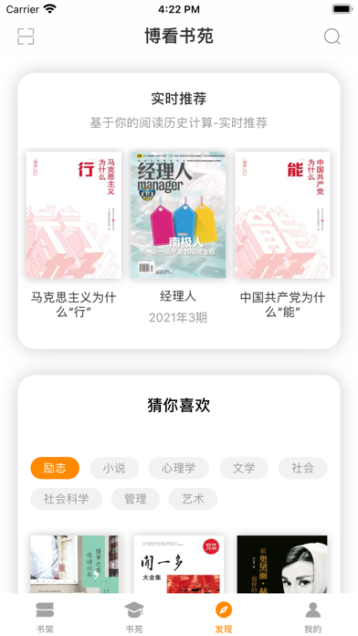
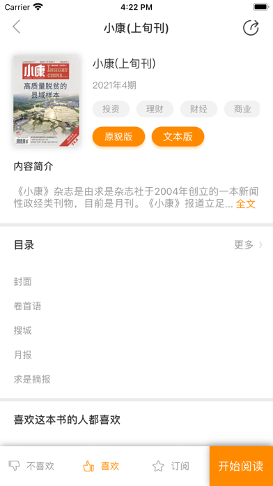
iPad screenshots


Icon palette
About this app
博看网以优质人文期刊内容为核心,其涵盖了政治、文化、金融、管理、文学、艺术、科学、学术、生活、时尚、教育等十多个领域,有效的利用互联网和移动互联网的拓展性和互动性,将授权的书、报、刊进行数字化,在互联网、移动互联网上以富媒体形式,通过触摸屏、电脑、Pad、手机等多屏展示,带给读者全新的数字阅读体验。 精致简约的界面设计和版式布局,阅览流畅,享受最佳的数字原版杂志阅读体验。 阅读格式同时支持文本和原貌阅读,根据读者喜好随意切换。 指间灵动,知晓世界尽在掌心。 街角咖啡馆、旅途中、每一个夜晚,行走于页,澎湃无声,随心所阅!
App details
What you can learn from 博看书苑
Every shipping app on the App Store has gone through the same decisions you're working through right now: which screenshot goes first, what caption sits over it, which device frame to show, what color the background should be. The 8 screenshots above are 博看书苑's answers to those questions — they're public, they're real, and they made it through Apple's review.
What the numbers say: 博看书苑 runs a light set with one background colour (#FCFCFC) carried across every screenshot — the listing reads as a single poster when the shots sit side by side in search results. The accent colour we picked up, #A40C0C, is the one to reuse for badges, arrows and highlighted words if you borrow this look. Hit Use this style to open the editor with these exact colours and drop your own screenshot in.
Notice the first screenshot in particular. It's the one users see in search results and on the product page, and it's where most apps spend their best caption and tightest design. Look at the proportion of background to phone, where the text sits, what one thing the image is trying to communicate.
Want to see how other Book apps approach the same problem? Browse more Book apps in the showcase.
Take what works into your own screenshots
Open LaunchShots and design your App Store & Google Play screenshots — pick a device frame, drop captions, ship in minutes. Free, in your browser.
Open the screenshot editor →Apps with a similar look
Closest background + accent colours among the listings we've analysed — useful when you want to see the same palette handled by a different team.