Chart position — tracked daily by LaunchShots
Screenshot style breakdown
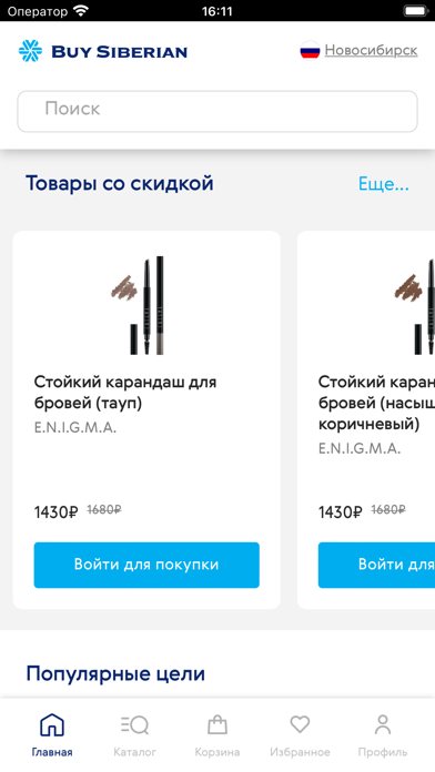
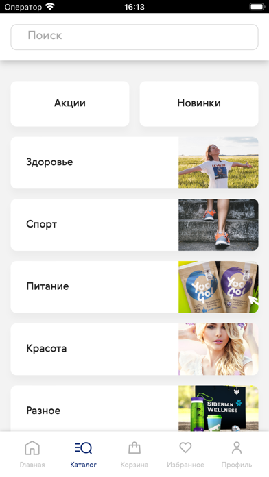
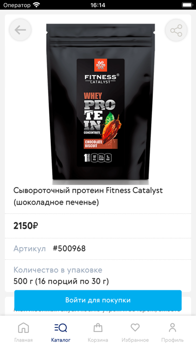
Sampled from 4 of Buy Siberian's App Store screenshots — background, accent and theme, measured by LaunchShots (not something Apple publishes).
#FCFCFC bg
#DDDDDD
#04ACEC accent
#111111 text
Screenshots

iPad screenshots


Icon palette
About this app
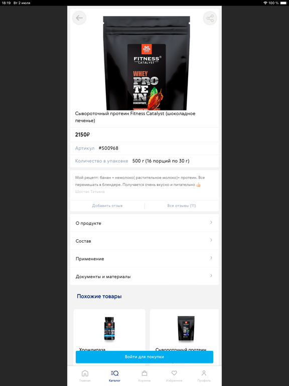
BuySiberian: шопинг для жизни в стиле wellness Заказывайте инновационные продукты в любом месте Максимально быстро формируйте заказы, выбирайте способы доставки и оплачивайте покупки в несколько кликов. Быстрый доступ ко всему ассортименту Выбирайте продукты из каталога Siberian Wellness, легко переключайтесь между новинками, акциями и категориями, создавайте списки покупок и планируйте расходы. Умные рекомендации Алгоритмы покажут самые популярные продукты, специальные предложения или товары определенных категорий, чтобы сэкономить ваше время. Акции, специальные предложения и подарочные наборы Косметика, парфюм, продукты для поддержания здоровья взрослых и детей, а также спортивное питание и многое другое – со скидками, в удобных комбинациях и лимитированных коллекциях. Кэшбэк, бонусы и промо Становитесь Бизнес-Партнером Siberian Wellness, получайте кэшбэк и сертификаты, копите балл…
App details
What you can learn from Buy Siberian
Every shipping app on the App Store has gone through the same decisions you're working through right now: which screenshot goes first, what caption sits over it, which device frame to show, what color the background should be. The 8 screenshots above are Buy Siberian's answers to those questions — they're public, they're real, and they made it through Apple's review.
What the numbers say: Buy Siberian runs a light set with one background colour (#FCFCFC) carried across every screenshot — the listing reads as a single poster when the shots sit side by side in search results. The accent colour we picked up, #04ACEC, is the one to reuse for badges, arrows and highlighted words if you borrow this look. Hit Use this style to open the editor with these exact colours and drop your own screenshot in.
Notice the first screenshot in particular. It's the one users see in search results and on the product page, and it's where most apps spend their best caption and tightest design. Look at the proportion of background to phone, where the text sits, what one thing the image is trying to communicate.
Want to see how other Health & Fitness apps approach the same problem? Browse more Health & Fitness apps in the showcase.
Take what works into your own screenshots
Open LaunchShots and design your App Store & Google Play screenshots — pick a device frame, drop captions, ship in minutes. Free, in your browser.
Open the screenshot editor →Apps with a similar look
Closest background + accent colours among the listings we've analysed — useful when you want to see the same palette handled by a different team.