Chart position — tracked daily by LaunchShots
Screenshot style breakdown
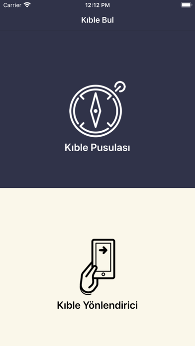
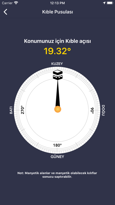
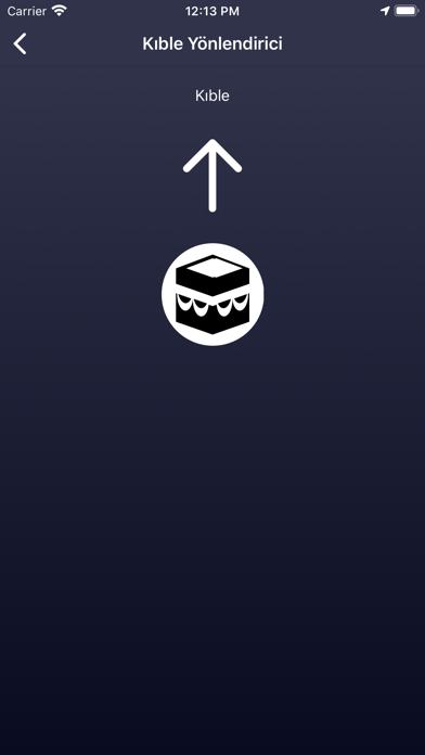
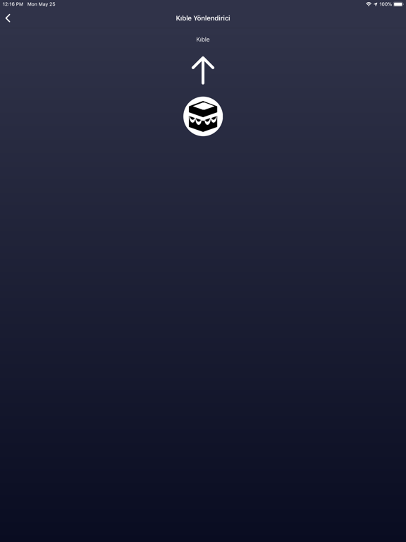
Sampled from 3 of Kıble Yönü's App Store screenshots — background, accent and theme, measured by LaunchShots (not something Apple publishes).
#34344C bg
#505065
#FCDC04 accent
#FFFFFF text
Screenshots
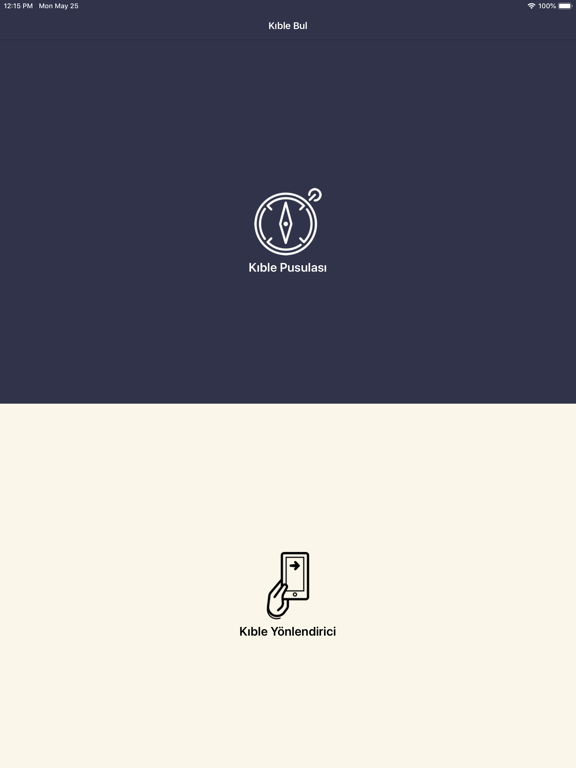
iPad screenshots

Icon palette
About this app
Kıble Yönü uygulamasıyla namaz kılarken Kabe'ye doğru yönelmek artık çok daha kolay. Ana Özellikler: Kıble Yönü Hesaplama: Kıble Bulucu, doğru kıble yönünü belirlemek için hassas hesaplamalar yapar ve size namaz kılarken doğru yönlendirmeler sunar. Konum Tabanlı: Uygulama, GPS teknolojisi ile kullanıcının bulunduğu konumu belirler ve buna göre en doğru kıble yönünü gösterir. Kıble Yönü, kullanıcıların Kabe'ye doğru namaz kılmalarına yardımcı olurken, kullanıcı deneyimini kolaylaştırmak için sade ve kullanıcı dostu bir tasarıma sahiptir. Namaz vakitleri ve kıble yönü ile ilgili en iyi sonuçları elde etmek için bu uygulamayı bugün indirin! Not: Uygulamayı kullanmadan önce, GPS'iniz ve konum servislerinin etkin olduğundan emin olun. Uygulama, hassas sonuçlar sağlamak için en iyi sonuçları elde etmek için bu bilgilere ihtiyaç duyar. Kullanıcı ve Gizlilik Sözleşmesi: https://codeida.co…
App details
What you can learn from Kıble Yönü
Every shipping app on the App Store has gone through the same decisions you're working through right now: which screenshot goes first, what caption sits over it, which device frame to show, what color the background should be. The 6 screenshots above are Kıble Yönü's answers to those questions — they're public, they're real, and they made it through Apple's review.
What the numbers say: Kıble Yönü runs a dark set where the background shifts from screenshot to screenshot (first shot #34344C) — each image has to stand on its own, so the captions carry more of the story. The accent colour we picked up, #FCDC04, is the one to reuse for badges, arrows and highlighted words if you borrow this look. Hit Use this style to open the editor with these exact colours and drop your own screenshot in.
Notice the first screenshot in particular. It's the one users see in search results and on the product page, and it's where most apps spend their best caption and tightest design. Look at the proportion of background to phone, where the text sits, what one thing the image is trying to communicate.
Want to see how other Utilities apps approach the same problem? Browse more Utilities apps in the showcase.
Take what works into your own screenshots
Open LaunchShots and design your App Store & Google Play screenshots — pick a device frame, drop captions, ship in minutes. Free, in your browser.
Open the screenshot editor →Apps with a similar look
Closest background + accent colours among the listings we've analysed — useful when you want to see the same palette handled by a different team.