Chart position — tracked daily by LaunchShots
Screenshot style breakdown
Sampled from 6 of 微软必应's App Store screenshots — background, accent and theme, measured by LaunchShots (not something Apple publishes).
#446CDC bg
#5E80E0
#E47C7C accent
#FFFFFF text
Screenshots


iPad screenshots




Icon palette
About this app
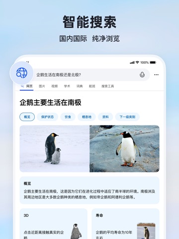
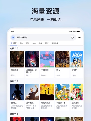
微软必应是由微软公司官方出品的全球搜索引擎应用,支持国内搜索和国际搜索。 微软必应App不仅提供高质量可信赖的国际搜索服务,还致力于为用户打造更纯净更具美感的使用体验,成为您手机里不可或缺的一抹风景。支持全球多种语言语音搜索;海量高清热门壁纸、天气预报每日更新;丰富的生活服务实用工具,解放您的手机空间。 【智能搜索体验】 -强大引擎搜索世界!轻松切换国内版和国际版,开拓您对世界的认知。 -极速轻快搜索直达!没有复杂繁琐的功能,一键搜索直达结果页面。 -无痕搜索保护隐私!无痕模式下不保存搜索记录和其他隐私数据。 -跟广告彻底说再见!打开无广告纯搜索的大门,搜索结果就该如此纯净。 【海量精美壁纸】 甄选全球海量图库,每日为您推荐高清美图,完美适配各类手机壁纸,让您的手机桌面更美丽,同时支持下载与分享,让您留住美好,并且享受与朋友一同发现的乐趣。 【权威天气预报】 全国定位精准至市县级,未来10日天气可查,24小时逐小时预报,时刻追踪天气变化,上班出门早做准备。 ———— 联系我们&意见…
App details
What you can learn from 微软必应
Every shipping app on the App Store has gone through the same decisions you're working through right now: which screenshot goes first, what caption sits over it, which device frame to show, what color the background should be. The 13 screenshots above are 微软必应's answers to those questions — they're public, they're real, and they made it through Apple's review.
What the numbers say: 微软必应 runs a mixed light-and-dark set where the background shifts from screenshot to screenshot (first shot #446CDC) — each image has to stand on its own, so the captions carry more of the story. The accent colour we picked up, #E47C7C, is the one to reuse for badges, arrows and highlighted words if you borrow this look. Hit Use this style to open the editor with these exact colours and drop your own screenshot in.
Notice the first screenshot in particular. It's the one users see in search results and on the product page, and it's where most apps spend their best caption and tightest design. Look at the proportion of background to phone, where the text sits, what one thing the image is trying to communicate.
Want to see how other Utilities apps approach the same problem? Browse more Utilities apps in the showcase.
Take what works into your own screenshots
Open LaunchShots and design your App Store & Google Play screenshots — pick a device frame, drop captions, ship in minutes. Free, in your browser.
Open the screenshot editor →Apps with a similar look
Closest background + accent colours among the listings we've analysed — useful when you want to see the same palette handled by a different team.