Chart position — tracked daily by LaunchShots
Screenshot style breakdown
Sampled from 5 of خرائط طقس العرب's App Store screenshots — background, accent and theme, measured by LaunchShots (not something Apple publishes).
#FCFCFC bg
#DDDDDD
#2494F4 accent
#111111 text
Reading the caption text from the screenshots in your browser…
Screenshots
Icon palette
About this app
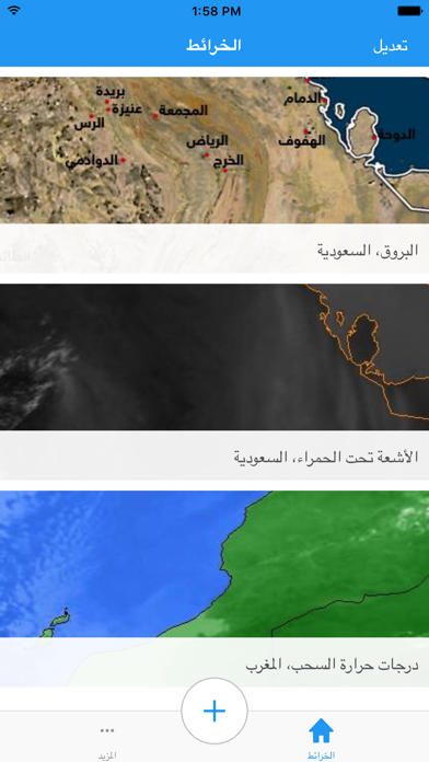
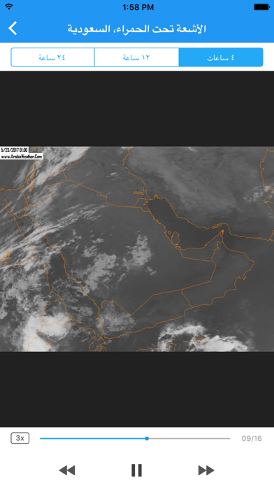
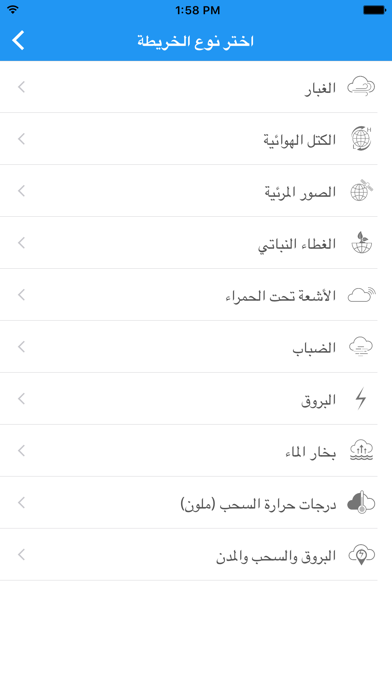
لعشاق وهواة الطقس في الوطن العربي، تطبيق خرائط طقس العرب يتيح لك متابعة صور الأقمار الاصطناعية وصور السحب بكل أنواعها ولكل أرجاء الوطن العربي من الخليج العربي إلى المغرب، سواء كنت متابع لأحوال الطقس أو متنبىء جوي أم كنت من مطاردي العواصف، تطبيق خرائط الطقس يجعلك في قلب الأحداث الجوية التي تؤثر على المناطق العربية سواء كانت أمطار أو منخفضات جوية أو غبار أو ضباب. مواصفات التطبيق: • صور الأقمار الاصطناعية بكل أنواعها (السحب والمدن والبروق، الصور المرئية، درجة حرارة السحب، بخار الماء، الكتل • صور الأقمار الاصطناعية لكل مناطق الوطن العربي (بحر العرب، الخليج العربي، البحر الأحمر، شبه الجزيرة العربية، بلاد الشام، القرن الأفريقي، شمال أفريقيا، البحر الأبيض المتوسط، دول المغرب العربي). • تحديث الصور كل 15 دقيقة، وصور متحركة إلى 24 ساعة سابقة. • إمكانية تلقي أنواع جديدة من صور الأقمار الصناعية حين يتم استحداثها من فريق عمل طقس العرب.
App details
What you can learn from خرائط طقس العرب
Every shipping app on the App Store has gone through the same decisions you're working through right now: which screenshot goes first, what caption sits over it, which device frame to show, what color the background should be. The 5 screenshots above are خرائط طقس العرب's answers to those questions — they're public, they're real, and they made it through Apple's review.
What the numbers say: خرائط طقس العرب runs a light set with one background colour (#FCFCFC) carried across every screenshot — the listing reads as a single poster when the shots sit side by side in search results. The accent colour we picked up, #2494F4, is the one to reuse for badges, arrows and highlighted words if you borrow this look. Hit Use this style to open the editor with these exact colours and drop your own screenshot in.
Notice the first screenshot in particular. It's the one users see in search results and on the product page, and it's where most apps spend their best caption and tightest design. Look at the proportion of background to phone, where the text sits, what one thing the image is trying to communicate.
Want to see how other Weather apps approach the same problem? Browse more Weather apps in the showcase.
Take what works into your own screenshots
Open LaunchShots and design your App Store & Google Play screenshots — pick a device frame, drop captions, ship in minutes. Free, in your browser.
Open the screenshot editor →Apps with a similar look
Closest background + accent colours among the listings we've analysed — useful when you want to see the same palette handled by a different team.