Chart position — tracked daily by LaunchShots
Screenshot style breakdown
Sampled from 6 of Tafsiri Hilol's App Store screenshots — background, accent and theme, measured by LaunchShots (not something Apple publishes).
#FCFCFC bg
#DDDDDD
#D4B444 accent
#111111 text
Screenshots


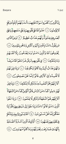

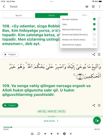
iPad screenshots




Icon palette
About this app
Ушбу иловага шайх Муҳаммад Содиқ Муҳаммад Юсуф ҳазратларининг «Тафсири Ҳилол» асари жойланган. Илованинг бепул имкониятлари: • Мадина мусҳафини ўқиш; • оятларни тинглаш (Маҳмуд Халил Ҳусорий, Муҳаммад Сиддиқ Миншавий, Мишарий ибн Рошид Афасий, Абдурраҳмон Судайс қорилар тиловати); • ўзбек тилидаги маънолар таржимасини кирилл ва лотин ёзувларида ўқиш; • қидириш хизмати; • оятларга хатчўп қўйиш; • матнлар ўлчамини катталаштириш, кичрайтириш; • иловадан фойдаланиш бўйича видеоқўлланмалар билан танишиш. Сотиб олинадиган имкониятлар: • ўзбек тилидаги тафсирнинг тўлиқ матни – 24 минг сўм; • тафсир аудиоси – 24 минг сўм. Илова орқали Қуръони Каримдаги 114 суранинг арабий матни, маъно таржимаси ва тафсирини ўқишингиз мумкин: Фотиҳа, Бақара, Оли Имрон, Нисо, Моида, Анъом, Аъроф, Анфол, Тавба, Юнус, Ҳуд, Юсуф, Раъд, Иброҳим, Ҳижр, Наҳл, Исро, Каҳф, Марям, Тоҳа, Анбиё, Ҳаж, Муъминун, Нур, Фур…
App details
What you can learn from Tafsiri Hilol
Every shipping app on the App Store has gone through the same decisions you're working through right now: which screenshot goes first, what caption sits over it, which device frame to show, what color the background should be. The 16 screenshots above are Tafsiri Hilol's answers to those questions — they're public, they're real, and they made it through Apple's review.
What the numbers say: Tafsiri Hilol runs a mixed light-and-dark set where the background shifts from screenshot to screenshot (first shot #FCFCFC) — each image has to stand on its own, so the captions carry more of the story. The accent colour we picked up, #D4B444, is the one to reuse for badges, arrows and highlighted words if you borrow this look. Hit Use this style to open the editor with these exact colours and drop your own screenshot in.
Notice the first screenshot in particular. It's the one users see in search results and on the product page, and it's where most apps spend their best caption and tightest design. Look at the proportion of background to phone, where the text sits, what one thing the image is trying to communicate.
Want to see how other Book apps approach the same problem? Browse more Book apps in the showcase.
Take what works into your own screenshots
Open LaunchShots and design your App Store & Google Play screenshots — pick a device frame, drop captions, ship in minutes. Free, in your browser.
Open the screenshot editor →Apps with a similar look
Closest background + accent colours among the listings we've analysed — useful when you want to see the same palette handled by a different team.