Chart position — tracked daily by LaunchShots
Screenshot style breakdown
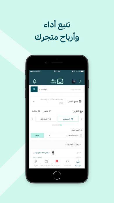
Sampled from 6 of سلة: تجارة إلكترونية سهلة's App Store screenshots — background, accent and theme, measured by LaunchShots (not something Apple publishes).
#CCF4EC bg
#B3D6CF
#1C4C54 accent
#111111 text
Screenshots


iPad screenshots


Icon palette
About this app
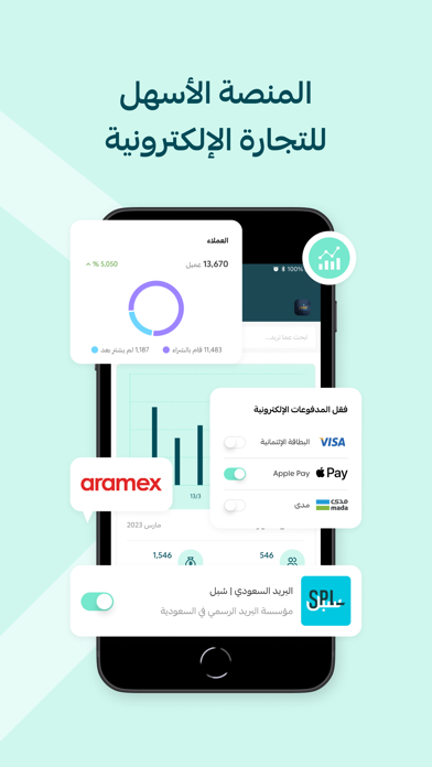
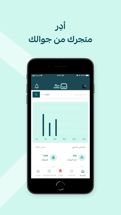
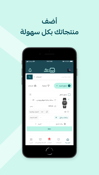
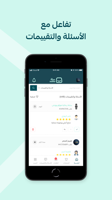
انطلق بتجارتك الإلكترونية مجانًا وخلال دقائق مع سلة، وتحكم بإدارة متجرك وإضافة وتحديث منتجاتك وتتّبع مبيعاتك من أي جهاز تفضّله، وبأي وقت. - تجربة استخدام تسهّل عليك إدارة متجرك يمكنّك تطبيق سلة من إنجاز المهام المختلفة في متجرك بخطوات بسيطة، كإضافة منتجاتك وخدماتك ومتابعة وتحديث حالات الطلب والتفاعل مع عملائك مباشرة وغيرها من الخصائص التي تحتاجها لإدارة متجرك. - أداء سريع ينسجم مع احتياجاتك وتطلعاتك أنجز المهام الأساسية في متجرك بأقل وقت ومن أي جهاز، واستقبل إشعارات مباشرة على جوالك أو جهازك اللوحي بآخر حالات الطلبات وتحديثات المنصة لتبقى على اطلاع فوري بكل جديد. - حلول تسويقية للتجار في كل القطاعات التجارية ارفع عدد الزيارات ومرات الشراء من متجرك عبر أدوات التسويق الرقمي في سلة، مثل الحملات التسويقية وكوبونات تخفيض وعروض خاصة وغيرها من الحلول التسويقية الاحترافية. تاجر جديد في عالم التجارة الإلكترونية؟ فريق سلة معك خطوة بخطوة لتحقِّق انطلاقتك وتدشّن متجرك بثقة. عندك أي استفسار؟ ن…
App details
What you can learn from سلة: تجارة إلكترونية سهلة
Every shipping app on the App Store has gone through the same decisions you're working through right now: which screenshot goes first, what caption sits over it, which device frame to show, what color the background should be. The 14 screenshots above are سلة: تجارة إلكترونية سهلة's answers to those questions — they're public, they're real, and they made it through Apple's review.
What the numbers say: سلة: تجارة إلكترونية سهلة runs a light set with one background colour (#CCF4EC) carried across every screenshot — the listing reads as a single poster when the shots sit side by side in search results. The accent colour we picked up, #1C4C54, is the one to reuse for badges, arrows and highlighted words if you borrow this look. Hit Use this style to open the editor with these exact colours and drop your own screenshot in.
Notice the first screenshot in particular. It's the one users see in search results and on the product page, and it's where most apps spend their best caption and tightest design. Look at the proportion of background to phone, where the text sits, what one thing the image is trying to communicate.
Want to see how other Business apps approach the same problem? Browse more Business apps in the showcase.
Take what works into your own screenshots
Open LaunchShots and design your App Store & Google Play screenshots — pick a device frame, drop captions, ship in minutes. Free, in your browser.
Open the screenshot editor →Apps with a similar look
Closest background + accent colours among the listings we've analysed — useful when you want to see the same palette handled by a different team.