Chart position — tracked daily by LaunchShots
Screenshot style breakdown
Sampled from 5 of ひまトーク+'s App Store screenshots — background, accent and theme, measured by LaunchShots (not something Apple publishes).
#3CC4CC bg
#34ACB3
#94DCE4 accent
#111111 text
Reading the caption text from the screenshots in your browser…
Screenshots


Icon palette
About this app
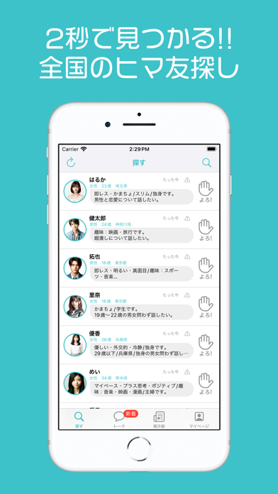
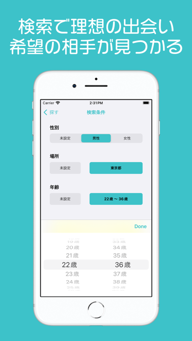
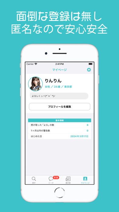
「ひまトーク+」は性別・年齢・場所別で幅広い 出会いが可能な暇つぶしチャットアプリです。 メールアドレス、電話番号登録なども一切不要!! 匿名なので安心安全。 インストール後すぐに始められます。 超簡単操作なので初心者の方でも安心◎ .。*゚+.*.。 こんな方にオススメ ゚+..。*゚+ ◯新しい友達、恋人が欲しい ◯近所で友達を作りたい ◯他のSNSに飽きた ◯誰かにかまって欲しい ◯とにかく誰かと話したい ◯暇 .。*゚+.*.。 ひまトーク+の機能 ゚+..。*゚+ ◯「よろ!」...気になる人にはとりあえず送信。挨拶のきっかけに ◯「写真送信」...ある程度仲良くなったら写真交換可能 ◯「検索」...性別・年齢・場所での検索が可能 ◯「ブロック」...迷惑な相手はブロック可能 .。*゚+.*.。 してはいけない使い方 ゚+..。*゚+ ◯卑猥・過激な言葉や画像の送信 ◯勧誘、宣伝等を目的とした行為 ◯性的な内容を含むトーク ◯個人情報の送信 これらに反した場合、アカウント削除の対象になります。 ※ルールを守って楽しくトークしましょう
App details
What you can learn from ひまトーク+
Every shipping app on the App Store has gone through the same decisions you're working through right now: which screenshot goes first, what caption sits over it, which device frame to show, what color the background should be. The 5 screenshots above are ひまトーク+'s answers to those questions — they're public, they're real, and they made it through Apple's review.
What the numbers say: ひまトーク+ runs a light set with one background colour (#3CC4CC) carried across every screenshot — the listing reads as a single poster when the shots sit side by side in search results. The accent colour we picked up, #94DCE4, is the one to reuse for badges, arrows and highlighted words if you borrow this look. Hit Use this style to open the editor with these exact colours and drop your own screenshot in.
Notice the first screenshot in particular. It's the one users see in search results and on the product page, and it's where most apps spend their best caption and tightest design. Look at the proportion of background to phone, where the text sits, what one thing the image is trying to communicate.
Want to see how other Social Networking apps approach the same problem? Browse more Social Networking apps in the showcase.
Take what works into your own screenshots
Open LaunchShots and design your App Store & Google Play screenshots — pick a device frame, drop captions, ship in minutes. Free, in your browser.
Open the screenshot editor →Apps with a similar look
Closest background + accent colours among the listings we've analysed — useful when you want to see the same palette handled by a different team.