Chart position — tracked daily by LaunchShots
Screenshot style breakdown
Sampled from 5 of 模拟城市:我是市长's App Store screenshots — background, accent and theme, measured by LaunchShots (not something Apple publishes).
#EC5C0C bg
#EE722E
#ECBC34 accent
#FFFFFF text
Screenshots
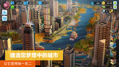


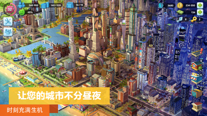
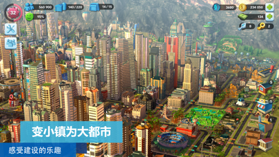
iPad screenshots


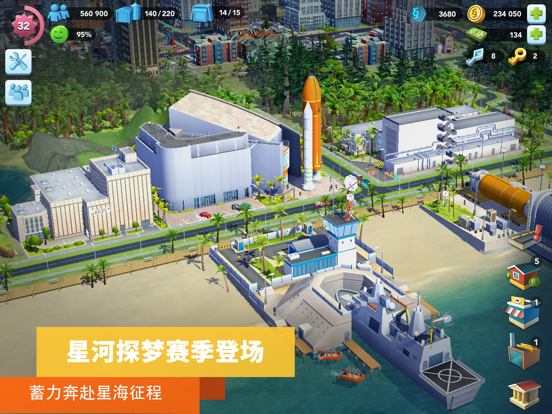


Icon palette
About this app
享誉全球的经典3D模拟经营手游,倾情打造全新“开元古都”国风资料片! 由EA开发、蜂巢游戏独家国内发行的《模拟城市:我是市长》,即将迎来市民入驻啦!一起建设高楼林立的繁华都市,为市民们提供舒适惬意的生活环境吧! 盛大推出全新国风资料片 您可以在古色古香的“开元古都”区域,建设您专属的中国风城市,其中不仅有精致的国风住宅、工坊和商店,更有精心设计的古风道具和场景,带您领略人间烟火气,漫步于金碧辉煌的宫殿、古韵悠然的亭台楼阁、巧夺天工的中式园林,在繁华市井中,感受昼夜轮换间的古都风情。 城市规划尽在掌握 《模拟城市:我是市长》拥有众多形态各异的建筑,市长们尽可发挥想象,建设一座独一无二的梦想城市。除此之外,您还可以利用游戏中的树木、湖泊等打造美丽的花园景点,或是购买独特地标,吸引市民们竞相游览。在这座城市里,文化融合之美将全数呈现! 城市资源连绵不绝 建设一座梦幻城市的过程中,必将面临着前所未有的考验。当您的住宅升级停滞之时,别忘记环顾城市四周,寻找工厂、商店、港口、机场等建筑设施,通过生产、运输…
App details
What you can learn from 模拟城市:我是市长
Every shipping app on the App Store has gone through the same decisions you're working through right now: which screenshot goes first, what caption sits over it, which device frame to show, what color the background should be. The 10 screenshots above are 模拟城市:我是市长's answers to those questions — they're public, they're real, and they made it through Apple's review.
What the numbers say: 模拟城市:我是市长 runs a mixed light-and-dark set where the background shifts from screenshot to screenshot (first shot #EC5C0C) — each image has to stand on its own, so the captions carry more of the story. The accent colour we picked up, #ECBC34, is the one to reuse for badges, arrows and highlighted words if you borrow this look. Hit Use this style to open the editor with these exact colours and drop your own screenshot in.
Notice the first screenshot in particular. It's the one users see in search results and on the product page, and it's where most apps spend their best caption and tightest design. Look at the proportion of background to phone, where the text sits, what one thing the image is trying to communicate.
Want to see how other Games apps approach the same problem? Browse more Games apps in the showcase.
Take what works into your own screenshots
Open LaunchShots and design your App Store & Google Play screenshots — pick a device frame, drop captions, ship in minutes. Free, in your browser.
Open the screenshot editor →Apps with a similar look
Closest background + accent colours among the listings we've analysed — useful when you want to see the same palette handled by a different team.