Chart position — tracked daily by LaunchShots
Screenshot style breakdown
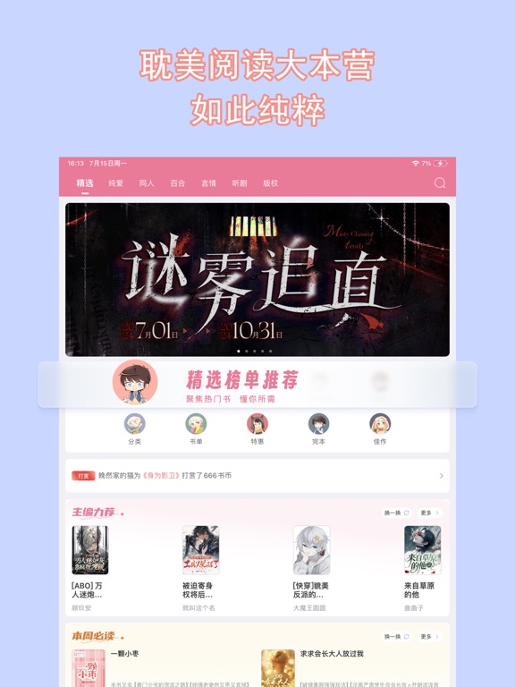
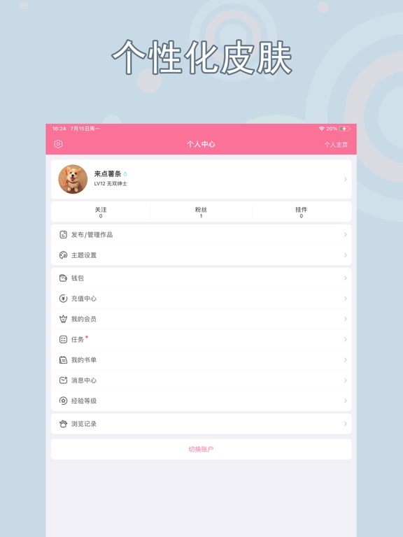
Sampled from 4 of 书耽-耽美同人BL小说's App Store screenshots — background, accent and theme, measured by LaunchShots (not something Apple publishes).
#CCD4FC bg
#B3BADD
#EC7C9C accent
#111111 text
Screenshots


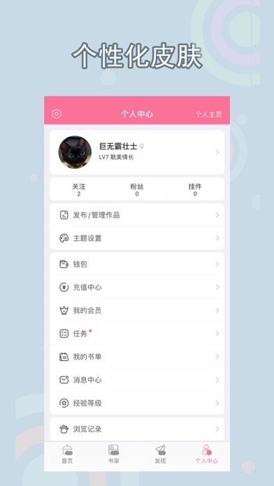
iPad screenshots


Icon palette
About this app
耽美,耽美小说,专为腐女打造的搅基大本营 ! 这里有你没看过的新鲜耽美小说,bl小说,纯爱小说,cp,同人小说。 腹黑攻,鬼畜攻,傲娇攻,忠犬攻,女王受,帝王受, 以及各种cp任君挑选带走 。 各类耽美题材小说:(古代,现代,校园,青春,HE,BE,架空,动漫,快穿,甜文,爽文,虐文,武侠,玄幻,穿越,重生,百合)应有尽有!比腐漫,耽美动漫更带感 这里是女生二次元小说阅读社区 ,是我的世界,也是你的乐园 ,更是广大腐女的天堂 ,不怕不够甜,不够萌;就怕你的小心脏受不了 这里是二次元,腐次元,和基友交流魔道祖师,全职高手,瓶邪,里番,番外,新番,bl小说,bl基地,镇魂。豆腐,汤圆,日本小说,汤圆,迷说,乙女,M站,猫耳,腐漫。 这里还有社交吐槽,评论,社交聊天功能,阅读更贴心,和作者更贴近。 这就是书耽-耽美小说同人小说阅读书城,还能手机创作,手机写小说哦!! 看不完的耽美小说,追不完的同人小说,同好在这里等你! 书耽第三届盛世美颜征文大赛火热进行中,召唤腐圈大大! 【自动续费服务说明】 会员续订包含3个等级可以选…
App details
What you can learn from 书耽-耽美同人BL小说
Every shipping app on the App Store has gone through the same decisions you're working through right now: which screenshot goes first, what caption sits over it, which device frame to show, what color the background should be. The 8 screenshots above are 书耽-耽美同人BL小说's answers to those questions — they're public, they're real, and they made it through Apple's review.
What the numbers say: 书耽-耽美同人BL小说 runs a light set where the background shifts from screenshot to screenshot (first shot #CCD4FC) — each image has to stand on its own, so the captions carry more of the story. The accent colour we picked up, #EC7C9C, is the one to reuse for badges, arrows and highlighted words if you borrow this look. Hit Use this style to open the editor with these exact colours and drop your own screenshot in.
Notice the first screenshot in particular. It's the one users see in search results and on the product page, and it's where most apps spend their best caption and tightest design. Look at the proportion of background to phone, where the text sits, what one thing the image is trying to communicate.
Want to see how other Book apps approach the same problem? Browse more Book apps in the showcase.
Take what works into your own screenshots
Open LaunchShots and design your App Store & Google Play screenshots — pick a device frame, drop captions, ship in minutes. Free, in your browser.
Open the screenshot editor →Apps with a similar look
Closest background + accent colours among the listings we've analysed — useful when you want to see the same palette handled by a different team.