Chart position — tracked daily by LaunchShots
Screenshot style breakdown
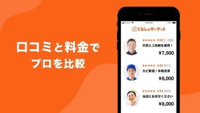
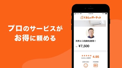
Sampled from 3 of くらしのマーケット - 暮らしに関わるサービスを比較・予約's App Store screenshots — background, accent and theme, measured by LaunchShots (not something Apple publishes).
#FC6414 bg
#FC7934
#FCC49C accent
#FFFFFF text
Screenshots

Icon palette
About this app
■くらしのマーケットについて くらしのマーケットは、ハウスクリーニングや引越しなど、暮らしに関わるサービスをオンライン予約できるアプリです。 口コミや料金を比較して、自分にあうプロを選ぶことができます。 無料のアプリ通話やメッセージ機能で、お問い合わせや予約後のやりとりもスムーズに行えます。 ■カテゴリ例 エアコンクリーニング お風呂クリーニング 洗濯機クリーニング 換気扇クリーニング トイレクリーニング キッチンクリーニング 家事代行・家政婦 格安引越し 不用品回収 エアコン取り付け 壁紙・クロスのリフォーム 家具組み立てサービス 網戸張り替え 庭木の剪定・伐採・伐根 害虫駆除 出張着付け 出張撮影・カメラマン ドライブレコーダーの出張取り付け その他、400種類以上のカテゴリをご用意しています。
App details
What you can learn from くらしのマーケット - 暮らしに関わるサービスを比較・予約
Every shipping app on the App Store has gone through the same decisions you're working through right now: which screenshot goes first, what caption sits over it, which device frame to show, what color the background should be. The 3 screenshots above are くらしのマーケット - 暮らしに関わるサービスを比較・予約's answers to those questions — they're public, they're real, and they made it through Apple's review.
What the numbers say: くらしのマーケット - 暮らしに関わるサービスを比較・予約 runs a dark set with one background colour (#FC6414) carried across every screenshot — the listing reads as a single poster when the shots sit side by side in search results. The accent colour we picked up, #FCC49C, is the one to reuse for badges, arrows and highlighted words if you borrow this look. Hit Use this style to open the editor with these exact colours and drop your own screenshot in.
Notice the first screenshot in particular. It's the one users see in search results and on the product page, and it's where most apps spend their best caption and tightest design. Look at the proportion of background to phone, where the text sits, what one thing the image is trying to communicate.
Want to see how other Shopping apps approach the same problem? Browse more Shopping apps in the showcase.
Take what works into your own screenshots
Open LaunchShots and design your App Store & Google Play screenshots — pick a device frame, drop captions, ship in minutes. Free, in your browser.
Open the screenshot editor →Apps with a similar look
Closest background + accent colours among the listings we've analysed — useful when you want to see the same palette handled by a different team.