Chart position — tracked daily by LaunchShots
Screenshot style breakdown
Sampled from 6 of Coral Travel -сеть турагентств's App Store screenshots — background, accent and theme, measured by LaunchShots (not something Apple publishes).
#4494C4 bg
#5EA2CC
#EC943C accent
#FFFFFF text
Screenshots
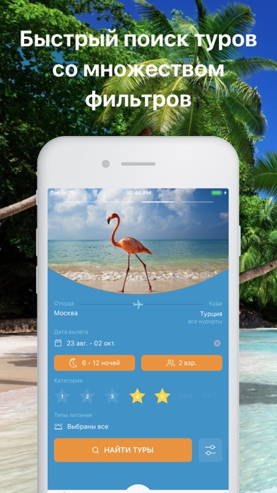
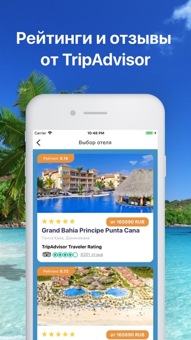
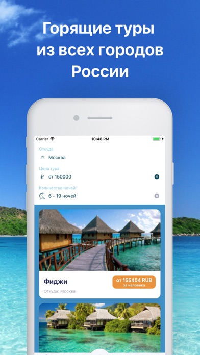
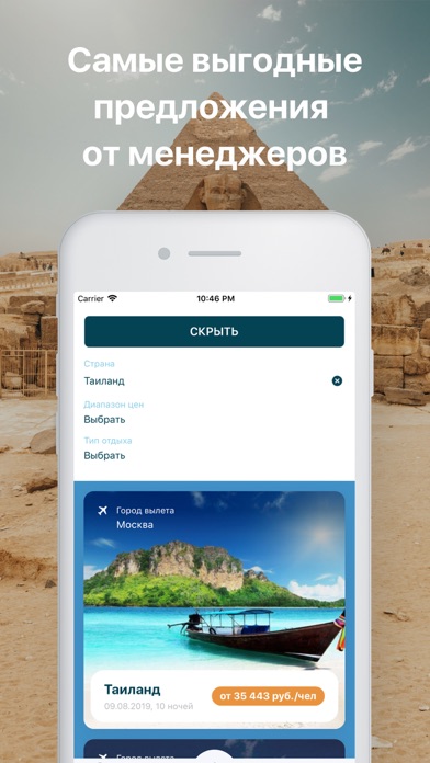
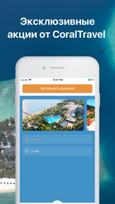
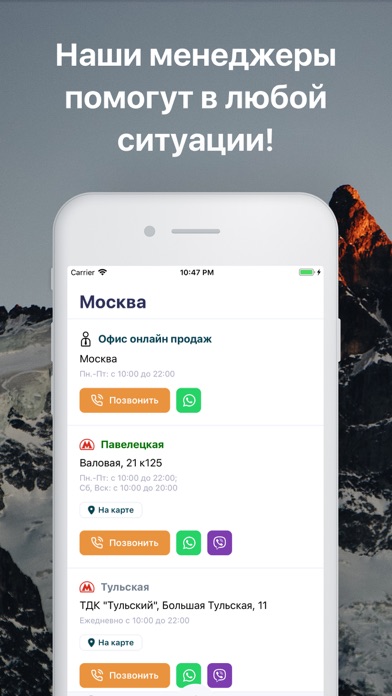
iPad screenshots

Icon palette
About this app
Coral Travel - Горящие туры, а так же поиск туров, от ведущего туроператора России, Корал Тревел, выбирайте лучшие горящие путевки! Поиск туров актуален для всех, желающих поехать на отдых. Coral Travel поможет найти самые выгодные горящие туры онлайн! С помощью нашего приложения вы всегда сможете произвести поиск туров, а так же найти, самые выгодные горящие туры и предложения! Многолетний опыт работы туроператора Корал Тревел позволил грамотно подойти к выбору партнёров и сотрудничать лишь с надёжными ведущими авиакомпаниями, представителями отелей, профессиональными гидами, водителями и не только. Заниматься организацией, как индивидуальных туров, так и групповых, корпоративных, спортивных и VIP-поездок. При этом обязательно учитываются все индивидуальные пожелания клиентов, которые обрабатываются и корректируются, нашими, исключительно опытными менеджерами по туризму. В нашем при…
App details
What you can learn from Coral Travel -сеть турагентств
Every shipping app on the App Store has gone through the same decisions you're working through right now: which screenshot goes first, what caption sits over it, which device frame to show, what color the background should be. The 7 screenshots above are Coral Travel -сеть турагентств's answers to those questions — they're public, they're real, and they made it through Apple's review.
What the numbers say: Coral Travel -сеть турагентств runs a mixed light-and-dark set where the background shifts from screenshot to screenshot (first shot #4494C4) — each image has to stand on its own, so the captions carry more of the story. The accent colour we picked up, #EC943C, is the one to reuse for badges, arrows and highlighted words if you borrow this look. Hit Use this style to open the editor with these exact colours and drop your own screenshot in.
Notice the first screenshot in particular. It's the one users see in search results and on the product page, and it's where most apps spend their best caption and tightest design. Look at the proportion of background to phone, where the text sits, what one thing the image is trying to communicate.
Want to see how other Travel apps approach the same problem? Browse more Travel apps in the showcase.
Take what works into your own screenshots
Open LaunchShots and design your App Store & Google Play screenshots — pick a device frame, drop captions, ship in minutes. Free, in your browser.
Open the screenshot editor →Apps with a similar look
Closest background + accent colours among the listings we've analysed — useful when you want to see the same palette handled by a different team.