Chart position — tracked daily by LaunchShots
Screenshot style breakdown
Sampled from 4 of بانوراما فيديو - تحميل الفيديو's App Store screenshots — background, accent and theme, measured by LaunchShots (not something Apple publishes).
#541424 bg
#6B3442
#C41C3C accent
#FFFFFF text
Screenshots


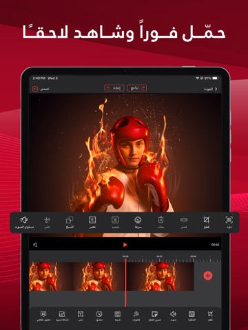
iPad screenshots



Icon palette
About this app
التطبيق العربي الاول و الاشمل يعد تطبيق بانورما فيديو أداة مبتكرة وسهلة الاستخدام تمكن المستخدمين من صناعة وتعديل الفيديوهات بشكل احترافي. يوفر التطبيق مجموعة شاملة من الميزات المتقدمة التي تساعدك على إنشاء محتوى فيديو مخصص يتناسب مع احتياجاتك، سواء كنت مبتدئًا أو محترفًا. يمكنك من خلال التطبيق تسجيل مقاطع الفيديو بجودة عالية، ثم تعديلها باستخدام أدوات تحرير متقدمة مثل القص، والدمج، وإضافة المؤثرات البصرية والصوتية. يتميز التطبيق بواجهة مستخدم بسيطة وملائمة، مما يتيح لك الوصول بسهولة إلى جميع الميزات دون تعقيد. كما يدعم التطبيق مشاركة الفيديوهات على منصات التواصل الاجتماعي بنقرة واحدة، مما يجعل من السهل عليك عرض إبداعاتك على جمهورك. سواء كنت ترغب في صنع فيديو ترويجي، أو محتوى تعليمي، أو مجرد لحظات ممتعة من حياتك اليومية، فإن تطبيق بانورما فيديو هو الخيار الأمثل لتحقيق رؤيتك الفنية. يتيح لك تطبيق بانوراما فيديو فرصة رائعة لـ صنع و تعديل و تحرير و تحميل او تنزيل فيديوهات فريدة تعكس إبد…
App details
What you can learn from بانوراما فيديو - تحميل الفيديو
Every shipping app on the App Store has gone through the same decisions you're working through right now: which screenshot goes first, what caption sits over it, which device frame to show, what color the background should be. The 8 screenshots above are بانوراما فيديو - تحميل الفيديو's answers to those questions — they're public, they're real, and they made it through Apple's review.
What the numbers say: بانوراما فيديو - تحميل الفيديو runs a mixed light-and-dark set where the background shifts from screenshot to screenshot (first shot #541424) — each image has to stand on its own, so the captions carry more of the story. The accent colour we picked up, #C41C3C, is the one to reuse for badges, arrows and highlighted words if you borrow this look. Hit Use this style to open the editor with these exact colours and drop your own screenshot in.
Notice the first screenshot in particular. It's the one users see in search results and on the product page, and it's where most apps spend their best caption and tightest design. Look at the proportion of background to phone, where the text sits, what one thing the image is trying to communicate.
Want to see how other Photo & Video apps approach the same problem? Browse more Photo & Video apps in the showcase.
Take what works into your own screenshots
Open LaunchShots and design your App Store & Google Play screenshots — pick a device frame, drop captions, ship in minutes. Free, in your browser.
Open the screenshot editor →Apps with a similar look
Closest background + accent colours among the listings we've analysed — useful when you want to see the same palette handled by a different team.