Chart position — tracked daily by LaunchShots
Screenshot changes — detected by LaunchShots
Screenshot style breakdown
Sampled from 5 of 我的世界:移动版's App Store screenshots — background, accent and theme, measured by LaunchShots (not something Apple publishes).
#242424 bg
#424242
#9C548C accent
#FFFFFF text
Screenshots


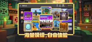
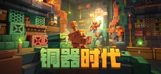
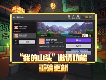
iPad screenshots




Icon palette
About this app
《我的世界》– 铜器时代 【游戏介绍】 《我的世界》(Minecraft)是一款风靡全球的3D沙盒游戏,由网易游戏代理运营的中国版手游,现在已开放官方正版的免费下载。 凭借自由无限的开放世界、超乎想象的游戏玩法,《我的世界》深受上亿玩家的喜爱。玩家可以独自探索、或与朋友并肩冒险,探索随机生成的世界,创造令人惊叹的奇迹。更有丰富的组件资源,帮助玩家开启多种创意玩法。你想玩的,这里都有。快拉上小伙伴一同加入冒险家大家庭,随时随地享受创造乐趣! 【游戏特色】 《我的世界》中国版由网易游戏经微软Mojang工作室官方授权代理,采用免费下载的模式,游戏内容与国际版保持一致,致力于为玩家提供原汁原味的游戏体验。 【铜器时代盛大开启,铜色光辉点亮世界】 《我的世界》中国版正式步入铜器时代!这用途多样的金属,可被打造成称手的工具、锃亮的盔甲、明亮的光源与氧化的装饰。全新加入的铜箱子带来更好的存储体验,铜傀儡则化身活泼灵动的机械伙伴陪伴左右,还有铜傀儡像、铜粒、展示架等丰富内容等待冒险家探索。以每一抹铜色装点你的方块世界,尽…
App details
What you can learn from 我的世界:移动版
Every shipping app on the App Store has gone through the same decisions you're working through right now: which screenshot goes first, what caption sits over it, which device frame to show, what color the background should be. The 10 screenshots above are 我的世界:移动版's answers to those questions — they're public, they're real, and they made it through Apple's review.
What the numbers say: 我的世界:移动版 runs a dark set with one background colour (#242424) carried across every screenshot — the listing reads as a single poster when the shots sit side by side in search results. The accent colour we picked up, #9C548C, is the one to reuse for badges, arrows and highlighted words if you borrow this look. Hit Use this style to open the editor with these exact colours and drop your own screenshot in.
Notice the first screenshot in particular. It's the one users see in search results and on the product page, and it's where most apps spend their best caption and tightest design. Look at the proportion of background to phone, where the text sits, what one thing the image is trying to communicate.
Want to see how other Games apps approach the same problem? Browse more Games apps in the showcase.
Take what works into your own screenshots
Open LaunchShots and design your App Store & Google Play screenshots — pick a device frame, drop captions, ship in minutes. Free, in your browser.
Open the screenshot editor →Apps with a similar look
Closest background + accent colours among the listings we've analysed — useful when you want to see the same palette handled by a different team.