Screenshots


Icon palette
About this app
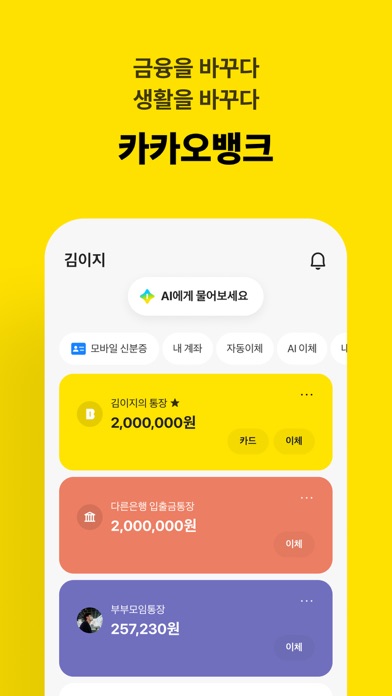
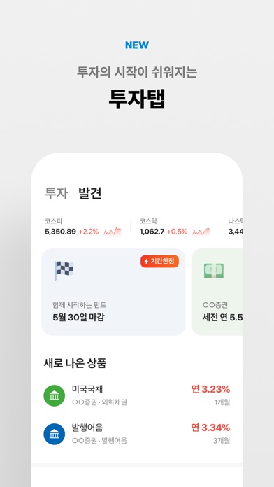
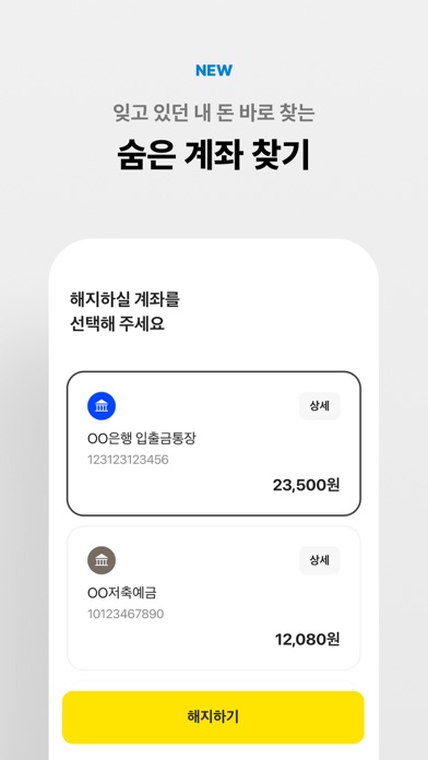
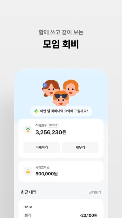
금융을 바꾸다 생활을 바꾸다 제1금융권 은행, 카카오뱅크 ■ 대한민국 대표 인터넷은행 • 365일 언제나 지점 방문 없이 모든 은행 업무를 모바일에서 • 계좌번호를 몰라도 카카오톡 친구에게 손쉬운 이체 ■ 눈에 바로 보이는 혜택 • 복잡한 가입 조건이나 우대 조건 없이, 누구에게나 경쟁력 있는 금리 제공 • 혜택탭에서 매일 미션 달성하고 통장으로 바로 받는 캐시백 ■ 함께 쓰고 같이 보는 통장 • 카카오톡 친구들을 손쉽게 모임 멤버로 초대 • 잔액과 입출금 현황을 모임 멤버들과 실시간으로 공유 • 모임 전용 체크카드로 더욱 크게 누리는 혜택 ■ 천원부터 시작하는 26주간의 도전 • 26주 동안 매주 차곡차곡 쌓아가는 적금 • 카카오프렌즈 응원과 함께하면 어느덧 만기 달성이 눈앞에! ■ 쓰는만큼 돌려받는 체크카드 • 쓸 때마다 캐시백 받는 모두를 위한 체크카드 • 사장님에게 필요한 혜택만 담은 사업자 전용 체크카드 • 랜덤 캐시백으로 또다른 재미를 누리는 모임 전용 체크카드 ■ 챗봇으로 쉽고 빠른 주택자금대출 • 구입 자금부터 전월세 보증금…
App details
What you can learn from 카카오뱅크
Every shipping app on the App Store has gone through the same decisions you're working through right now: which screenshot goes first, what caption sits over it, which device frame to show, what color the background should be. The 8 screenshots above are 카카오뱅크's answers to those questions — they're public, they're real, and they made it through Apple's review.
Notice the first screenshot in particular. It's the one users see in search results and on the product page, and it's where most apps spend their best caption and tightest design. Look at the proportion of background to phone, where the text sits, what one thing the image is trying to communicate.
Want to see how other Finance apps approach the same problem? Browse more Finance apps in the showcase.
Take what works into your own screenshots
Open LaunchShots and design your App Store & Google Play screenshots — pick a device frame, drop captions, ship in minutes. Free, in your browser.
Open the screenshot editor →