Chart position — tracked daily by LaunchShots
Screenshot changes — detected by LaunchShots
Screenshot style breakdown
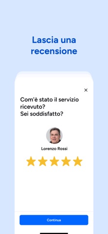
Sampled from 6 of ProntoPro Trova Professionisti's App Store screenshots — background, accent and theme, measured by LaunchShots (not something Apple publishes).
#D4E4FC bg
#BAC8DD
#0464FC accent
#111111 text
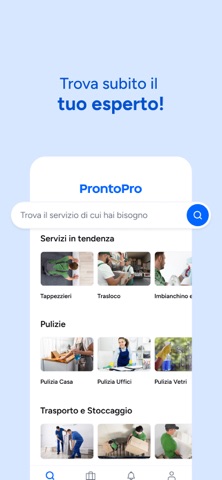
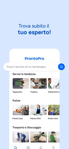
- #1Trova subito il tuo esperto!
- #2Trova subito il tuo esperto!
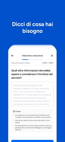
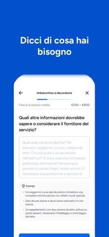
- #3Dicci di cosa hai bisogno
- #4Dicci di cosa hai bisogno
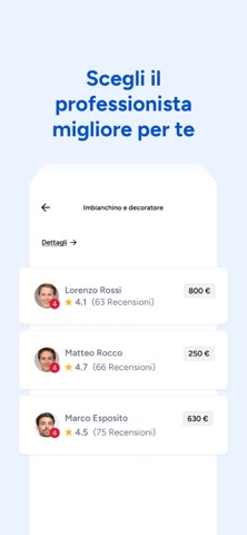
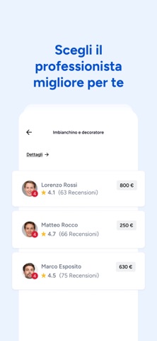
- #5Scegli il professionista migliore per te
- #6Scegli il professionista migliore per te
Captions read from the screenshots (OCR, may contain small errors): 6 headlines, 5.3 words on average (longest 6).
Screenshots

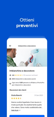
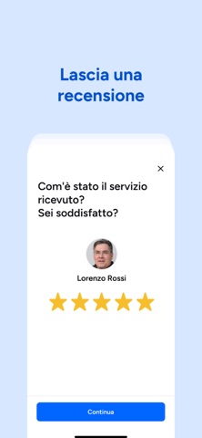
iPad screenshots


Icon palette
About this app
Raggiungi migliaia di Professionisti attraverso la nostra app, in modo semplice e veloce. Occorre solo un minuto per rispondere alle domande sul tipo di servizio di cui hai bisogno e ottieni gratuitamente preventivi adatti a te, fra più di 4.000 servizi disponibili: da idraulici ad imbianchini, da installatori di aria condizionata a imprese di pulizia, ma anche psicologi, personal trainer e nutrizionisti, web designer, organizzatori di eventi e autisti privati. Perché fare una richiesta su ProntoPro? • Ottieni un servizio di qualità: scegli Professionisti qualificati attraverso le recensioni dei loro precedenti clienti e prendi la tua decisione in maniera consapevole. • Risparmi tempo: dimentica il passaparola, ricevi preventivi online personalizzati e investi più tempo con i tuoi cari. • Accedi a diversi servizi: trova i migliori Professionisti per ogni necessità, ti offriranno un lav…
App details
What you can learn from ProntoPro Trova Professionisti
Every shipping app on the App Store has gone through the same decisions you're working through right now: which screenshot goes first, what caption sits over it, which device frame to show, what color the background should be. The 20 screenshots above are ProntoPro Trova Professionisti's answers to those questions — they're public, they're real, and they made it through Apple's review.
What the numbers say: ProntoPro Trova Professionisti runs a mixed light-and-dark set where the background shifts from screenshot to screenshot (first shot #D4E4FC) — each image has to stand on its own, so the captions carry more of the story. The accent colour we picked up, #0464FC, is the one to reuse for badges, arrows and highlighted words if you borrow this look. Hit Use this style to open the editor with these exact colours and drop your own screenshot in.
Notice the first screenshot in particular. It's the one users see in search results and on the product page, and it's where most apps spend their best caption and tightest design. Look at the proportion of background to phone, where the text sits, what one thing the image is trying to communicate.
Want to see how other Lifestyle apps approach the same problem? Browse more Lifestyle apps in the showcase.
Take what works into your own screenshots
Open LaunchShots and design your App Store & Google Play screenshots — pick a device frame, drop captions, ship in minutes. Free, in your browser.
Open the screenshot editor →Apps with a similar look
Closest background + accent colours among the listings we've analysed — useful when you want to see the same palette handled by a different team.