Screenshot changes — detected by LaunchShots
Screenshot style breakdown
Sampled from 6 of Fifty Outlet's App Store screenshots — background, accent and theme, measured by LaunchShots (not something Apple publishes).
#340C0C bg
#502E2E
#845C54 accent
#FFFFFF text
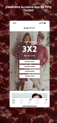
- #1iDescubre la nueva app de Fifty Outlet!
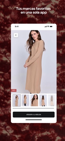
- #2Tus marcas favoritas en una sola app a
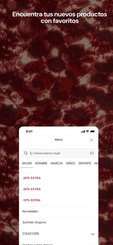
- #3* Encuentra tus nuevos Ss
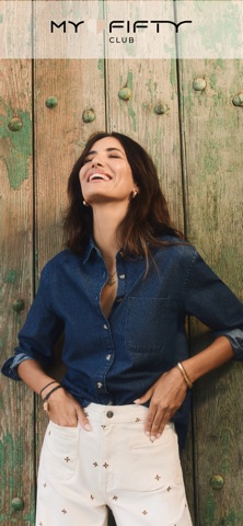
- #4Forma parte de My Fifty Club My Fifty Club ==
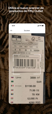
- #5Utiliza el nuevo scanner de productos de Fifty Outlet € Escáner
- #6MY FIAT
Captions read from the screenshots (OCR, may contain small errors): 6 headlines, 7.2 words on average (longest 11).
Screenshots

iPad screenshots

Icon palette
About this app
Fifty es un outlet de moda con todas las marcas de Tendam. En la app encontrarás grandes descuentos de las marcas Women'secret, Springfield, Cortefiel, Pedro del Hierro, Milano y prendas de terceros como Only, Pieces, Vero Moda, Slow Love, Jack and Jones, Levi’s, Selected y Dockers. Aprovecha las mejores ofertas en moda, complementos, calzado o ropa interior tanto de hombre como de mujer. Cada día ofrecemos nuevos productos que provienen de los excedentes de producción de cada marca o bien las últimas novedades de la firma Milano. De esta manera, podrás disfrutar de ofertas irresistibles que están disponibles durante solo unos días y en cantidades limitadas. En Fifty siempre hay algo diferente. Activa tus comunicaciones para enterarte antes que nadie de las últimas entradas, porque en Fifty Outlet la mejor moda se vende rápido. Todas nuestras prendas, ya sean de colecciones anteriore…
App details
What you can learn from Fifty Outlet
Every shipping app on the App Store has gone through the same decisions you're working through right now: which screenshot goes first, what caption sits over it, which device frame to show, what color the background should be. The 7 screenshots above are Fifty Outlet's answers to those questions — they're public, they're real, and they made it through Apple's review.
What the numbers say: Fifty Outlet runs a mixed light-and-dark set where the background shifts from screenshot to screenshot (first shot #340C0C) — each image has to stand on its own, so the captions carry more of the story. The accent colour we picked up, #845C54, is the one to reuse for badges, arrows and highlighted words if you borrow this look. Hit Use this style to open the editor with these exact colours and drop your own screenshot in.
Notice the first screenshot in particular. It's the one users see in search results and on the product page, and it's where most apps spend their best caption and tightest design. Look at the proportion of background to phone, where the text sits, what one thing the image is trying to communicate.
Want to see how other Shopping apps approach the same problem? Browse more Shopping apps in the showcase.
Take what works into your own screenshots
Open LaunchShots and design your App Store & Google Play screenshots — pick a device frame, drop captions, ship in minutes. Free, in your browser.
Open the screenshot editor →Apps with a similar look
Closest background + accent colours among the listings we've analysed — useful when you want to see the same palette handled by a different team.