Chart position — tracked daily by LaunchShots
Screenshot changes — detected by LaunchShots
Screenshot style breakdown
Sampled from 6 of コミックDAYS's App Store screenshots — background, accent and theme, measured by LaunchShots (not something Apple publishes).
#FCFCFC bg
#DDDDDD
#FCEC5C accent
#111111 text
Screenshots


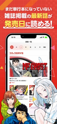

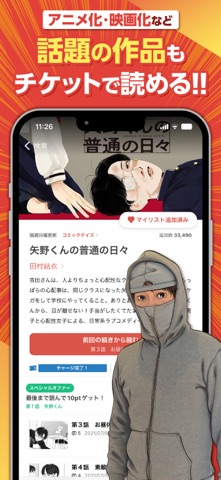
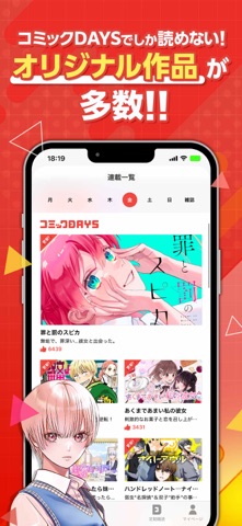
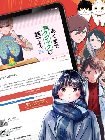
iPad screenshots



Icon palette
About this app
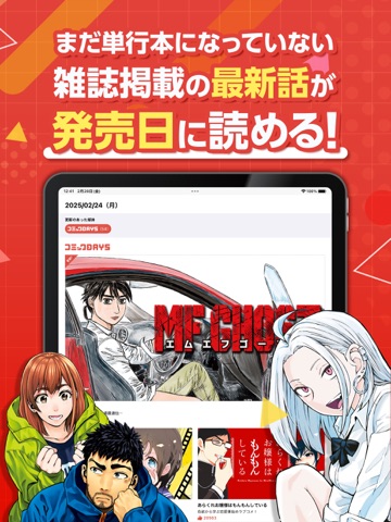
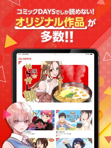
【コミックDAYSの特徴】 ◆無料で読める豊富な連載マンガ! コミックDAYSでしか読めないオリジナル作品や、アニメ化・ドラマ化・映画化された有名作品、雑誌の人気作を毎日更新。 (一部紹介) ・忍者と極道 ・あくまでクジャクの話です。 ・K2 ・大正學生愛妻家 ・波うららかに、めおと日和 ・金田一パパの事件簿 ・邪神の弁当屋さん ・ドクターチルドレン ・ウリッコ ・教え子くんとはデキません ・かわいいのは俺である ・かみあそび!~カードゲーマー少女の日常~ ・矢野くんの普通の日々 ・離婚しない男 CASE2 ・雪と墨 ・僕の奥さんはちょっと怖い ・ツレ猫 マルルとハチ ・この世界は不完全すぎる ・てんぷる ・平和の国の島崎へ ・アンダーニンジャ ・税金で買った本 など ◆完結した人気作も待てば無料で読める! 23時間で回復する無料チケットを使えば対象話が無料で読めるので、あの人気作を自分のペースでお楽しみいただけます。 (一部紹介) ・宇宙兄弟 ・ザ・ファブル ・ザ・ファブル The second contact ・食糧人類Re:-Starving Re:velation- ・M…
App details
What you can learn from コミックDAYS
Every shipping app on the App Store has gone through the same decisions you're working through right now: which screenshot goes first, what caption sits over it, which device frame to show, what color the background should be. The 12 screenshots above are コミックDAYS's answers to those questions — they're public, they're real, and they made it through Apple's review.
What the numbers say: コミックDAYS runs a mixed light-and-dark set where the background shifts from screenshot to screenshot (first shot #FCFCFC) — each image has to stand on its own, so the captions carry more of the story. The accent colour we picked up, #FCEC5C, is the one to reuse for badges, arrows and highlighted words if you borrow this look. Hit Use this style to open the editor with these exact colours and drop your own screenshot in.
Notice the first screenshot in particular. It's the one users see in search results and on the product page, and it's where most apps spend their best caption and tightest design. Look at the proportion of background to phone, where the text sits, what one thing the image is trying to communicate.
Want to see how other Book apps approach the same problem? Browse more Book apps in the showcase.
Take what works into your own screenshots
Open LaunchShots and design your App Store & Google Play screenshots — pick a device frame, drop captions, ship in minutes. Free, in your browser.
Open the screenshot editor →Apps with a similar look
Closest background + accent colours among the listings we've analysed — useful when you want to see the same palette handled by a different team.