Chart position — tracked daily by LaunchShots
Screenshot style breakdown
Sampled from 6 of radio NED+'s App Store screenshots — background, accent and theme, measured by LaunchShots (not something Apple publishes).
#F4F4F4 bg
#D6D6D6
#FC4C04 accent
#111111 text
Screenshots
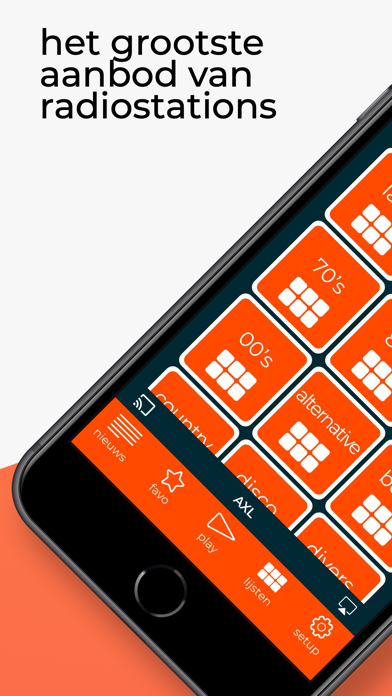
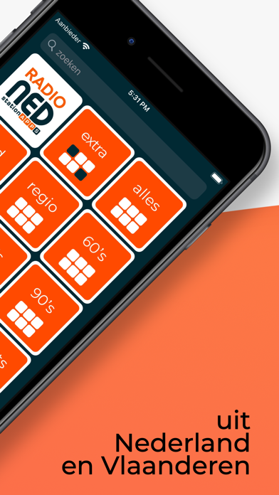
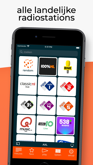
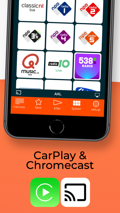
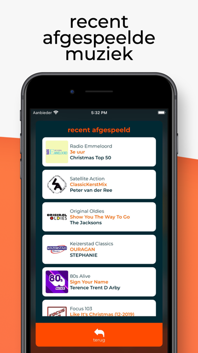
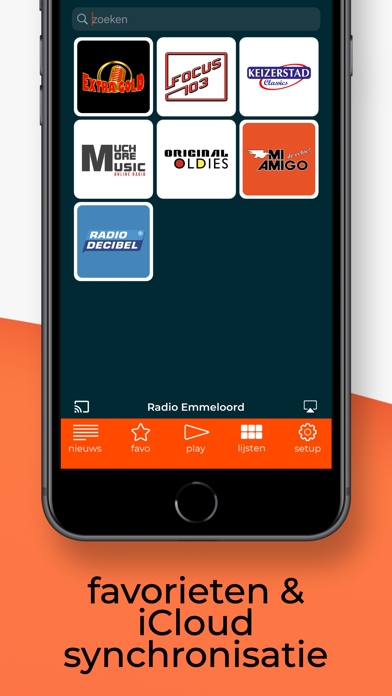
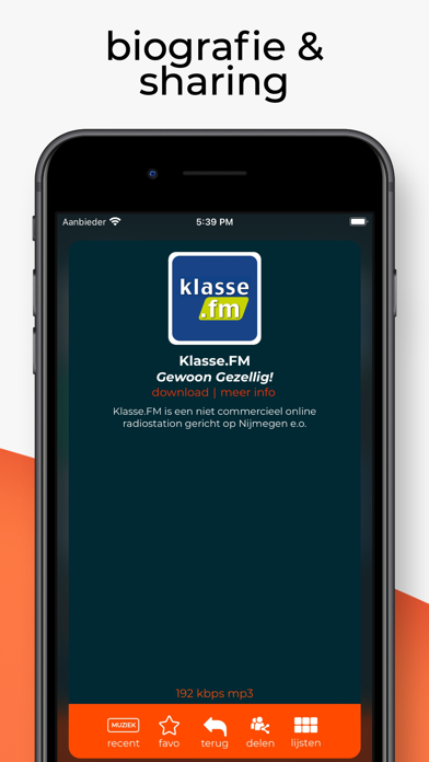
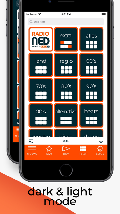
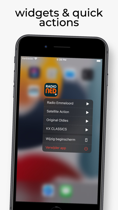
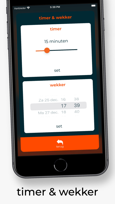
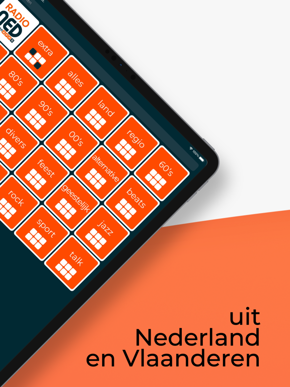
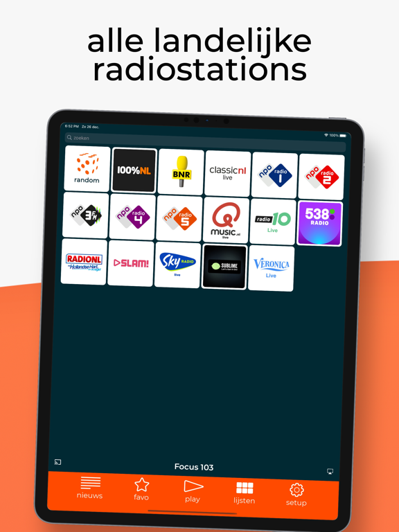
iPad screenshots



Icon palette
About this app
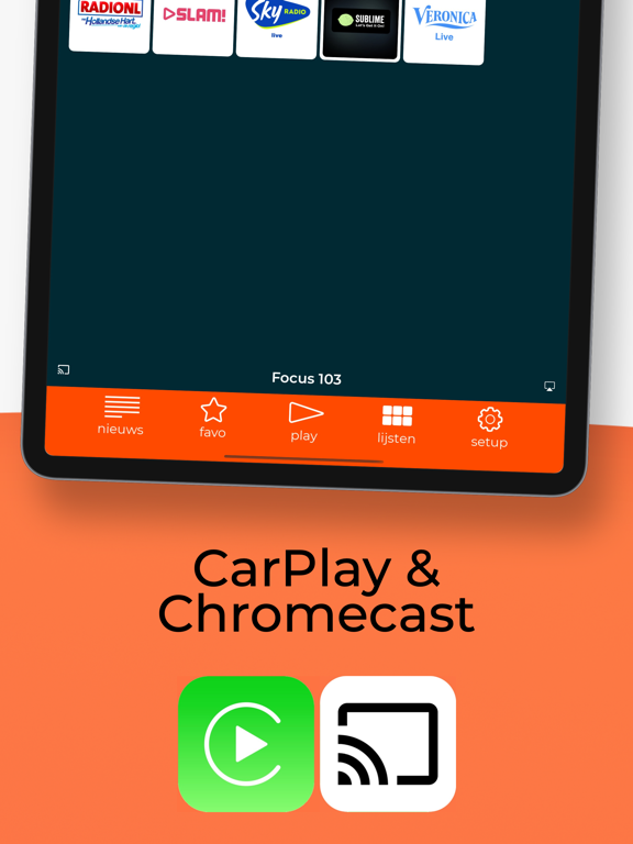
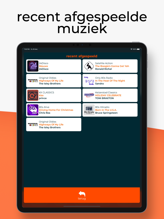
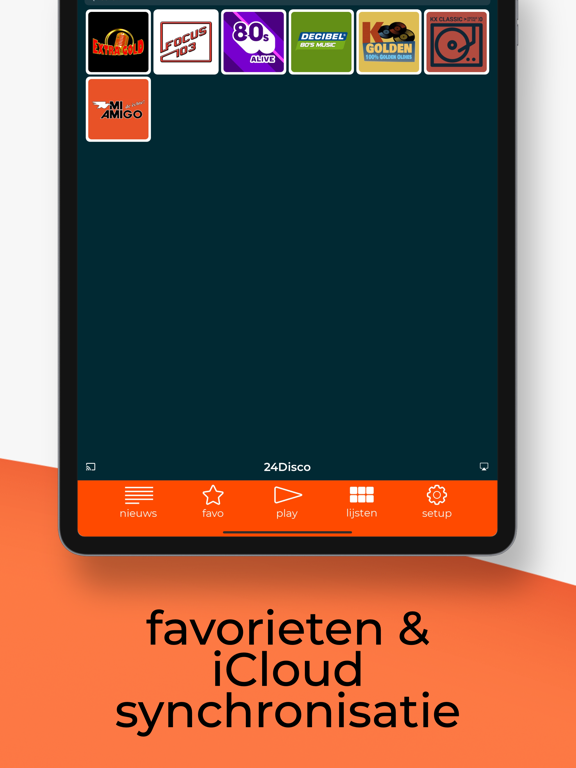
Luister naar meer dan 1000 AM, FM, DAB+ en online radiostations uit Nederland en Vlaanderen. Radio NED+ biedt veel handige functies: stream je favorieten zender via Chromecast of AirPlay, maak je eigen favorietenlijst aan en synchroniseer deze via iCloud sync met radio NED+ voor iPhone, iPad, AppleTV, Apple Watch, CarPlay en macOS, zie welk nummer afgespeeld wordt (indien doorgegeven door de zender), bekijk de biografie van een radiostation en het aantal luisteraars op dat moment (indien openbaar), browse door verschillend categorieën: landelijk, regio, 60s, 70s, 80s, 90s, 00s, dance, Nederlands, talk radio, klassiek en feest, zet een wekker en/of een timer zodat je wakker wordt en/of in slaap valt met je favoriete radiostation, lees het laatste medianieuws, bepaal de afgespeelde streamkwaliteit en radio NED+ is volledig geïntegreerd met de media-afspeelmogelijkheden binnen iOS, tvOS en…
App details
What you can learn from radio NED+
Every shipping app on the App Store has gone through the same decisions you're working through right now: which screenshot goes first, what caption sits over it, which device frame to show, what color the background should be. The 20 screenshots above are radio NED+'s answers to those questions — they're public, they're real, and they made it through Apple's review.
What the numbers say: radio NED+ runs a light set where the background shifts from screenshot to screenshot (first shot #F4F4F4) — each image has to stand on its own, so the captions carry more of the story. The accent colour we picked up, #FC4C04, is the one to reuse for badges, arrows and highlighted words if you borrow this look. Hit Use this style to open the editor with these exact colours and drop your own screenshot in.
Notice the first screenshot in particular. It's the one users see in search results and on the product page, and it's where most apps spend their best caption and tightest design. Look at the proportion of background to phone, where the text sits, what one thing the image is trying to communicate.
Want to see how other Music apps approach the same problem? Browse more Music apps in the showcase.
Take what works into your own screenshots
Open LaunchShots and design your App Store & Google Play screenshots — pick a device frame, drop captions, ship in minutes. Free, in your browser.
Open the screenshot editor →Apps with a similar look
Closest background + accent colours among the listings we've analysed — useful when you want to see the same palette handled by a different team.