Chart position — tracked daily by LaunchShots
Screenshot style breakdown
Sampled from 4 of 京东读书-读好书,上京东's App Store screenshots — background, accent and theme, measured by LaunchShots (not something Apple publishes).
#FC2C04 bg
#FC4927
#FC9474 accent
#FFFFFF text
Screenshots
iPad screenshots
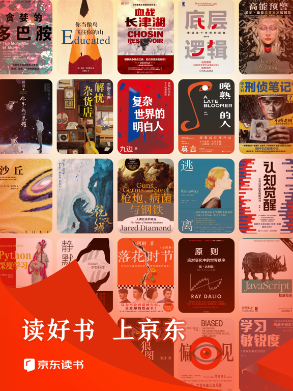
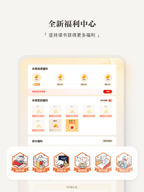
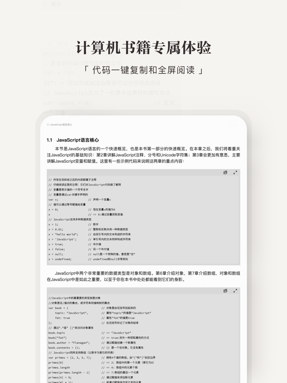
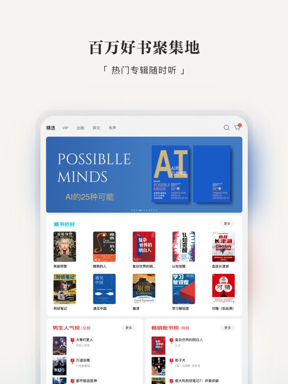
Icon palette
About this app
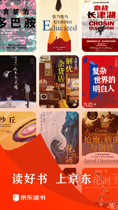
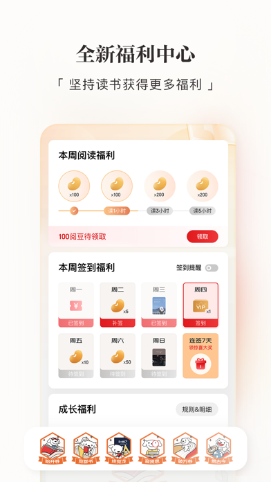
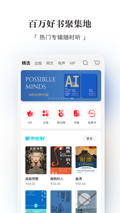
【京东读书】百万好书聚集地,畅享品质阅读,致力于打造纸、电、声一站式全阅读生态平台。 那些沉甸甸的书,我们都压缩成巴掌大呈现给你;那些被时间封存了的文字,我们都吹散上面的灰尘呈献给你; 那些被人们称赞的绝妙灵魂,我们都一一排好队分享给你。 在这里你可以暂时忘却生活的鸡毛,用碎片的时间领略不一样的人生。 总之,有一个世界想给你看~ 【读书,不只有精神食粮】 在这里,除了能享受到知识上的福利,我们还有新人礼包,每天签到打卡也有超值礼包相送哦! 【读书,不只有一种人生】 我们有60万册电子书供你阅读,也有60万种人生供你体验。 【读书,不再是无人相伴】 当你走在路上,当你不方便阅读的时候,别担心我们有有声。 10万小时的有声内容,给你10万小时的暖心陪伴。 【读书,不再言知己好难】 读书是否有时候觉得曲高和寡,孤掌难鸣?想要寻到知己,不如从分享开始吧。赠一得一,把你喜欢的书籍送给你的朋友,把你的品味分享出去,我相信总有一个人会懂你。 【近日好书】 影视原著:《欢乐颂》《足利女童连续失踪事件》《生吞》《长安十二时辰》…
App details
What you can learn from 京东读书-读好书,上京东
Every shipping app on the App Store has gone through the same decisions you're working through right now: which screenshot goes first, what caption sits over it, which device frame to show, what color the background should be. The 8 screenshots above are 京东读书-读好书,上京东's answers to those questions — they're public, they're real, and they made it through Apple's review.
What the numbers say: 京东读书-读好书,上京东 runs a mixed light-and-dark set where the background shifts from screenshot to screenshot (first shot #FC2C04) — each image has to stand on its own, so the captions carry more of the story. The accent colour we picked up, #FC9474, is the one to reuse for badges, arrows and highlighted words if you borrow this look. Hit Use this style to open the editor with these exact colours and drop your own screenshot in.
Notice the first screenshot in particular. It's the one users see in search results and on the product page, and it's where most apps spend their best caption and tightest design. Look at the proportion of background to phone, where the text sits, what one thing the image is trying to communicate.
Want to see how other Book apps approach the same problem? Browse more Book apps in the showcase.
Take what works into your own screenshots
Open LaunchShots and design your App Store & Google Play screenshots — pick a device frame, drop captions, ship in minutes. Free, in your browser.
Open the screenshot editor →Apps with a similar look
Closest background + accent colours among the listings we've analysed — useful when you want to see the same palette handled by a different team.