Chart position — tracked daily by LaunchShots
Screenshot style breakdown
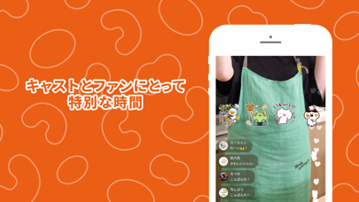
Sampled from 3 of NATSLIVE's App Store screenshots — background, accent and theme, measured by LaunchShots (not something Apple publishes).
#EC5C14 bg
#EE7234
#F49464 accent
#FFFFFF text
Screenshots


Icon palette
About this app
◆NATSLIVEの特徴 NATSLIVEは、キャストとの特別な時間を過ごせるライブ配信サービスです。 メディアやSNSで活躍する話題のキャストを起用し、食を中心とした様々なテーマのライブ番組を配信しています。 キャストのプロデュース商品やオリジナルグッズなどのライブコマースも楽しめます。 ◆NATSLIVEゴールド会員(加入は任意) 【機能】 1. ライブ配信中に設けられた特別な時間「スペシャルTIME」を視聴できます。 2. 自分でカメラを操作できる「スタジオ観覧モード」が利用できます(対象配信のみ)。 3. NATSLIVEオリジナルスタンプや番組オリジナルスタンプが押し放題で利用できます。 4. 1週間の見逃し配信後も、アーカイブ映像が視聴できます(期間は配信によって異なる)。 5. ライブコマース購入時に「スペシャル特典」が付与されます(対象配信のみ)。 【課金方法】 お使いのiTunesアカウントに課金されます。 申込日から起算して1ヶ月ごとに自動更新されます。 ゴールド会員期間の終了日の24時間以上前に自動更新を解除しない限り、会員期間が自動更新さ…
App details
What you can learn from NATSLIVE
Every shipping app on the App Store has gone through the same decisions you're working through right now: which screenshot goes first, what caption sits over it, which device frame to show, what color the background should be. The 3 screenshots above are NATSLIVE's answers to those questions — they're public, they're real, and they made it through Apple's review.
What the numbers say: NATSLIVE runs a dark set with one background colour (#EC5C14) carried across every screenshot — the listing reads as a single poster when the shots sit side by side in search results. The accent colour we picked up, #F49464, is the one to reuse for badges, arrows and highlighted words if you borrow this look. Hit Use this style to open the editor with these exact colours and drop your own screenshot in.
Notice the first screenshot in particular. It's the one users see in search results and on the product page, and it's where most apps spend their best caption and tightest design. Look at the proportion of background to phone, where the text sits, what one thing the image is trying to communicate.
Want to see how other Food & Drink apps approach the same problem? Browse more Food & Drink apps in the showcase.
Take what works into your own screenshots
Open LaunchShots and design your App Store & Google Play screenshots — pick a device frame, drop captions, ship in minutes. Free, in your browser.
Open the screenshot editor →Apps with a similar look
Closest background + accent colours among the listings we've analysed — useful when you want to see the same palette handled by a different team.