Chart position — tracked daily by LaunchShots
Screenshot style breakdown
Sampled from 5 of 朗新sTalent's App Store screenshots — background, accent and theme, measured by LaunchShots (not something Apple publishes).
#BCDCF4 bg
#A5C1D6
#1484CC accent
#111111 text
Screenshots
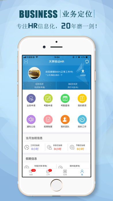

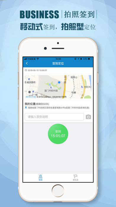
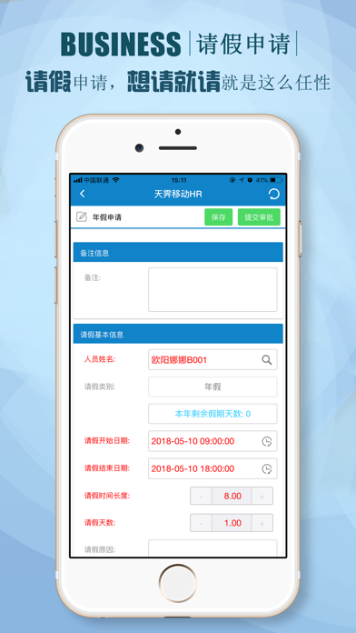
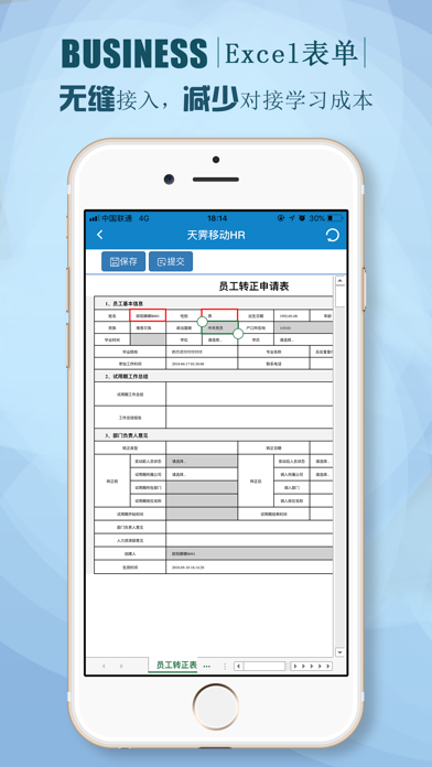
iPad screenshots


Icon palette
About this app
随着智能移动终端(手机、平板电脑等)性能进一步提高,人们对移动办公的需求就变得非常迫切,朗新移动人力资源管理系统,推出了一系列精心设计可移动办公的人力资源业务功能集,既富有时代感,又具可操作性,提高了企业人力资源管理的工作效率。朗新HR移动应用带给您更多的保障,更便捷的人力管理系统体系。 为员工贴心服务 |-员工通过移动设备可以方便管理个人信息; |-可以随时随地查阅个人薪酬; |-查看/申请/跟进个人请假、加班、公差、销假、年假、福利假等情况; |-可以发起如:转正、晋升、物品领用、印章申请等人事业务流程并跟进; |-快捷方便的使用移动打卡; |-随时查看公司发送的最新动态、新闻通知、规章制度; |-便捷的参与公司组织的在线测评,问卷调查; 为经理人业务助力 |-提供组织与员工信息查询,可查看员工个人档案信息; |-满足人事流程、考勤业务移动审批; |-通过本部门员工职等、工作年限、年龄、编制与在岗人数对比等多维度统计分析; |-支持经理人随时随地管理下属团队的加班、请假、员工变动、人员编制与结构配置; |-帮助经理人及时关注…
App details
What you can learn from 朗新sTalent
Every shipping app on the App Store has gone through the same decisions you're working through right now: which screenshot goes first, what caption sits over it, which device frame to show, what color the background should be. The 10 screenshots above are 朗新sTalent's answers to those questions — they're public, they're real, and they made it through Apple's review.
What the numbers say: 朗新sTalent runs a light set with one background colour (#BCDCF4) carried across every screenshot — the listing reads as a single poster when the shots sit side by side in search results. The accent colour we picked up, #1484CC, is the one to reuse for badges, arrows and highlighted words if you borrow this look. Hit Use this style to open the editor with these exact colours and drop your own screenshot in.
Notice the first screenshot in particular. It's the one users see in search results and on the product page, and it's where most apps spend their best caption and tightest design. Look at the proportion of background to phone, where the text sits, what one thing the image is trying to communicate.
Want to see how other Productivity apps approach the same problem? Browse more Productivity apps in the showcase.
Take what works into your own screenshots
Open LaunchShots and design your App Store & Google Play screenshots — pick a device frame, drop captions, ship in minutes. Free, in your browser.
Open the screenshot editor →Apps with a similar look
Closest background + accent colours among the listings we've analysed — useful when you want to see the same palette handled by a different team.