Chart position — tracked daily by LaunchShots
Screenshot style breakdown
Sampled from 4 of Сборник дуа's App Store screenshots — background, accent and theme, measured by LaunchShots (not something Apple publishes).
#FCFCFC bg
#DDDDDD
#6C9CCC accent
#111111 text
Screenshots
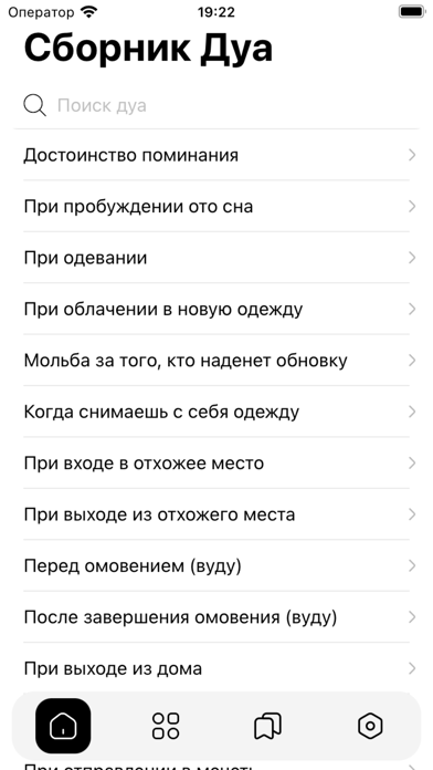
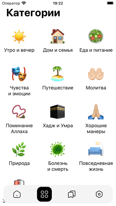
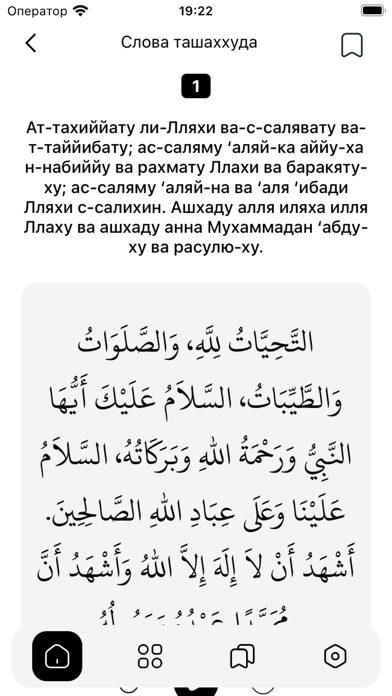

iPad screenshots


Icon palette
About this app
Приложение "Сборник дуа" собрало в себе самые важные дуа (молитвы) на все случаи жизни. Достоинством данного справочника является достоверность собранной в ней информации. Каждый мусульманин должен стремиться к заучиванию дуа (молитв), собранных в этой книге. Используйте свой iPhone, iPad, или iPod touch для того, чтобы в любой момент найти нужное дуа (молитву). Для удобства мы предусмотрели функцию «Поиск», с помощью которой вы сможете искать как по названиям глав, так и по ключевым словам. Также вы сможете сохранить часто используемые дуа в «Избранное». Данная программа является бесплатной. Мы лишь просим прочитать за нас дуа! Пусть Всевышний сделает этот труд полезным для людей! Благодарим переводчика и ИД Умма за предоставление текста книги. Да воздаст им Аллах благом в обоих мирах! Убедительная просьба: в приложении есть некоторые опечатки в тексте (транскрипции). Если вы о…
App details
What you can learn from Сборник дуа
Every shipping app on the App Store has gone through the same decisions you're working through right now: which screenshot goes first, what caption sits over it, which device frame to show, what color the background should be. The 8 screenshots above are Сборник дуа's answers to those questions — they're public, they're real, and they made it through Apple's review.
What the numbers say: Сборник дуа runs a light set with one background colour (#FCFCFC) carried across every screenshot — the listing reads as a single poster when the shots sit side by side in search results. The accent colour we picked up, #6C9CCC, is the one to reuse for badges, arrows and highlighted words if you borrow this look. Hit Use this style to open the editor with these exact colours and drop your own screenshot in.
Notice the first screenshot in particular. It's the one users see in search results and on the product page, and it's where most apps spend their best caption and tightest design. Look at the proportion of background to phone, where the text sits, what one thing the image is trying to communicate.
Want to see how other Book apps approach the same problem? Browse more Book apps in the showcase.
Take what works into your own screenshots
Open LaunchShots and design your App Store & Google Play screenshots — pick a device frame, drop captions, ship in minutes. Free, in your browser.
Open the screenshot editor →Apps with a similar look
Closest background + accent colours among the listings we've analysed — useful when you want to see the same palette handled by a different team.