Chart position — tracked daily by LaunchShots
Screenshot style breakdown
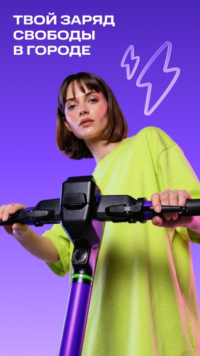
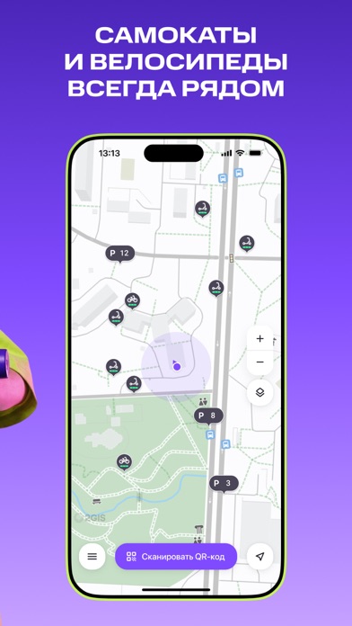
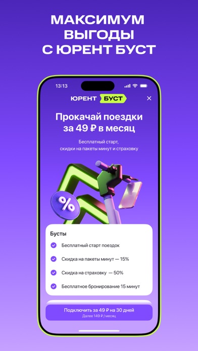
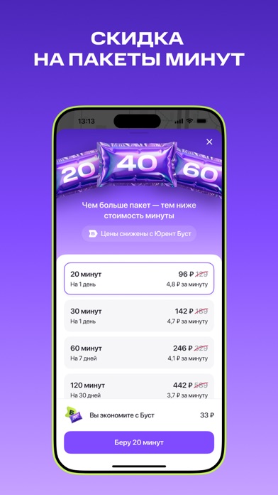
Sampled from 6 of Юрент: аренда самокатов's App Store screenshots — background, accent and theme, measured by LaunchShots (not something Apple publishes).
#4C24BC bg
#6542C5
#844CFC accent
#FFFFFF text
Screenshots


Icon palette
About this app
Юрент — сервис аренды самокатов и велосипедов через удобное приложение, созданное для активных пользователей городских пространств. С помощью интуитивно понятного интерфейса пользователи могут быстро находить и арендовать электрические самокаты и велосипеды для комфортных поездок по городу. САМОКАТЫ Огромный выбор самокатов по всей России. Начать поездку просто, быстро и удобно: - Скачайте приложение и зарегистрируйтесь за пару минут – нужен только номер телефона и карта для оплаты. - Найдите ближайший самокат на карте в приложении. - Отсканируйте куар-код на руле, выберите тариф и нажмите "Старт". - Возьмите самокат, оттолкнитесь и нажмите на газ – он на правой стороне руля. - Следите за зарядом самоката, чтобы вовремя добраться до парковки. - На карте множество парковок, где можно завершить аренду, чтобы самокат никому не мешал. Используйте наиболее удобный, быстрый и экономичный сп…
App details
What you can learn from Юрент: аренда самокатов
Every shipping app on the App Store has gone through the same decisions you're working through right now: which screenshot goes first, what caption sits over it, which device frame to show, what color the background should be. The 6 screenshots above are Юрент: аренда самокатов's answers to those questions — they're public, they're real, and they made it through Apple's review.
What the numbers say: Юрент: аренда самокатов runs a mixed light-and-dark set where the background shifts from screenshot to screenshot (first shot #4C24BC) — each image has to stand on its own, so the captions carry more of the story. The accent colour we picked up, #844CFC, is the one to reuse for badges, arrows and highlighted words if you borrow this look. Hit Use this style to open the editor with these exact colours and drop your own screenshot in.
Notice the first screenshot in particular. It's the one users see in search results and on the product page, and it's where most apps spend their best caption and tightest design. Look at the proportion of background to phone, where the text sits, what one thing the image is trying to communicate.
Want to see how other Lifestyle apps approach the same problem? Browse more Lifestyle apps in the showcase.
Take what works into your own screenshots
Open LaunchShots and design your App Store & Google Play screenshots — pick a device frame, drop captions, ship in minutes. Free, in your browser.
Open the screenshot editor →Apps with a similar look
Closest background + accent colours among the listings we've analysed — useful when you want to see the same palette handled by a different team.