Screenshot style breakdown
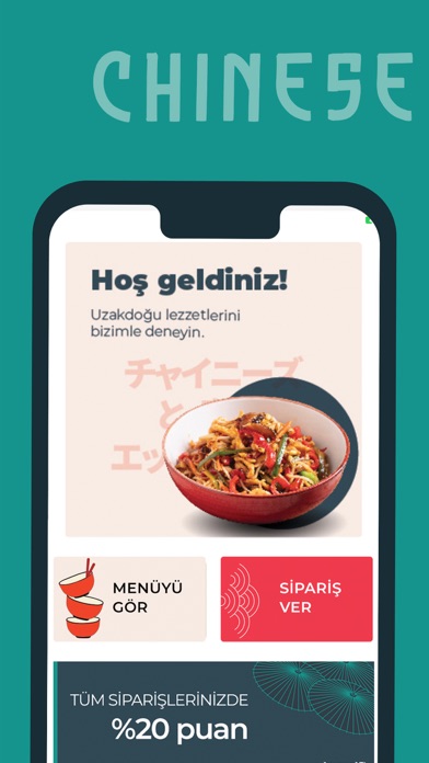
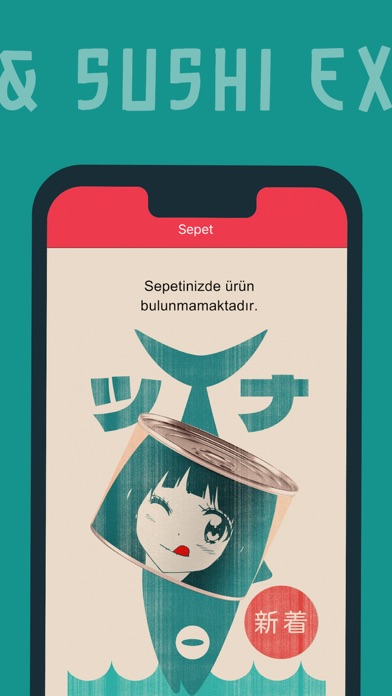
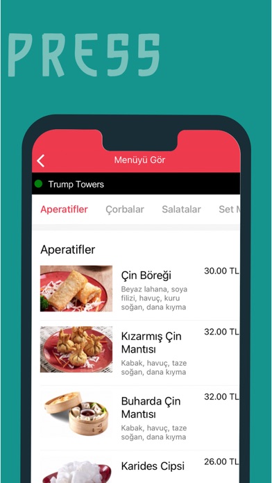
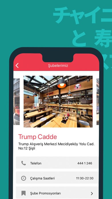
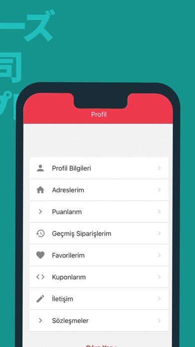
Sampled from 5 of Chinese & Sushi Express's App Store screenshots — background, accent and theme, measured by LaunchShots (not something Apple publishes).
#14948C bg
#34A29C
#EC3C4C accent
#FFFFFF text
Screenshots
Icon palette
About this app
Usta şeflerin elinden çıkan noodle, sushi, egzotik ana yemekler ve aperatifler ile Uzak Doğu mutfağının büyüsünü sizlerle buluşturan şubelerimiz oldukça geniş bir paket servis ağına da sahipler. İstanbul’da Bağdat Caddesi, Ortaköy, Moda, Bakırköy Carousel, Şişhane, Kurtköy, Trump Cadde, Kozzy Avm, Altunizade, Ataşehir, Etiler, Ümraniye, Maslak, Kavacık, Çekmeköy, Kartal, Zekeriyaköy, Zeytinburnu, İstinye, Beylikdüzü, Acıbadem, Sancaktepe; Ankara’da Çayyolu ve Beysukent; Bursa Nilüfer, İzmit Yahyakaptan, Sakarya Adapazarı, Eskişehir ve Antalya Alanya olmak üzere toplam 29 noktada hizmet veren Chinese & Sushi Express, Çin ve Japon mutfağının en gözde lezzetlerini sizlerle buluşturuyor. Daha sağlıklı, düşük kalorili ve lezzetli olması nedeniyle büyük rağbet gören Uzak Doğu mutfağının en güzel lezzetlerine Chinese & Sushi Express mobil uygulamamız üzerinden vereceğiniz siparişlerle tadabi…
App details
What you can learn from Chinese & Sushi Express
Every shipping app on the App Store has gone through the same decisions you're working through right now: which screenshot goes first, what caption sits over it, which device frame to show, what color the background should be. The 5 screenshots above are Chinese & Sushi Express's answers to those questions — they're public, they're real, and they made it through Apple's review.
What the numbers say: Chinese & Sushi Express runs a dark set with one background colour (#14948C) carried across every screenshot — the listing reads as a single poster when the shots sit side by side in search results. The accent colour we picked up, #EC3C4C, is the one to reuse for badges, arrows and highlighted words if you borrow this look. Hit Use this style to open the editor with these exact colours and drop your own screenshot in.
Notice the first screenshot in particular. It's the one users see in search results and on the product page, and it's where most apps spend their best caption and tightest design. Look at the proportion of background to phone, where the text sits, what one thing the image is trying to communicate.
Want to see how other Food & Drink apps approach the same problem? Browse more Food & Drink apps in the showcase.
Take what works into your own screenshots
Open LaunchShots and design your App Store & Google Play screenshots — pick a device frame, drop captions, ship in minutes. Free, in your browser.
Open the screenshot editor →Apps with a similar look
Closest background + accent colours among the listings we've analysed — useful when you want to see the same palette handled by a different team.