Chart position — tracked daily by LaunchShots
Screenshot changes — detected by LaunchShots
Screenshot style breakdown
Sampled from 6 of Vitality's App Store screenshots — background, accent and theme, measured by LaunchShots (not something Apple publishes).
#ECF4F4 bg
#CFD6D6
#E40414 accent
#111111 text
Screenshots
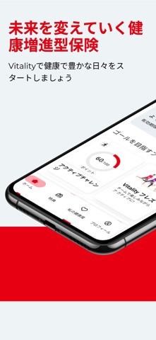


iPad screenshots

Icon palette
About this app
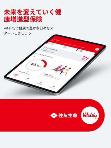
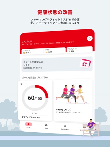
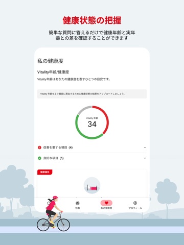
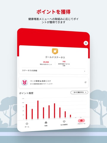
このアプリについて 未来を変えていく健康増進型保険 アプリをダウンロードして健康で豊かな日々をスタートしましょう。 【Vitalityの特徴】 健康状態の把握や改善のための取組みによってポイントを獲得できます。また、健康増進をサポートする各種特典(リワード)をご利用いただけます。 【Vitalityの主な機能】 ■ 健康状態の把握 オンラインチェック機能の1つである「Vitality総合チェック」を行うと、健康年齢と実年齢の差を確認することができます。 また、健康診断の測定項目(血圧、BMI、血糖、コレステロール、尿蛋白)の数値を入力し、自分の健康状態を管理することができます。そして、これらの取組みを行うことでポイントを獲得できます。 ■ 健康状態の改善 ウォーキングやフィットネスジムでの運動、スポーツイベントへの参加といった健康増進に向けた取組みがポイント化されます。 ■ 特典(リワード)を楽しむ 1週間の運動目標を達成することでドリンクチケットがもらえるなど、楽しみながら健康的な毎日を過ごせる機能が搭載されています…
App details
What you can learn from Vitality
Every shipping app on the App Store has gone through the same decisions you're working through right now: which screenshot goes first, what caption sits over it, which device frame to show, what color the background should be. The 11 screenshots above are Vitality's answers to those questions — they're public, they're real, and they made it through Apple's review.
What the numbers say: Vitality runs a light set with one background colour (#ECF4F4) carried across every screenshot — the listing reads as a single poster when the shots sit side by side in search results. The accent colour we picked up, #E40414, is the one to reuse for badges, arrows and highlighted words if you borrow this look. Hit Use this style to open the editor with these exact colours and drop your own screenshot in.
Notice the first screenshot in particular. It's the one users see in search results and on the product page, and it's where most apps spend their best caption and tightest design. Look at the proportion of background to phone, where the text sits, what one thing the image is trying to communicate.
Want to see how other Health & Fitness apps approach the same problem? Browse more Health & Fitness apps in the showcase.
Take what works into your own screenshots
Open LaunchShots and design your App Store & Google Play screenshots — pick a device frame, drop captions, ship in minutes. Free, in your browser.
Open the screenshot editor →Apps with a similar look
Closest background + accent colours among the listings we've analysed — useful when you want to see the same palette handled by a different team.