Chart position — tracked daily by LaunchShots
Screenshot changes — detected by LaunchShots
Screenshot style breakdown
Sampled from 6 of E-Bilet's App Store screenshots — background, accent and theme, measured by LaunchShots (not something Apple publishes).
#FCFCFC bg
#DDDDDD
#5C7CFC accent
#111111 text
- #1Q ÜYE OLMADAN DEVAM ET +
Captions read from the screenshots (OCR, may contain small errors): 1 headline, 6 words on average (longest 6), mostly ALL CAPS.
Screenshots


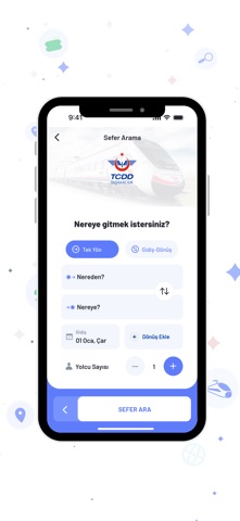


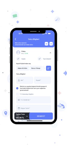
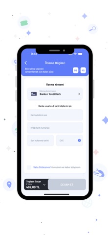

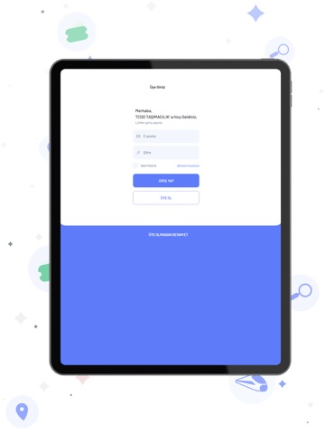
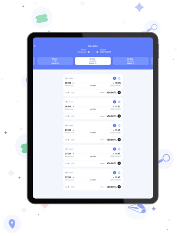
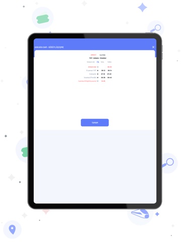
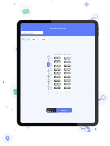
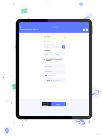
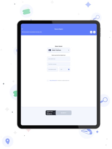
iPad screenshots



Icon palette
About this app
TCDD Taşımacılık AŞ artık cebinizde. TCDD Taşımacılık AŞ, iletişim ve bilişim teknolojisinin sunduğu fırsatlarla daha hızlı ve daha rahat yolculuk imkanı sunuyor. Gişeye Gelmeden Online Bilet Alabilirsiniz Elektronik Yolcu Bilet İşlemleri Sistemi (EYBİS) ile gişelere gelmeden mobil uygulamadan, internetten, çağrı merkezinden biletinizi alabilirsiniz. Satış işleminin tamamlanmasının ardından biletiniz SMS ve e-posta ile tarafınıza gönderilir. Trene binerken resimli bir kimlik belgesi ibraz etmek zorunludur. Çağrı Merkezi Çağrı Merkezi, 444 82 33 no.lu özel servis numarası ile 7 gün 24 saat size hizmet veriyor. Çağrı Merkezimizden; yolcu, yük ve liman hizmetleri konusunda her türlü bilgi verilirken, biletle ilgili işlemlerle öneri ve şikâyetlere ilişkin hizmetler yapılıyor. Whatsapp üzerinden Anlık Şikâyet, Anlık Çözüm Uygulaması 0507 321 82 33 numaralı Whatsapp hattına 7/24 ulaştırı…
App details
What you can learn from E-Bilet
Every shipping app on the App Store has gone through the same decisions you're working through right now: which screenshot goes first, what caption sits over it, which device frame to show, what color the background should be. The 18 screenshots above are E-Bilet's answers to those questions — they're public, they're real, and they made it through Apple's review.
What the numbers say: E-Bilet runs a light set with one background colour (#FCFCFC) carried across every screenshot — the listing reads as a single poster when the shots sit side by side in search results. The accent colour we picked up, #5C7CFC, is the one to reuse for badges, arrows and highlighted words if you borrow this look. Hit Use this style to open the editor with these exact colours and drop your own screenshot in.
Notice the first screenshot in particular. It's the one users see in search results and on the product page, and it's where most apps spend their best caption and tightest design. Look at the proportion of background to phone, where the text sits, what one thing the image is trying to communicate.
Want to see how other Travel apps approach the same problem? Browse more Travel apps in the showcase.
Take what works into your own screenshots
Open LaunchShots and design your App Store & Google Play screenshots — pick a device frame, drop captions, ship in minutes. Free, in your browser.
Open the screenshot editor →Apps with a similar look
Closest background + accent colours among the listings we've analysed — useful when you want to see the same palette handled by a different team.