Chart position — tracked daily by LaunchShots
Screenshot style breakdown
Sampled from 6 of Anytime Mobile Print's App Store screenshots — background, accent and theme, measured by LaunchShots (not something Apple publishes).
#040404 bg
#272727
#047CFC accent
#FFFFFF text
Screenshots
Icon palette
About this app
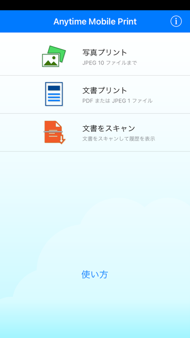
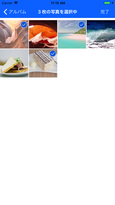
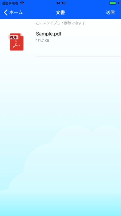
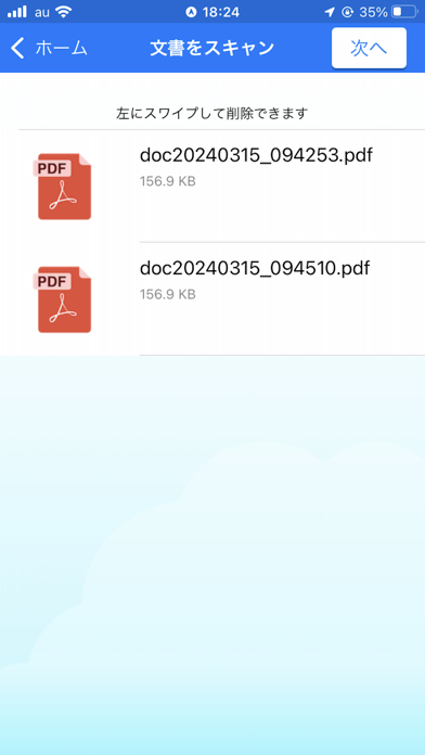
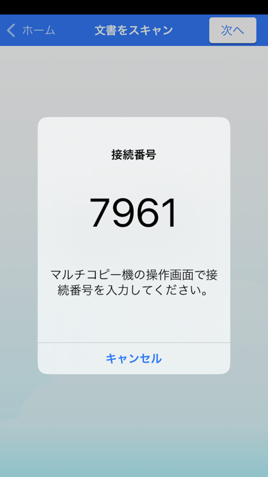
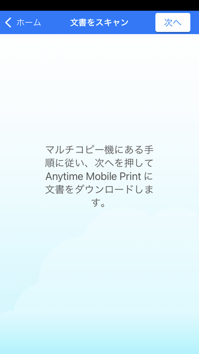
●コンビニで簡単・安全にプリント! デイリーヤマザキやセイコーマートのマルチコピー機で写真や文書を簡単かつ安全にプリントできます。 ●プリントの使い方 1.マルチコピー機の「写真プリント」または「文書プリント」を選択し、「スマートフォン(Wi-Fi)」からのプリントを選択 2.マルチコピー機画面の手順に従い、マルチコピー機とスマートフォンをWi-Fi接続 3.スマートフォン上の写真または文書をマルチコピー機に転送 4.マルチコピー機にコインを投入してプリント ●スキャンの使い方 1.マルチコピー機の「スキャン」を選択し、保存先に「スマートフォン(Wi-Fi)」を選択 2.マルチコピー機画面の手順に従い、保存したい写真または文章をスキャン 3.マルチコピー機画面の手順に従い、マルチコピー機とスマートフォンをWi-Fi接続 4.マルチコピー機にコインを投入して、スマートフォンにデータを保存 ●利用いただける店舗 マルチコピー機が設置されている以…
App details
What you can learn from Anytime Mobile Print
Every shipping app on the App Store has gone through the same decisions you're working through right now: which screenshot goes first, what caption sits over it, which device frame to show, what color the background should be. The 7 screenshots above are Anytime Mobile Print's answers to those questions — they're public, they're real, and they made it through Apple's review.
What the numbers say: Anytime Mobile Print runs a mixed light-and-dark set where the background shifts from screenshot to screenshot (first shot #040404) — each image has to stand on its own, so the captions carry more of the story. The accent colour we picked up, #047CFC, is the one to reuse for badges, arrows and highlighted words if you borrow this look. Hit Use this style to open the editor with these exact colours and drop your own screenshot in.
Notice the first screenshot in particular. It's the one users see in search results and on the product page, and it's where most apps spend their best caption and tightest design. Look at the proportion of background to phone, where the text sits, what one thing the image is trying to communicate.
Want to see how other Utilities apps approach the same problem? Browse more Utilities apps in the showcase.
Take what works into your own screenshots
Open LaunchShots and design your App Store & Google Play screenshots — pick a device frame, drop captions, ship in minutes. Free, in your browser.
Open the screenshot editor →Apps with a similar look
Closest background + accent colours among the listings we've analysed — useful when you want to see the same palette handled by a different team.