Chart position — tracked daily by LaunchShots
Screenshot changes — detected by LaunchShots
Screenshot style breakdown
Sampled from 6 of كروة Carwah I تأجير سيارات's App Store screenshots — background, accent and theme, measured by LaunchShots (not something Apple publishes).
#643C24 bg
#795742
#7CB4C4 accent
#FFFFFF text
Screenshots

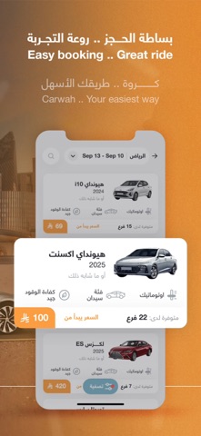
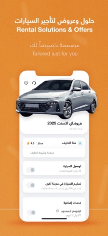


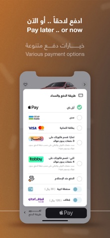
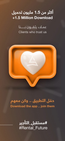
Icon palette
About this app
إنطلقنا في منتصف عام 2018 ، منصة كروة اليوم هي المنصة الرائدة في قطاع تأجير السيارات بالمملكة العربية السعودية، وذلك لوجود مميزات استثنائية وخيارات متعددة لعملائنا. حيث نقوم بتقديم خدمات حصرية لعملائنا لدى أكثر من 600 مكتب تأجير، وأكثر من 55,000 سيارة متاحة على منصتنا ، نتواجد في 45 مدينة ومطار في جميع أنحاء المملكة العربية السعودية. نعمل في منصة كروة على ربط حلفائنا بعملائنا للحصول على تجربة تأجيرأكثر سهولة وسلاسة . نهجنا هو البساطة: إرضاء عملاؤنا هو هدفنا الأسمى في كروة وذلك بتسهيل إجراءات الحجز باستخدام تطبيق كروة حيث يُسمح للعميل بالوصول إلى مجموعة متنوعة من الخيارات التي يقدمها حلفاؤنا. لدينا خدمات مبتكرة ومتنوعة مثل توصيل السيارة المستأجرة إلى المكان والوقت المُختار، بالإضافة الى خدمة إعادة السيارة إلى مدينة أخرى ، وخدمة الكيلومترات اللامحدودة و أسعار خاصة للإيجار الشهري والسنوي، خدمة السائق مع السيارة، الخ ...). نعد بأننا لن نتوقف عن التطوير والإبتكار في خدماتنا وتحديثها ل…
App details
What you can learn from كروة Carwah I تأجير سيارات
Every shipping app on the App Store has gone through the same decisions you're working through right now: which screenshot goes first, what caption sits over it, which device frame to show, what color the background should be. The 7 screenshots above are كروة Carwah I تأجير سيارات's answers to those questions — they're public, they're real, and they made it through Apple's review.
What the numbers say: كروة Carwah I تأجير سيارات runs a mixed light-and-dark set where the background shifts from screenshot to screenshot (first shot #643C24) — each image has to stand on its own, so the captions carry more of the story. The accent colour we picked up, #7CB4C4, is the one to reuse for badges, arrows and highlighted words if you borrow this look. Hit Use this style to open the editor with these exact colours and drop your own screenshot in.
Notice the first screenshot in particular. It's the one users see in search results and on the product page, and it's where most apps spend their best caption and tightest design. Look at the proportion of background to phone, where the text sits, what one thing the image is trying to communicate.
Want to see how other Travel apps approach the same problem? Browse more Travel apps in the showcase.
Take what works into your own screenshots
Open LaunchShots and design your App Store & Google Play screenshots — pick a device frame, drop captions, ship in minutes. Free, in your browser.
Open the screenshot editor →Apps with a similar look
Closest background + accent colours among the listings we've analysed — useful when you want to see the same palette handled by a different team.