Chart position — tracked daily by LaunchShots
Screenshot style breakdown
Sampled from 5 of プロント公式アプリ's App Store screenshots — background, accent and theme, measured by LaunchShots (not something Apple publishes).
#BCBCBC bg
#A5A5A5
#0C9CA4 accent
#111111 text
Screenshots


Icon palette
About this app
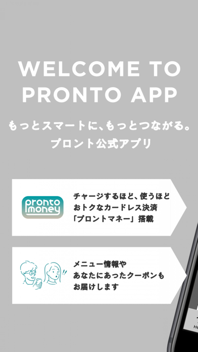
プロントの公式アプリです。アプリ内のバーコード画面で決済が可能な「プロントマネー」をご利用いただけます。 新機能の「プロントマネー」は、チャージ金額に応じたボーナスマネープレゼントや、使うほどクーポンが増えるランクアッププログラムなど、プロントをよりスマートでお得にご利用いただける決済サービスです。 他にも、メニュー情報やクーポン等、「昼はカフェ、夜はサカバ。」という「二面性」をもつプロントから、様々な情報をお届けいたします。 ー 主な機能 ー ■HOME■ プロントのメニュー情報や最新情報をご覧いただけます。 ■PAY■ 全国のプロントでご利用いただける決済サービス「プロントマネー」を追加いたしました。 「プロントマネー」をご利用いただくと、3,000円以上のチャージで金額の3~7%をボーナスマネーとしてプレゼントする他、利用回数に応じてクーポンが増える「ランクアッププログラム」に参加できます。 アプリ内で、プロントマネーカードの発行や、クレジットカードによるオンラインチャージが出来ます。 ■COUPON■ アプリ限定…
App details
What you can learn from プロント公式アプリ
Every shipping app on the App Store has gone through the same decisions you're working through right now: which screenshot goes first, what caption sits over it, which device frame to show, what color the background should be. The 5 screenshots above are プロント公式アプリ's answers to those questions — they're public, they're real, and they made it through Apple's review.
What the numbers say: プロント公式アプリ runs a light set where the background shifts from screenshot to screenshot (first shot #BCBCBC) — each image has to stand on its own, so the captions carry more of the story. The accent colour we picked up, #0C9CA4, is the one to reuse for badges, arrows and highlighted words if you borrow this look. Hit Use this style to open the editor with these exact colours and drop your own screenshot in.
Notice the first screenshot in particular. It's the one users see in search results and on the product page, and it's where most apps spend their best caption and tightest design. Look at the proportion of background to phone, where the text sits, what one thing the image is trying to communicate.
Want to see how other Food & Drink apps approach the same problem? Browse more Food & Drink apps in the showcase.
Take what works into your own screenshots
Open LaunchShots and design your App Store & Google Play screenshots — pick a device frame, drop captions, ship in minutes. Free, in your browser.
Open the screenshot editor →Apps with a similar look
Closest background + accent colours among the listings we've analysed — useful when you want to see the same palette handled by a different team.