Chart position — tracked daily by LaunchShots
Screenshot changes — detected by LaunchShots
Screenshot style breakdown
Sampled from 5 of 上海知天气's App Store screenshots — background, accent and theme, measured by LaunchShots (not something Apple publishes).
#FCFCFC bg
#DDDDDD
#145C94 accent
#111111 text
Screenshots
Icon palette
About this app
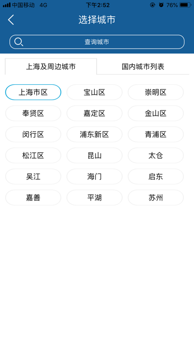
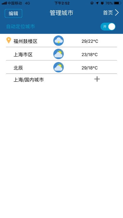
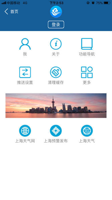
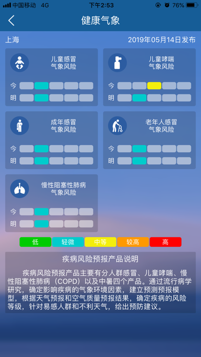
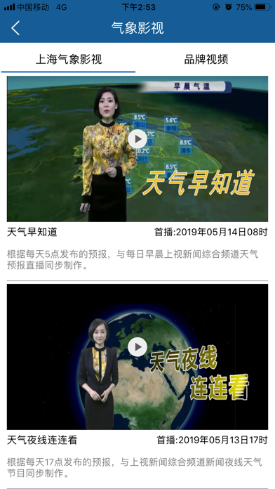
上海知天气手机APP面向上海市公众、决策、专业、行业用户研发,融海派风格和科技气质,为用户提供移动、智能、个性、集约的气象服务。 1、权威:所有气象数据由上海气象部门官方提供,以最高诚意和权威提供气象服务,助力上海及周边地区开展气象防灾减灾救灾工作。 2、高效:作为上海气象部门集约化、移动化业务平台,气象数据与数据源系统实时同步,务求高效发布、快速传递、精准送达。 3、专业:集专业团队之力和专业成果之优,全面提供网格预报、实时预警、分钟级实况及气象雷达、云图、台风路径、专项服务、数值预报等丰富的气象产品。 4、个性:基于手机终端优势,为用户提供丰富的管理工具,精准定制决策服务,个性设置通知推送、气象产品、生活指数等功能。
App details
What you can learn from 上海知天气
Every shipping app on the App Store has gone through the same decisions you're working through right now: which screenshot goes first, what caption sits over it, which device frame to show, what color the background should be. The 5 screenshots above are 上海知天气's answers to those questions — they're public, they're real, and they made it through Apple's review.
What the numbers say: 上海知天气 runs a mixed light-and-dark set where the background shifts from screenshot to screenshot (first shot #FCFCFC) — each image has to stand on its own, so the captions carry more of the story. The accent colour we picked up, #145C94, is the one to reuse for badges, arrows and highlighted words if you borrow this look. Hit Use this style to open the editor with these exact colours and drop your own screenshot in.
Notice the first screenshot in particular. It's the one users see in search results and on the product page, and it's where most apps spend their best caption and tightest design. Look at the proportion of background to phone, where the text sits, what one thing the image is trying to communicate.
Want to see how other Weather apps approach the same problem? Browse more Weather apps in the showcase.
Take what works into your own screenshots
Open LaunchShots and design your App Store & Google Play screenshots — pick a device frame, drop captions, ship in minutes. Free, in your browser.
Open the screenshot editor →Apps with a similar look
Closest background + accent colours among the listings we've analysed — useful when you want to see the same palette handled by a different team.