Chart position — tracked daily by LaunchShots
Screenshot style breakdown
Sampled from 6 of サーフィンや釣りにタイドと波情報 SurfTideΔ's App Store screenshots — background, accent and theme, measured by LaunchShots (not something Apple publishes).
#BCFCEC bg
#A5DDCF
#24CCDC accent
#111111 text
Screenshots
Icon palette
About this app
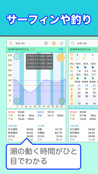
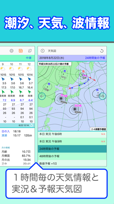
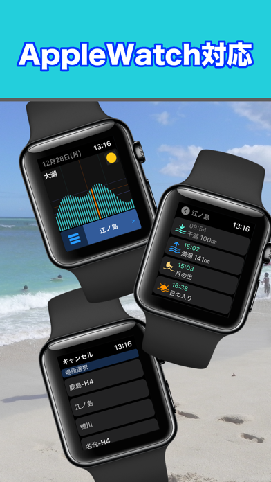
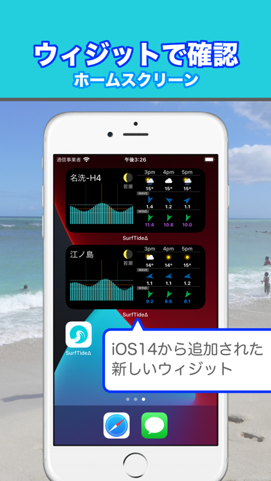
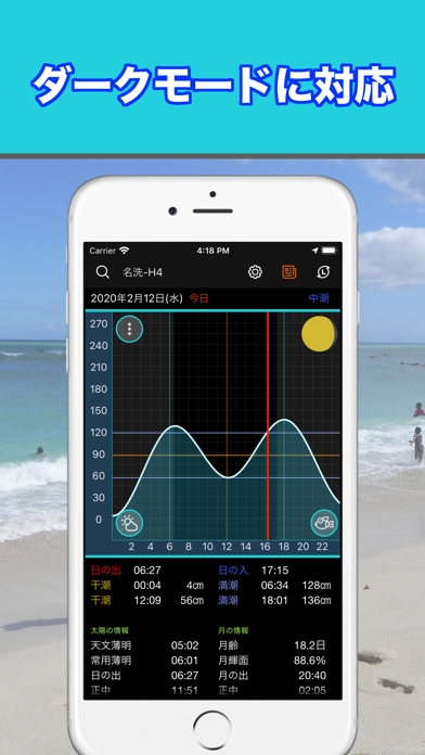
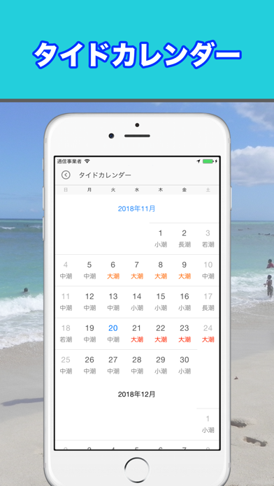
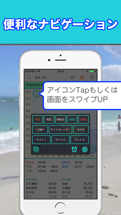
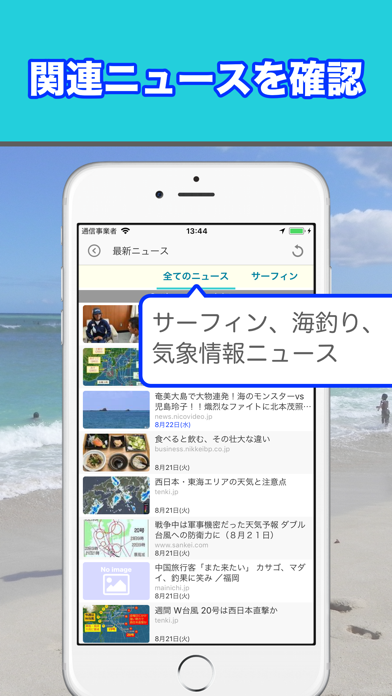
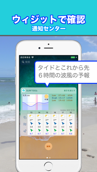
SurfTideΔ(サーフタイドデルタ)は波乗りや釣り等のマリンスポーツのための、タイド(潮汐)グラフや波情報/気象情報を表示できるアプリです。マリンスポーツのお供に是非利用してみて下さい。 ----------------------- ▶日本国内約340カ所のタイドグラフを表示できます タイドグラフは、アプリ内の潮汐非調和定数により予測計算します。年が変わってもアップデート等のデータ更新は必要ありません。 ▶現在のタイドを一目で確認できます 本日のタイドグラフには現在時刻をフリッカー表示するので、現在やこれからの潮の動きが一目で分かります。 早朝活動するサーファーや釣り人に便利な、日の出と日の入りも計算してグラフ表示します。 ▶釣りにも便利です! 釣りに便利な、上げ下げの三分七分をタイドグラフ上に表示することができます。 満潮と干潮の潮高と時間からから計算していますが、潮高は20単位での計測になっているため20分単位での表示になります。また、あまり潮が動かない潮回りでも同じように計算されます。 ▶簡単に場所を指定できます 一…
App details
What you can learn from サーフィンや釣りにタイドと波情報 SurfTideΔ
Every shipping app on the App Store has gone through the same decisions you're working through right now: which screenshot goes first, what caption sits over it, which device frame to show, what color the background should be. The 9 screenshots above are サーフィンや釣りにタイドと波情報 SurfTideΔ's answers to those questions — they're public, they're real, and they made it through Apple's review.
What the numbers say: サーフィンや釣りにタイドと波情報 SurfTideΔ runs a light set where the background shifts from screenshot to screenshot (first shot #BCFCEC) — each image has to stand on its own, so the captions carry more of the story. The accent colour we picked up, #24CCDC, is the one to reuse for badges, arrows and highlighted words if you borrow this look. Hit Use this style to open the editor with these exact colours and drop your own screenshot in.
Notice the first screenshot in particular. It's the one users see in search results and on the product page, and it's where most apps spend their best caption and tightest design. Look at the proportion of background to phone, where the text sits, what one thing the image is trying to communicate.
Want to see how other Weather apps approach the same problem? Browse more Weather apps in the showcase.
Take what works into your own screenshots
Open LaunchShots and design your App Store & Google Play screenshots — pick a device frame, drop captions, ship in minutes. Free, in your browser.
Open the screenshot editor →Apps with a similar look
Closest background + accent colours among the listings we've analysed — useful when you want to see the same palette handled by a different team.