Chart position — tracked daily by LaunchShots
Screenshot style breakdown
Sampled from 6 of РосДомофон твой умный дом's App Store screenshots — background, accent and theme, measured by LaunchShots (not something Apple publishes).
#3CC4FC bg
#34ACDD
#244C94 accent
#111111 text
Screenshots




Icon palette
About this app
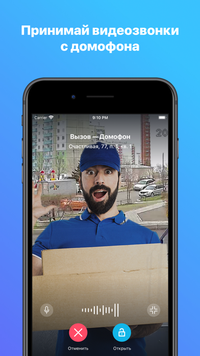
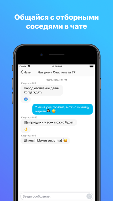
Сделай свой дом безопаснее и удобнее. Контролируй доступ в подъезд из любой точки мира. В режиме реального времени следи за придомовой территорией и парковкой. Смотри, кто заходит вместе с ребенком или к пожилым родителям. Пользуйся видео архивом, чтобы найти важные моменты и рассмотреть во всех подробностях. С приложением можно столько всего полезного делать с телефона: • Открывать дверь подъезда • Принимать видеозвонки с домофона • Отслеживать, кто звонил в квартиру в архиве вызовов • Наблюдать за придомовой территорией в режиме реального времени • Искать записи камер с придомовой территории с помощью видеоархива с удобным фильтром событий • Открывать шлагбаумы, калитки на территории ЖК • Общаться в чатах с технической поддержкой, соседями и УК • Высылать ссылки с электронными ключами своим гостям • Хранить все ключи от дверей, калиток и шлагбаумов • Делиться семейным доступом с самы…
App details
What you can learn from РосДомофон твой умный дом
Every shipping app on the App Store has gone through the same decisions you're working through right now: which screenshot goes first, what caption sits over it, which device frame to show, what color the background should be. The 6 screenshots above are РосДомофон твой умный дом's answers to those questions — they're public, they're real, and they made it through Apple's review.
What the numbers say: РосДомофон твой умный дом runs a light set with one background colour (#3CC4FC) carried across every screenshot — the listing reads as a single poster when the shots sit side by side in search results. The accent colour we picked up, #244C94, is the one to reuse for badges, arrows and highlighted words if you borrow this look. Hit Use this style to open the editor with these exact colours and drop your own screenshot in.
Notice the first screenshot in particular. It's the one users see in search results and on the product page, and it's where most apps spend their best caption and tightest design. Look at the proportion of background to phone, where the text sits, what one thing the image is trying to communicate.
Want to see how other Productivity apps approach the same problem? Browse more Productivity apps in the showcase.
Take what works into your own screenshots
Open LaunchShots and design your App Store & Google Play screenshots — pick a device frame, drop captions, ship in minutes. Free, in your browser.
Open the screenshot editor →Apps with a similar look
Closest background + accent colours among the listings we've analysed — useful when you want to see the same palette handled by a different team.