Chart position — tracked daily by LaunchShots
Screenshot style breakdown
Sampled from 6 of Сканер документов & фото в PDF's App Store screenshots — background, accent and theme, measured by LaunchShots (not something Apple publishes).
#141414 bg
#343434
#1C5484 accent
#FFFFFF text
Screenshots
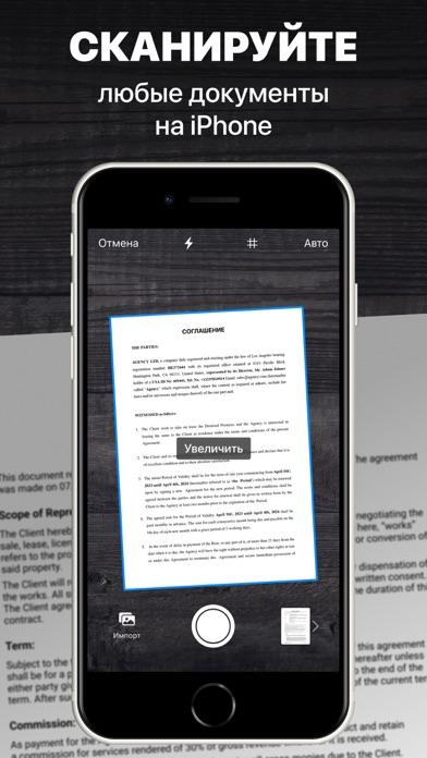

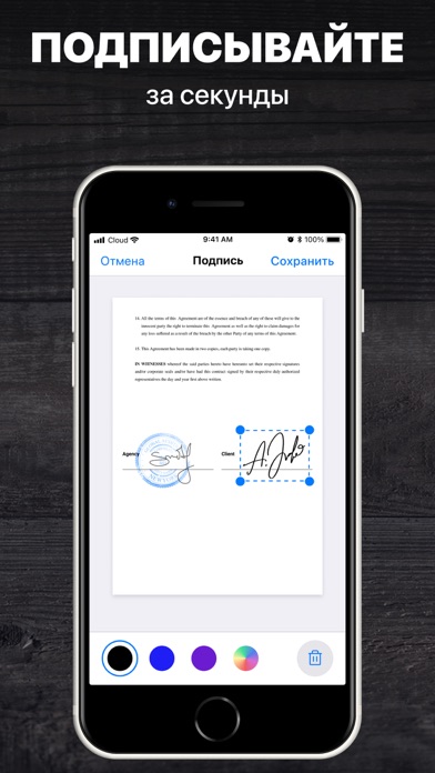
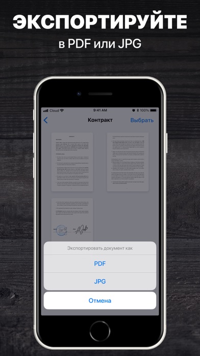
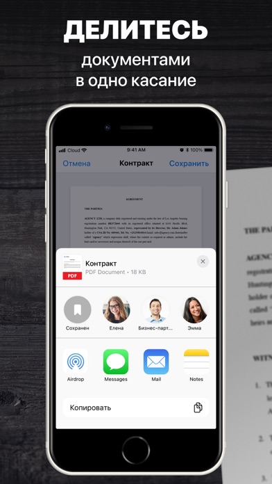
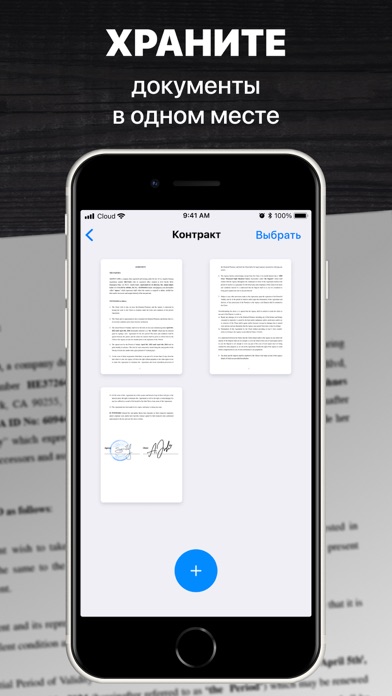
iPad screenshots


Icon palette
About this app
Сканер документов — профессиональный сканер у Вас в кармане. Сканируйте, сохраняйте, отправляйте документы в формате PDF или JPEG за считанные секунды. Сканер поддерживает любые типы документов: документы, фото, счета, чеки, квитанции, визитные карточки, заметки, книги, рецепты, статьи из журналов, диаграммы, таблицы. ФУНКЦИИ: — Максимально простой и понятный интерфейс; — Быстрое сканирование: результат за считанные секунды; — Профессиональные фильтры: улучшенные изображения; — Поддержка любых типов документов: ограничений нет; — Сканирование многостраничных документов; — Автоматический или ручной захват изображений; — Умное определение границ документа; — Профессиональный редактор; — Цифровая подпись где угодно. — Экспорт документов: отправляйте документы pdf по почте или загружайте в облако (iCloud, Dropbox, Evernote, Yandex Disk, Box, OneDrive или Google Drive). *Все отсканиро…
App details
What you can learn from Сканер документов & фото в PDF
Every shipping app on the App Store has gone through the same decisions you're working through right now: which screenshot goes first, what caption sits over it, which device frame to show, what color the background should be. The 12 screenshots above are Сканер документов & фото в PDF's answers to those questions — they're public, they're real, and they made it through Apple's review.
What the numbers say: Сканер документов & фото в PDF runs a dark set with one background colour (#141414) carried across every screenshot — the listing reads as a single poster when the shots sit side by side in search results. The accent colour we picked up, #1C5484, is the one to reuse for badges, arrows and highlighted words if you borrow this look. Hit Use this style to open the editor with these exact colours and drop your own screenshot in.
Notice the first screenshot in particular. It's the one users see in search results and on the product page, and it's where most apps spend their best caption and tightest design. Look at the proportion of background to phone, where the text sits, what one thing the image is trying to communicate.
Want to see how other Business apps approach the same problem? Browse more Business apps in the showcase.
Take what works into your own screenshots
Open LaunchShots and design your App Store & Google Play screenshots — pick a device frame, drop captions, ship in minutes. Free, in your browser.
Open the screenshot editor →Apps with a similar look
Closest background + accent colours among the listings we've analysed — useful when you want to see the same palette handled by a different team.