Screenshot style breakdown
Sampled from 6 of Emons Audiolibri's App Store screenshots — background, accent and theme, measured by LaunchShots (not something Apple publishes).
#F46434 bg
#F57950
#044C3C accent
#FFFFFF text
Screenshots





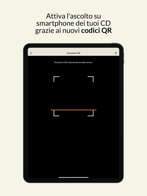
iPad screenshots





Icon palette
About this app
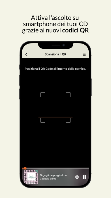
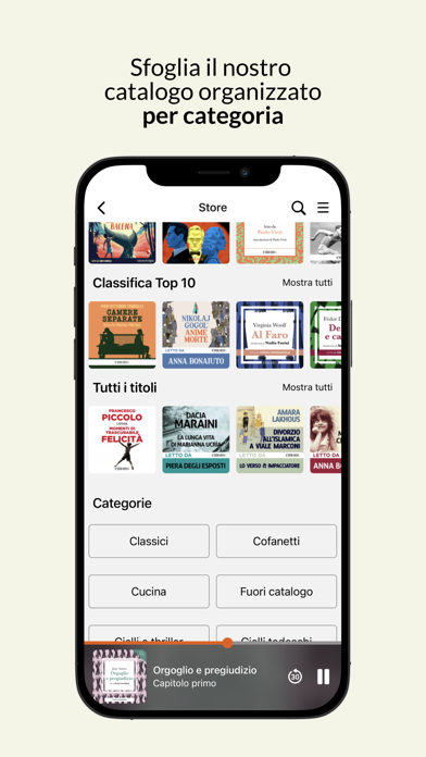
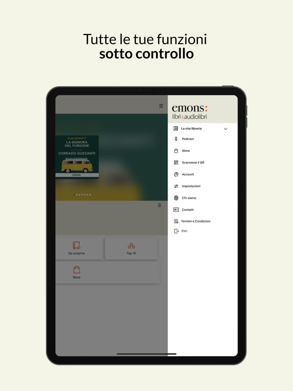
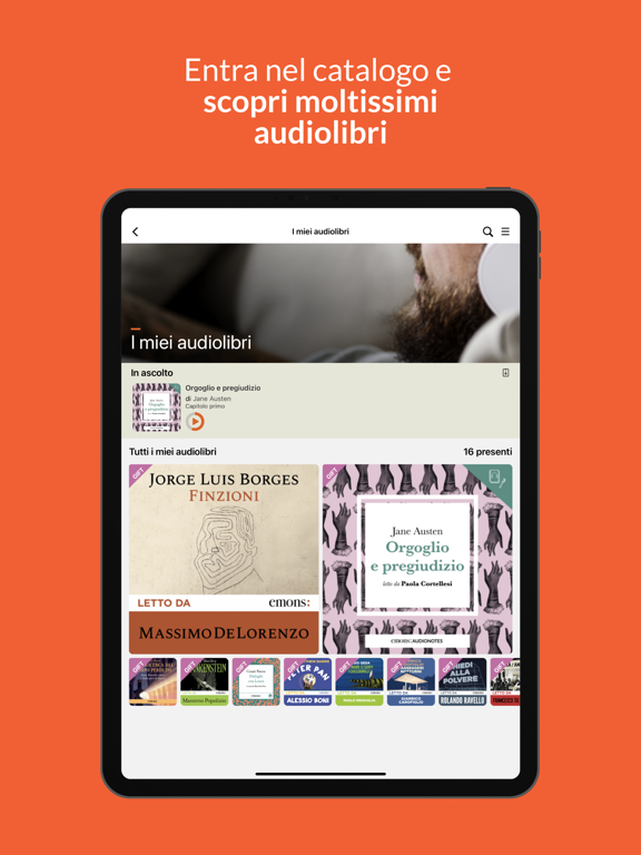
Da oltre quindici anni specializzata nella pubblicazione di audiolibri, Emons mette a disposizione di tutti gli appassionati della lettura ad alta voce, la sua App: orgogliosamente indipendente e senza necessità di abbonamento. Acquisti una volta e l’audiolibro resta tuo per sempre. Non hai mai ascoltato un audiolibro Emons? Iscriviti ora e ricevi in omaggio un grande titolo dal nostro catalogo. Scarica l'App Emons Audiolibri, accedi con le tue credenziali di registrazione al sito e sincronizza la tua libreria, così potrai avere i tuoi audiolibri in tasca, per sempre. Alcune caratteristiche della nostra app: • Sincronizza gli acquisti effettuati sul sito • Sincronizza il punto di ascolto tra più dispositivi • Offre una qualità dell’audio superiore, garantita a 192kbps • Attiva i tuoi QR Code univoci • Ascolta gratuitamente i podcast Emons Record Inoltre nella nostra App puoi: •…
App details
What you can learn from Emons Audiolibri
Every shipping app on the App Store has gone through the same decisions you're working through right now: which screenshot goes first, what caption sits over it, which device frame to show, what color the background should be. The 18 screenshots above are Emons Audiolibri's answers to those questions — they're public, they're real, and they made it through Apple's review.
What the numbers say: Emons Audiolibri runs a mixed light-and-dark set where the background shifts from screenshot to screenshot (first shot #F46434) — each image has to stand on its own, so the captions carry more of the story. The accent colour we picked up, #044C3C, is the one to reuse for badges, arrows and highlighted words if you borrow this look. Hit Use this style to open the editor with these exact colours and drop your own screenshot in.
Notice the first screenshot in particular. It's the one users see in search results and on the product page, and it's where most apps spend their best caption and tightest design. Look at the proportion of background to phone, where the text sits, what one thing the image is trying to communicate.
Want to see how other Book apps approach the same problem? Browse more Book apps in the showcase.
Take what works into your own screenshots
Open LaunchShots and design your App Store & Google Play screenshots — pick a device frame, drop captions, ship in minutes. Free, in your browser.
Open the screenshot editor →Apps with a similar look
Closest background + accent colours among the listings we've analysed — useful when you want to see the same palette handled by a different team.