Chart position — tracked daily by LaunchShots
Screenshot changes — detected by LaunchShots
Screenshot style breakdown
Sampled from 6 of SOUNDBOKS's App Store screenshots — background, accent and theme, measured by LaunchShots (not something Apple publishes).
#F40434 bg
#F52750
#7C041C accent
#FFFFFF text
Screenshots




iPad screenshots


Icon palette
About this app
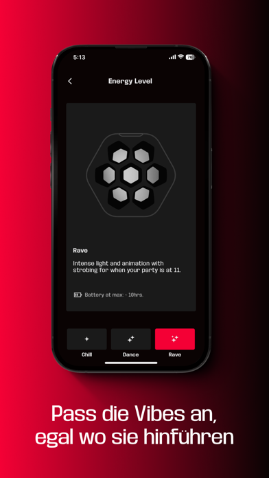
Sound Profiles & Stereo-Rollen Wähle zwischen verschiedenen Sound-Profilen, um den perfekten Sound für deine Stimmung zu finden. Ändere die Stereo-Rollen für Surround-Sound-Setups. Custom EQs Du willst mehr Bass? Möchtest die Höhen anpassen? Du hast die Kontrolle darüber. Erstelle so viele Custom EQs, wie du möchtest - ohne Limit. TeamUp & SKAA Pro Mode Verbinde bis zu fünf Soundboks miteinander, um dein eigenes Sound-System zu bauen und füge unbegrenzt viele Lightboks* für immersive Atmosphären hinzu. Du kannst dich auf SKAAs Audioqualität und Latenz verlassen. Pro Panel & Performance Modes Braucht dein Mikro mehr Lautstärke? Klingt der Mixer zu dünn? Nutze die Performance Modes des ProPanels, um deine Eingänge perfekt einzustellen. Energy Levels & Mirroring Wähle zwischen vier Energy Levels, die zu deiner Stimmung passen und steuere die Effekte wie du es willst. Mehrere Lightboks …
App details
What you can learn from SOUNDBOKS
Every shipping app on the App Store has gone through the same decisions you're working through right now: which screenshot goes first, what caption sits over it, which device frame to show, what color the background should be. The 17 screenshots above are SOUNDBOKS's answers to those questions — they're public, they're real, and they made it through Apple's review.
What the numbers say: SOUNDBOKS runs a dark set where the background shifts from screenshot to screenshot (first shot #F40434) — each image has to stand on its own, so the captions carry more of the story. The accent colour we picked up, #7C041C, is the one to reuse for badges, arrows and highlighted words if you borrow this look. Hit Use this style to open the editor with these exact colours and drop your own screenshot in.
Notice the first screenshot in particular. It's the one users see in search results and on the product page, and it's where most apps spend their best caption and tightest design. Look at the proportion of background to phone, where the text sits, what one thing the image is trying to communicate.
Want to see how other Music apps approach the same problem? Browse more Music apps in the showcase.
Take what works into your own screenshots
Open LaunchShots and design your App Store & Google Play screenshots — pick a device frame, drop captions, ship in minutes. Free, in your browser.
Open the screenshot editor →Apps with a similar look
Closest background + accent colours among the listings we've analysed — useful when you want to see the same palette handled by a different team.