Chart position — tracked daily by LaunchShots
Screenshot style breakdown
Sampled from 4 of Аудиокниги - Без Интернета's App Store screenshots — background, accent and theme, measured by LaunchShots (not something Apple publishes).
#5CBCAC bg
#50A597
#FC0404 accent
#111111 text
Screenshots
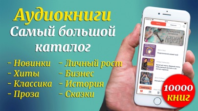
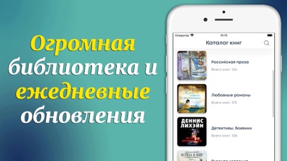
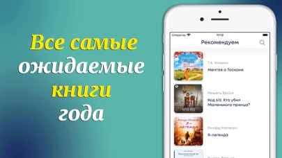
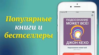
iPad screenshots
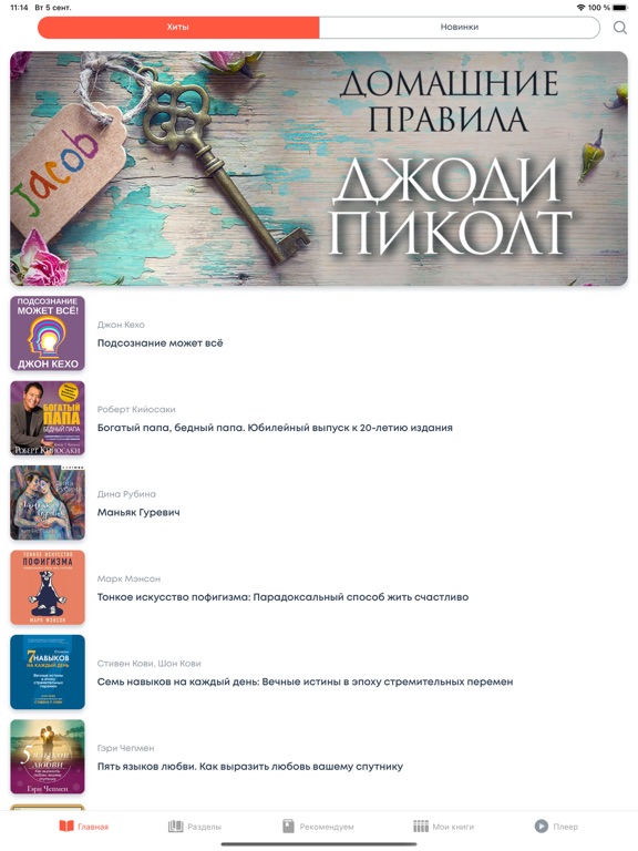
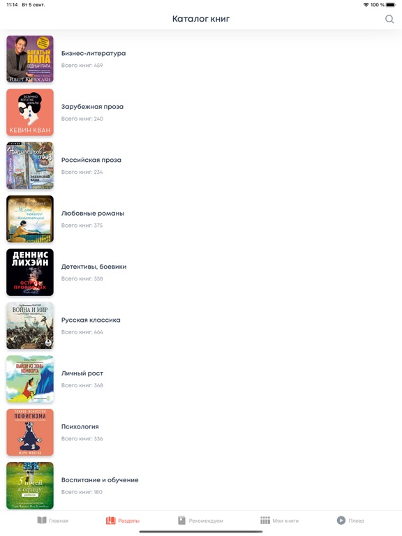
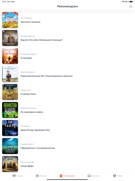
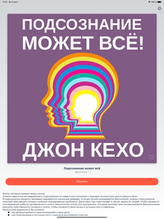
Icon palette
About this app
Самая большая подборка книг во всех жанрах: от классики до современной прозы, от детективов и романов до бизнес – литературы. Классики, авторы с мировым именем и начинающие писатели. Тысячи мировых бестселлеров в одном месте! Дома или в пути, получите доступ к сотням книг без интернета! Создайте свою собственную библиотеку! Скачайте приложение и получите: • Огромную подборку художественной и публицистической литературы во всех существующих жанрах с возможностью доступа оффлайн • Лучшие книги по саморазвитию и бизнесу. Такие знаменитые авторы, как Роберт Кийосаки, Стивен Кови, Брайан Трейси • Все мировые бестселлеры • Новинки книжного рынка. Получите эксклюзивный доступ первыми! • Постоянно пополняемую библиотеку • Удобный пользовательский интерфейс • Многое другое! Вся сокровищница мировой литературы в вашем кармане! Доступ офлайн 24 часа в сутки 7 дней в неделю! *** Для по…
App details
What you can learn from Аудиокниги - Без Интернета
Every shipping app on the App Store has gone through the same decisions you're working through right now: which screenshot goes first, what caption sits over it, which device frame to show, what color the background should be. The 8 screenshots above are Аудиокниги - Без Интернета's answers to those questions — they're public, they're real, and they made it through Apple's review.
What the numbers say: Аудиокниги - Без Интернета runs a light set where the background shifts from screenshot to screenshot (first shot #5CBCAC) — each image has to stand on its own, so the captions carry more of the story. The accent colour we picked up, #FC0404, is the one to reuse for badges, arrows and highlighted words if you borrow this look. Hit Use this style to open the editor with these exact colours and drop your own screenshot in.
Notice the first screenshot in particular. It's the one users see in search results and on the product page, and it's where most apps spend their best caption and tightest design. Look at the proportion of background to phone, where the text sits, what one thing the image is trying to communicate.
Want to see how other Book apps approach the same problem? Browse more Book apps in the showcase.
Take what works into your own screenshots
Open LaunchShots and design your App Store & Google Play screenshots — pick a device frame, drop captions, ship in minutes. Free, in your browser.
Open the screenshot editor →Apps with a similar look
Closest background + accent colours among the listings we've analysed — useful when you want to see the same palette handled by a different team.