Chart position — tracked daily by LaunchShots
Screenshot changes — detected by LaunchShots
Screenshot style breakdown
Sampled from 6 of Детский магазин «Детский мир»'s App Store screenshots — background, accent and theme, measured by LaunchShots (not something Apple publishes).
#0CACFC bg
#0A97DD
#547C8C accent
#111111 text
Screenshots
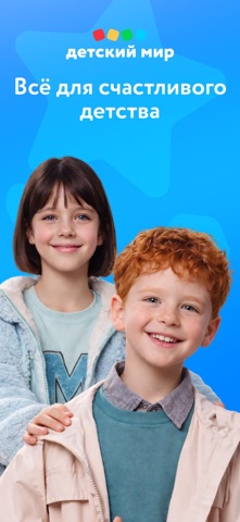

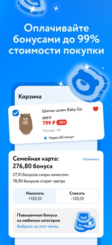
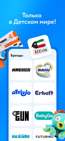
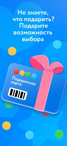
Icon palette
About this app
Приложение детского магазина «Детский мир» (Детмир) со всеми товарами из магазинов торговой сети. Покупайте игрушки, одежду и аксессуары с помощью телефона. Подгузники и трусики Manu со скидкой до 40%. Заказывайте любимые и нужные товары быстро и легко с приложением «Детский мир». Покупайте и получайте их тогда, когда удобно вам! К вашему выбору всё, и даже больше: игрушки, детская одежда и обувь, развивающие и настольные игры, витамины для взрослых и детей, детское и спортивное питание, товары для беременных и новорожденных, наборы для рисования и подарки на любой вкус и кошелек. Вас ждут лучшие мировые бренды ведущих производителей детских товаров. Предупреждаем — от выбора может закружиться голова! И немного о нашем функционале: 1. «Детский мир» в телефоне — это круглосуточный детский магазин, который всегда под рукой. Выбирайте и заказывайте товары в любое удобное для вас время.…
App details
What you can learn from Детский магазин «Детский мир»
Every shipping app on the App Store has gone through the same decisions you're working through right now: which screenshot goes first, what caption sits over it, which device frame to show, what color the background should be. The 6 screenshots above are Детский магазин «Детский мир»'s answers to those questions — they're public, they're real, and they made it through Apple's review.
What the numbers say: Детский магазин «Детский мир» runs a mixed light-and-dark set where the background shifts from screenshot to screenshot (first shot #0CACFC) — each image has to stand on its own, so the captions carry more of the story. The accent colour we picked up, #547C8C, is the one to reuse for badges, arrows and highlighted words if you borrow this look. Hit Use this style to open the editor with these exact colours and drop your own screenshot in.
Notice the first screenshot in particular. It's the one users see in search results and on the product page, and it's where most apps spend their best caption and tightest design. Look at the proportion of background to phone, where the text sits, what one thing the image is trying to communicate.
Want to see how other Shopping apps approach the same problem? Browse more Shopping apps in the showcase.
Take what works into your own screenshots
Open LaunchShots and design your App Store & Google Play screenshots — pick a device frame, drop captions, ship in minutes. Free, in your browser.
Open the screenshot editor →Apps with a similar look
Closest background + accent colours among the listings we've analysed — useful when you want to see the same palette handled by a different team.