Chart position — tracked daily by LaunchShots
Screenshot style breakdown
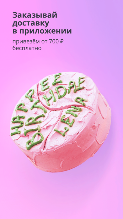
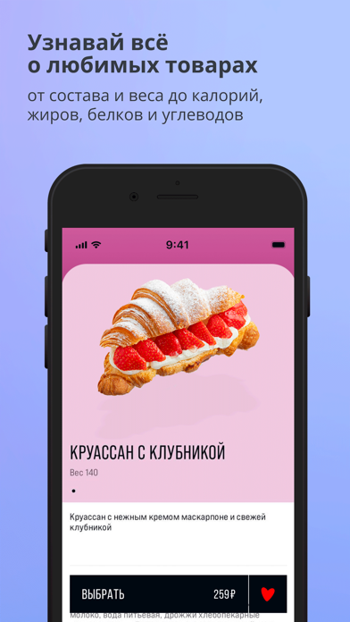
Sampled from 4 of Цeх85's App Store screenshots — background, accent and theme, measured by LaunchShots (not something Apple publishes).
#FCB4FC bg
#DD9EDD
#E46C84 accent
#111111 text
Screenshots


Icon palette
About this app
Мобильное приложение сети кафе-пекарен Цех85 — твой удобный способ заказать напитки, готовую еду, булочки, круассаны, пирожные и торты. Ищи наши пекарни в Санкт-Петербурге, Москве, Красногорске, Мурино, Гатчине, Кудрово, Колпино, Всеволожске, Петергофе, Пушкине, Сестрорецке, Кировске, Зеленогорске, Приозерске, Кронштадте, Красном Селе, Агалатова, посёлках Коммунарка, Парголово, Шушары, Токсово и Рощино. В приложении можно: — копить кешбэк до 10% за каждую покупку; — получать флеш-бонусы с коротким сроком жизни в рамках акций и спецпредложений; — приглашать друзей через реферальную программу и получать ещё больше бонусов; — забирать самовывозом кофе, выпечку и десерты без очереди; — оформлять доставку всего меню приложения и делать предзаказ тортов на День рождения и другие праздники в Санкт-Петербурге и Ленинградской области; — оплачивать онлайн прямо в приложении; — следить за акция…
App details
What you can learn from Цeх85
Every shipping app on the App Store has gone through the same decisions you're working through right now: which screenshot goes first, what caption sits over it, which device frame to show, what color the background should be. The 4 screenshots above are Цeх85's answers to those questions — they're public, they're real, and they made it through Apple's review.
What the numbers say: Цeх85 runs a light set where the background shifts from screenshot to screenshot (first shot #FCB4FC) — each image has to stand on its own, so the captions carry more of the story. The accent colour we picked up, #E46C84, is the one to reuse for badges, arrows and highlighted words if you borrow this look. Hit Use this style to open the editor with these exact colours and drop your own screenshot in.
Notice the first screenshot in particular. It's the one users see in search results and on the product page, and it's where most apps spend their best caption and tightest design. Look at the proportion of background to phone, where the text sits, what one thing the image is trying to communicate.
Want to see how other Food & Drink apps approach the same problem? Browse more Food & Drink apps in the showcase.
Take what works into your own screenshots
Open LaunchShots and design your App Store & Google Play screenshots — pick a device frame, drop captions, ship in minutes. Free, in your browser.
Open the screenshot editor →Apps with a similar look
Closest background + accent colours among the listings we've analysed — useful when you want to see the same palette handled by a different team.