Chart position — tracked daily by LaunchShots
Screenshot style breakdown
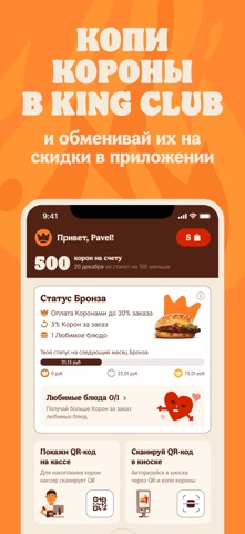
Sampled from 6 of Burger King Belarus's App Store screenshots — background, accent and theme, measured by LaunchShots (not something Apple publishes).
#E42C0C bg
#E7492E
#542414 accent
#FFFFFF text
Screenshots



iPad screenshots


Icon palette
About this app
Скачай приложение Burger King Belarus – удобный и быстрый доступ к меню ресторана, купонам, скидкам и выгодам бонусной программы King Club. Сделай первый заказ на доставку и получи Воппер Джуниор в подарок по промокоду JUNIOR. Burger King – готовим на огне с 1954 годa. В приложении ты найдешь легендарный Воппер, Биг Кинг, Чизбургер, картофель фри, луковые колечки, фирменные наггетсы, горячие и холодные напитки, вкуснейшие закуски, роллы, креветки, салаты и десерты, и первым затестишь новинки. В меню есть еда для гурманов и любителей простой и сытной пищи, для тех, кто любит отборную говядину Ангус, курицу, рыбу или морепродукты. Детям придутся по душе Джуниор Обеды с игрушками, а очень голодных взрослых ждут Кинг Комбо и Кинг Букеты. Выбирай удобный способ получения заказа: доставку, самовывоз или драйв. Выбрал доставку? Доставим бесплатно и быстро. Выбрал самовывоз? Просто подо…
App details
What you can learn from Burger King Belarus
Every shipping app on the App Store has gone through the same decisions you're working through right now: which screenshot goes first, what caption sits over it, which device frame to show, what color the background should be. The 12 screenshots above are Burger King Belarus's answers to those questions — they're public, they're real, and they made it through Apple's review.
What the numbers say: Burger King Belarus runs a mixed light-and-dark set where the background shifts from screenshot to screenshot (first shot #E42C0C) — each image has to stand on its own, so the captions carry more of the story. The accent colour we picked up, #542414, is the one to reuse for badges, arrows and highlighted words if you borrow this look. Hit Use this style to open the editor with these exact colours and drop your own screenshot in.
Notice the first screenshot in particular. It's the one users see in search results and on the product page, and it's where most apps spend their best caption and tightest design. Look at the proportion of background to phone, where the text sits, what one thing the image is trying to communicate.
Want to see how other Food & Drink apps approach the same problem? Browse more Food & Drink apps in the showcase.
Take what works into your own screenshots
Open LaunchShots and design your App Store & Google Play screenshots — pick a device frame, drop captions, ship in minutes. Free, in your browser.
Open the screenshot editor →Apps with a similar look
Closest background + accent colours among the listings we've analysed — useful when you want to see the same palette handled by a different team.