Chart position — tracked daily by LaunchShots
Screenshot changes — detected by LaunchShots
Screenshot style breakdown
Sampled from 6 of 竞技联盟德州扑克's App Store screenshots — background, accent and theme, measured by LaunchShots (not something Apple publishes).
#0C0404 bg
#2E2727
#F4645C accent
#FFFFFF text
Screenshots


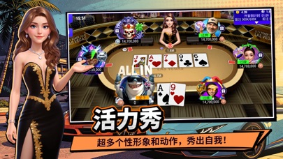

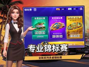
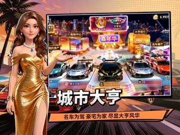
iPad screenshots




Icon palette
About this app
真实还原,真人竞技对抗的超人气poker游戏! 欢乐火爆活动不停迭代,超多世界级poker玩法不断更新,快来竞技联盟,show出你的牌技! 竞技联盟德州扑克是一款专业、高度还原poker规则的德州扑克游戏。风靡全球的竞技博弈手游,丰富的德州扑克游戏玩法!游戏中更有赛季段位排名,与来自各地的德州扑克高手切磋牌技,让竞技的乐趣陪伴你的闲暇时光。 【真实体验】 我们认真深挖了德州扑克的规则和细节,以求尽可能地提供给玩家最真实和最专业的德州扑克游戏体验,让玩家既能感受德扑的刺激,也能玩的开心。 【权威认证】 公平竞技是德州游戏的重中之重,竞技联盟德州扑克通过了行业严格的dieharder测试,并获得了国际权威机构GLI的随机算法认证。 【趣味福利】 游戏中包含福利宝箱,刮刮乐,城市大亨等丰富的休闲小游戏,通过这些小游戏玩家可以获取加倍的快乐,丰厚的道具福利! 【免费福利】 下载游戏即可获得大量免费竞技币,除此之外,每日登录,完成任务,升级也可获得大量免费竞技币! 【竞技积分】 游戏内重要的成长系统。通过升级和完成任务可以获取竞技积分…
App details
What you can learn from 竞技联盟德州扑克
Every shipping app on the App Store has gone through the same decisions you're working through right now: which screenshot goes first, what caption sits over it, which device frame to show, what color the background should be. The 16 screenshots above are 竞技联盟德州扑克's answers to those questions — they're public, they're real, and they made it through Apple's review.
What the numbers say: 竞技联盟德州扑克 runs a dark set where the background shifts from screenshot to screenshot (first shot #0C0404) — each image has to stand on its own, so the captions carry more of the story. The accent colour we picked up, #F4645C, is the one to reuse for badges, arrows and highlighted words if you borrow this look. Hit Use this style to open the editor with these exact colours and drop your own screenshot in.
Notice the first screenshot in particular. It's the one users see in search results and on the product page, and it's where most apps spend their best caption and tightest design. Look at the proportion of background to phone, where the text sits, what one thing the image is trying to communicate.
Want to see how other Games apps approach the same problem? Browse more Games apps in the showcase.
Take what works into your own screenshots
Open LaunchShots and design your App Store & Google Play screenshots — pick a device frame, drop captions, ship in minutes. Free, in your browser.
Open the screenshot editor →Apps with a similar look
Closest background + accent colours among the listings we've analysed — useful when you want to see the same palette handled by a different team.