Chart position — tracked daily by LaunchShots
Screenshot style breakdown
Sampled from 5 of へがふっど!'s App Store screenshots — background, accent and theme, measured by LaunchShots (not something Apple publishes).
#FCFCFC bg
#DDDDDD
#047CD4 accent
#111111 text
Reading the caption text from the screenshots in your browser…
Screenshots
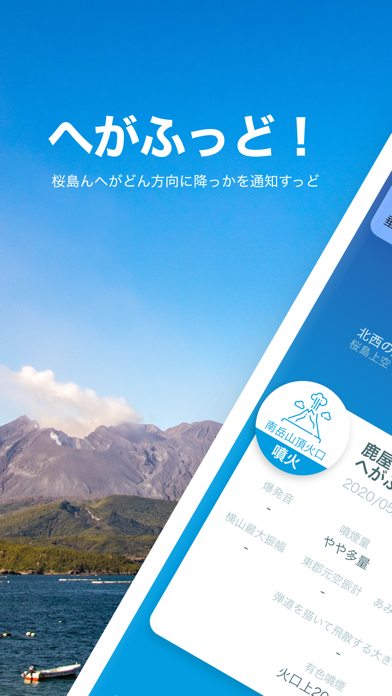
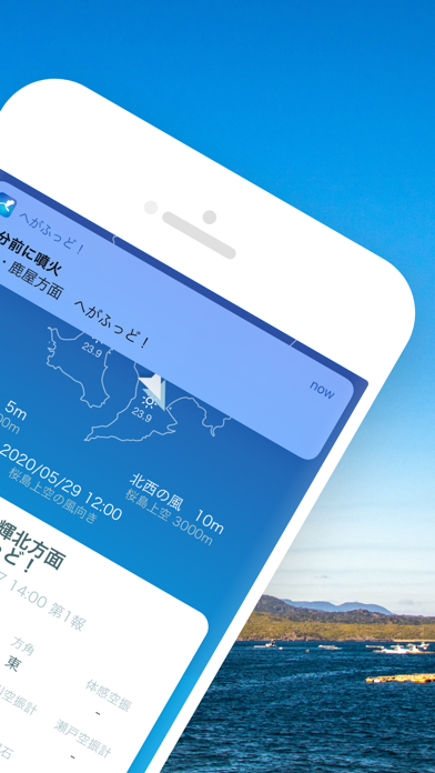
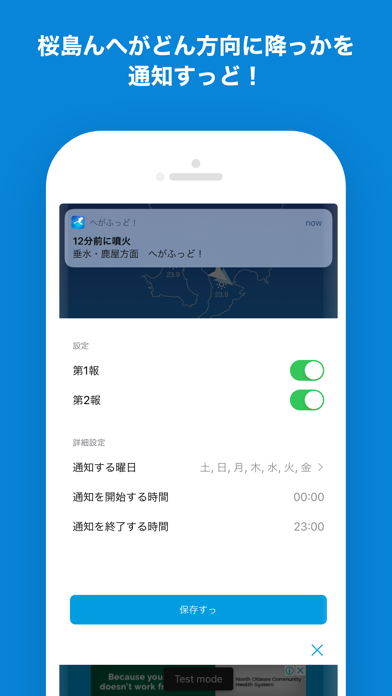
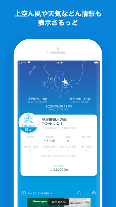
iPad screenshots



Icon palette
About this app
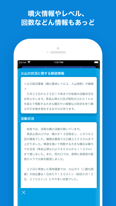
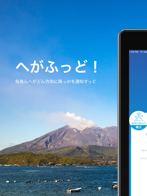
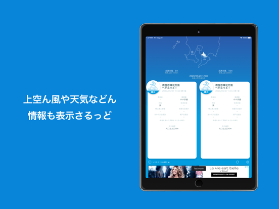
ゆくさおじゃったもんせ! かごんまん皆さぁ、桜島ん噴火や爆発でへが降っせ、わっぜのさんなぁ。 こんアプリは、桜島ん噴火や爆発によってどん方向にへが降っかを通知すっアプリじゃっど。 桜島上空ん風や天気などん情報も表示さるっで、あれもんやそこあたいいたっくっに便利やっど。 桜島ん噴火情報や噴火レベル、回数など詳し情報も提供しちょっせ、 「へー。こげな噴火しちょるんな」とおもっくいやい。 ※情報ん提供には、噴火からちっと(10〜30分程度)時間がかかっど。 【標準語Ver】 ようこそいらっしゃいませ! 鹿児島の皆さん、桜島の噴火や爆発で灰が降って大変ですよね。 このアプリは、桜島の噴火や爆発によってどの方向に灰が降るのかを通知するアプリです。 桜島上空の風や天気などの情報も表示されるので、洗濯物やお出かけの際に便利です。 桜島の噴火情報や噴火レベル、回数など詳しい情報も提供しているので、 「へー。こんな噴火しているんだ」と思ってください。 ※情報の提供には、噴火からちょっと(10〜30分程度)時間がかかりま…
App details
What you can learn from へがふっど!
Every shipping app on the App Store has gone through the same decisions you're working through right now: which screenshot goes first, what caption sits over it, which device frame to show, what color the background should be. The 10 screenshots above are へがふっど!'s answers to those questions — they're public, they're real, and they made it through Apple's review.
What the numbers say: へがふっど! runs a mixed light-and-dark set where the background shifts from screenshot to screenshot (first shot #FCFCFC) — each image has to stand on its own, so the captions carry more of the story. The accent colour we picked up, #047CD4, is the one to reuse for badges, arrows and highlighted words if you borrow this look. Hit Use this style to open the editor with these exact colours and drop your own screenshot in.
Notice the first screenshot in particular. It's the one users see in search results and on the product page, and it's where most apps spend their best caption and tightest design. Look at the proportion of background to phone, where the text sits, what one thing the image is trying to communicate.
Want to see how other Weather apps approach the same problem? Browse more Weather apps in the showcase.
Take what works into your own screenshots
Open LaunchShots and design your App Store & Google Play screenshots — pick a device frame, drop captions, ship in minutes. Free, in your browser.
Open the screenshot editor →Apps with a similar look
Closest background + accent colours among the listings we've analysed — useful when you want to see the same palette handled by a different team.