Chart position — tracked daily by LaunchShots
Screenshot style breakdown
Sampled from 6 of スポーツタウンWALKER's App Store screenshots — background, accent and theme, measured by LaunchShots (not something Apple publishes).
#FCFCFC bg
#DDDDDD
#84A4D4 accent
#111111 text
Screenshots
Icon palette
About this app
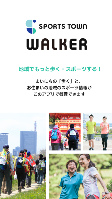
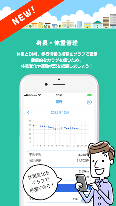
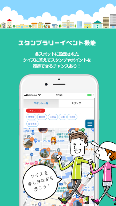
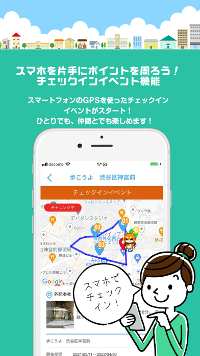
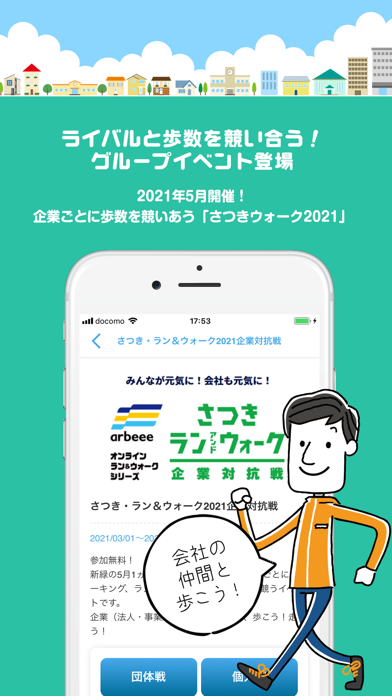
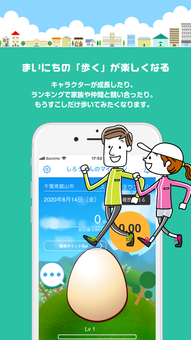
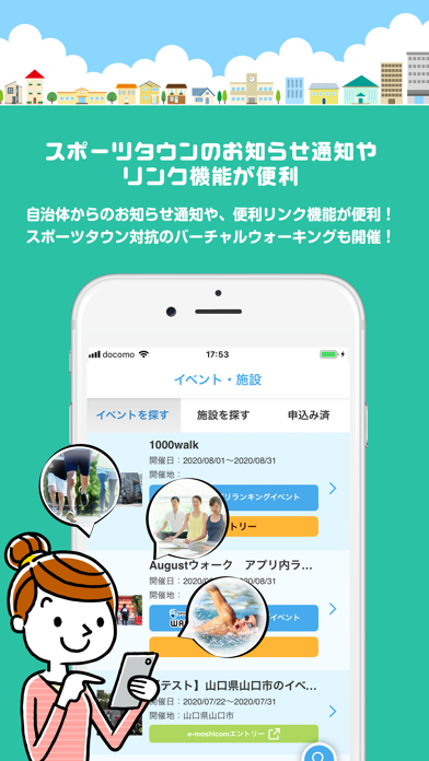
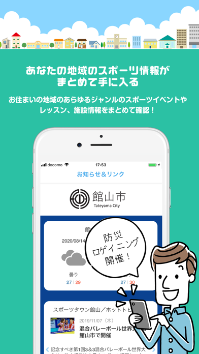
地域でもっと歩く・スポーツする!「スポーツタウンWALKERアプリ」 まいにちの「歩く」と、お住まいの地域のスポーツ情報がこのアプリで管理できます <機能> -まいにちの「歩く」が楽しくなる あなたの歩いた距離に応じてキャラクターが成長したり、新しいキャラクターが手に入ったり。 お住まいの地域、年代、性別によって歩行距離がランキングされ、家族や仲間で競い合ったり。 何だかもうすこしだけ歩いてみたくなります。 -あなたの地域のスポーツ情報がまとめて手に入る お住まいの地域のランニング、ウォーキング、水泳、ヨガのほか、あらゆるジャンルのスポーツイベントやレッスン、施設情報がまとめてあるので、内容や価格などから自分にぴったりのものが見つかります。 そのままエントリーしたり、施設予約まで可能。 もっとDoスポーツが身近なものになります。 -スポーツタウンのお知らせ通知やリンク機能が便利 もしあなたのお住まいの地域が「スポーツタウン*」であれば自治体からのお知らせ通知や、防災マップなどの便利リンク機能が使えます。 10…
App details
What you can learn from スポーツタウンWALKER
Every shipping app on the App Store has gone through the same decisions you're working through right now: which screenshot goes first, what caption sits over it, which device frame to show, what color the background should be. The 8 screenshots above are スポーツタウンWALKER's answers to those questions — they're public, they're real, and they made it through Apple's review.
What the numbers say: スポーツタウンWALKER runs a light set where the background shifts from screenshot to screenshot (first shot #FCFCFC) — each image has to stand on its own, so the captions carry more of the story. The accent colour we picked up, #84A4D4, is the one to reuse for badges, arrows and highlighted words if you borrow this look. Hit Use this style to open the editor with these exact colours and drop your own screenshot in.
Notice the first screenshot in particular. It's the one users see in search results and on the product page, and it's where most apps spend their best caption and tightest design. Look at the proportion of background to phone, where the text sits, what one thing the image is trying to communicate.
Want to see how other Health & Fitness apps approach the same problem? Browse more Health & Fitness apps in the showcase.
Take what works into your own screenshots
Open LaunchShots and design your App Store & Google Play screenshots — pick a device frame, drop captions, ship in minutes. Free, in your browser.
Open the screenshot editor →Apps with a similar look
Closest background + accent colours among the listings we've analysed — useful when you want to see the same palette handled by a different team.