Chart position — tracked daily by LaunchShots
Screenshot style breakdown
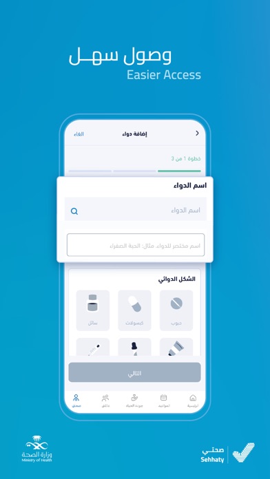
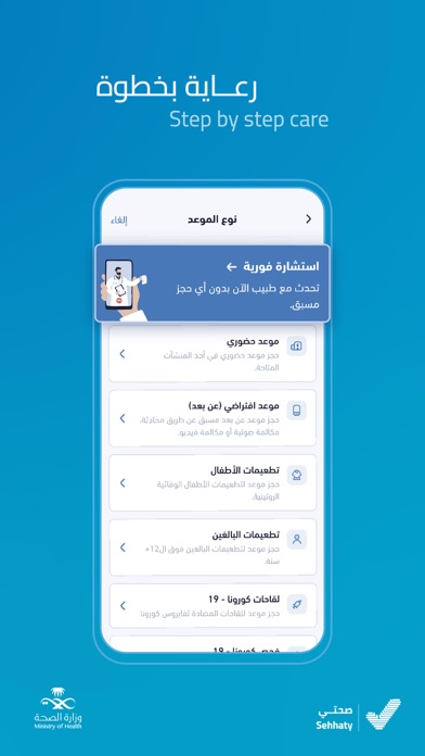
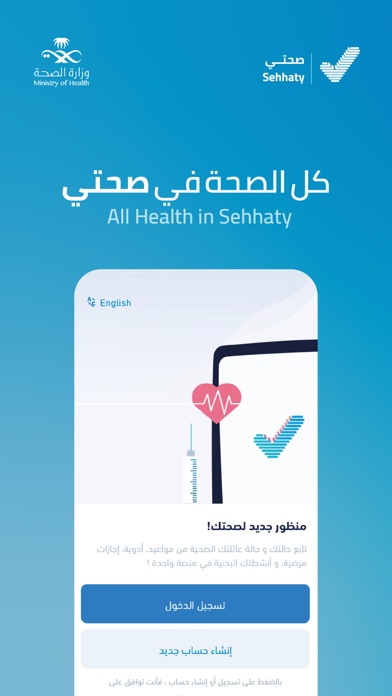
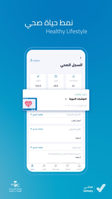
Sampled from 5 of صحتي | Sehhaty's App Store screenshots — background, accent and theme, measured by LaunchShots (not something Apple publishes).
#049CCC bg
#27A9D3
#94ECFC accent
#FFFFFF text
Screenshots
Icon palette
About this app
تم تطوير صحتي من قبل وزارة الصحة في المملكة العربية السعودية تماشياً مع رؤيتها لتسهيل الوصول للرعاية الصحية وتحسين جودتها وزيادة الوعي الصحي في المجتمع. - تعد صحتي منصة وطنية لصحة سكان المملكة من مواطنين ومقيمين من خلال توفير المعلومات الصحية والخدمات ذات الصلة لأكثر من 24 مليون مستفيد. - تهدف منصة صحتي إلى تمكين الأفراد من الحصول على معلوماتهم الصحية وتلقي الخدمات الطبية الإلكترونية التي تقدمها المؤسسات الصحية المختلفة في المملكة. ضمن استراتيجية الوزارة لتسهيل الوصول للرعاية الصحية وتحسين جودتها جرى العمل على دمج جميع التطبيقات في القطاع الصحي. وتم حتى الان دمج كلا من موعد وتطمن وصحة ورصد وبطاقة التأمين من مجلس الضمان. والعمل مستمر لإكمال الربط مع باقي الخدمات في المنظومة الصحية. - بعض هذه الخدمات تشمل: مواعيد فحص كوفيد 19: بأكثر من 24 مليون موعد لقاح كوفيد 19: تم تقديم أكثر من 51 مليون جرعة لقاح المواعيد: تم حجز أكثر من 3.8 مليون موعد ما بين حضوري وافتراضي التقارير الطبي…
App details
What you can learn from صحتي | Sehhaty
Every shipping app on the App Store has gone through the same decisions you're working through right now: which screenshot goes first, what caption sits over it, which device frame to show, what color the background should be. The 5 screenshots above are صحتي | Sehhaty's answers to those questions — they're public, they're real, and they made it through Apple's review.
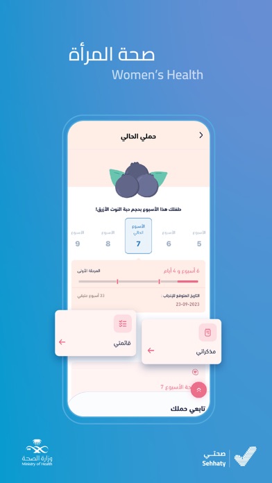
What the numbers say: صحتي | Sehhaty runs a dark set where the background shifts from screenshot to screenshot (first shot #049CCC) — each image has to stand on its own, so the captions carry more of the story. The accent colour we picked up, #94ECFC, is the one to reuse for badges, arrows and highlighted words if you borrow this look. Hit Use this style to open the editor with these exact colours and drop your own screenshot in.
Notice the first screenshot in particular. It's the one users see in search results and on the product page, and it's where most apps spend their best caption and tightest design. Look at the proportion of background to phone, where the text sits, what one thing the image is trying to communicate.
Want to see how other Health & Fitness apps approach the same problem? Browse more Health & Fitness apps in the showcase.
Take what works into your own screenshots
Open LaunchShots and design your App Store & Google Play screenshots — pick a device frame, drop captions, ship in minutes. Free, in your browser.
Open the screenshot editor →Apps with a similar look
Closest background + accent colours among the listings we've analysed — useful when you want to see the same palette handled by a different team.