Screenshot style breakdown
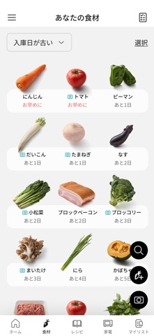
Sampled from 4 of KitchenPocket's App Store screenshots — background, accent and theme, measured by LaunchShots (not something Apple publishes).
#FCFCFC bg
#DDDDDD
#4C5C24 accent
#111111 text
Screenshots



Icon palette
About this app
◆キッチンポケットの特徴 <誰もが、いつもの食材で、手軽に「おいしい」を作れる> 忙しくても、料理が苦手でも、 家族に美味しく健康的な食材を作りたい、楽しく食卓を囲みたい そんな気持ちにキッチンポケットは応えます。 <何作ろう?を速攻解決> 使い慣れない食材を料理する時、マンネリでお悩みの時、 キッチンポケットなら献立のヒントがすぐに見つかります。 バナーやおすすめでは、新たなレシピやサービスとの出会いを提供します。 <我が家の1台に> 無線LAN接続に対応したキッチン家電を登録・連携すると、 機器へメニューを送信して、火加減や時間をおまかせで料理できます。 さらに送信したメニューを機器に保存することもでき、 お気に入りの自動メニューが入った「我が家の1台」が作れます。 冷蔵庫を登録・連携するとより省エネに利用できます。 <食材登録で早く使うべき食材とレシピが分かる> 家にある食材をアプリに登録することができる食材管理機能があります。 登録食材を日持ち目安に応じて一覧に並べることができるので早く使うべき食…
App details
What you can learn from KitchenPocket
Every shipping app on the App Store has gone through the same decisions you're working through right now: which screenshot goes first, what caption sits over it, which device frame to show, what color the background should be. The 4 screenshots above are KitchenPocket's answers to those questions — they're public, they're real, and they made it through Apple's review.
What the numbers say: KitchenPocket runs a light set with one background colour (#FCFCFC) carried across every screenshot — the listing reads as a single poster when the shots sit side by side in search results. The accent colour we picked up, #4C5C24, is the one to reuse for badges, arrows and highlighted words if you borrow this look. Hit Use this style to open the editor with these exact colours and drop your own screenshot in.
Notice the first screenshot in particular. It's the one users see in search results and on the product page, and it's where most apps spend their best caption and tightest design. Look at the proportion of background to phone, where the text sits, what one thing the image is trying to communicate.
Want to see how other Food & Drink apps approach the same problem? Browse more Food & Drink apps in the showcase.
Take what works into your own screenshots
Open LaunchShots and design your App Store & Google Play screenshots — pick a device frame, drop captions, ship in minutes. Free, in your browser.
Open the screenshot editor →Apps with a similar look
Closest background + accent colours among the listings we've analysed — useful when you want to see the same palette handled by a different team.