Chart position — tracked daily by LaunchShots
Screenshot style breakdown
Sampled from 5 of 美团管家's App Store screenshots — background, accent and theme, measured by LaunchShots (not something Apple publishes).
#FCFCFC bg
#DDDDDD
#FCD404 accent
#111111 text
Screenshots

Icon palette
About this app
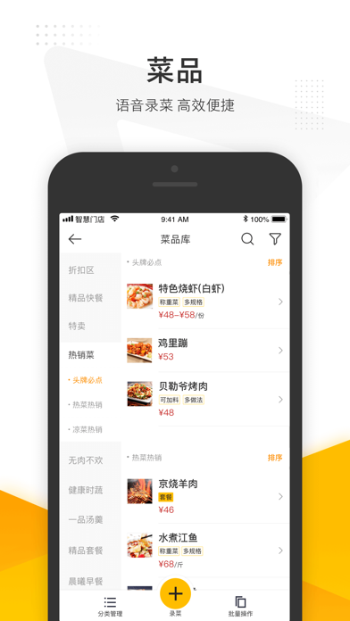
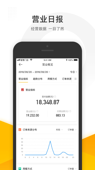
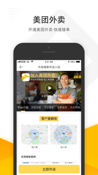
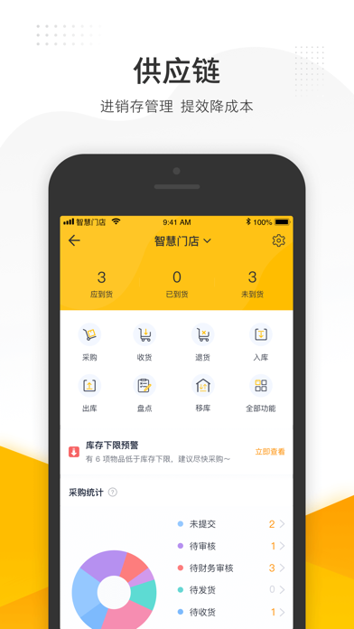
美团收银智能版—全渠道餐饮数字化管理系统。为餐饮商户提供从门店经营管理、全渠道订单管理、智能后厨到会员私域运营、供应链管理及规模连锁管控的全链路数字化解决方案,开放对接美团外卖、淘宝闪购、京东秒送、抖音团购、私域小程序等20+渠道订单与数据,已服务全国超100万家餐饮门店,覆盖快餐、正餐、火锅、烧烤、茶饮、烘焙等全业态场景。 【为什么选择美团收银智能版】 • 十四大独家平台生态能力,美团/大众点评/外卖全链路深度打通和赋能 • 全渠道聚合20+平台订单,一套系统统一管理外卖/团购/私域订单和数据 • 超过60种会员营销活动,AI营销+一键换肤打造品牌差异化 • AI经营诊断1分钟定位涨跌根因,数据驱动科学决策 • KDS智能后厨高峰期订单0遗漏,智能备餐降低25%原料浪费 • 供应链全链路智能管理,智能订货降低30%采购成本 • 多层级连锁管控,直营/加盟/联营混合管理模式统一支撑 • 全资持有支付牌照,支付链路高稳定性,资金合规安全有保障 【主要功能】 【独家能力:平台生态深度打通,线上流量直接导流到商家私域】 美团收银智能版独家打通美团/大…
App details
What you can learn from 美团管家
Every shipping app on the App Store has gone through the same decisions you're working through right now: which screenshot goes first, what caption sits over it, which device frame to show, what color the background should be. The 5 screenshots above are 美团管家's answers to those questions — they're public, they're real, and they made it through Apple's review.
What the numbers say: 美团管家 runs a light set with one background colour (#FCFCFC) carried across every screenshot — the listing reads as a single poster when the shots sit side by side in search results. The accent colour we picked up, #FCD404, is the one to reuse for badges, arrows and highlighted words if you borrow this look. Hit Use this style to open the editor with these exact colours and drop your own screenshot in.
Notice the first screenshot in particular. It's the one users see in search results and on the product page, and it's where most apps spend their best caption and tightest design. Look at the proportion of background to phone, where the text sits, what one thing the image is trying to communicate.
Want to see how other Business apps approach the same problem? Browse more Business apps in the showcase.
Take what works into your own screenshots
Open LaunchShots and design your App Store & Google Play screenshots — pick a device frame, drop captions, ship in minutes. Free, in your browser.
Open the screenshot editor →Apps with a similar look
Closest background + accent colours among the listings we've analysed — useful when you want to see the same palette handled by a different team.