Chart position — tracked daily by LaunchShots
Screenshot style breakdown
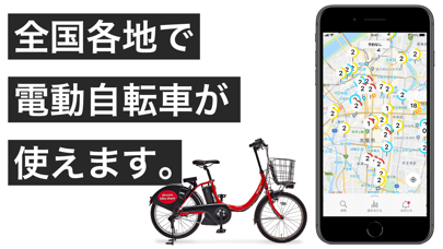
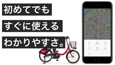
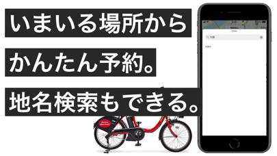
Sampled from 3 of ドコモ・バイクシェア - バイクシェアサービス's App Store screenshots — background, accent and theme, measured by LaunchShots (not something Apple publishes).
#FCFCFC bg
#DDDDDD
#FCEC3C accent
#111111 text
Screenshots
Icon palette
About this app
【街の移動がもっと手軽に。すぐ見つかるシェアサイクル】 使いたいときに、すぐ乗れる。 バイクシェアサービスが、もっとシンプルで、もっと使いやすくなりました。 初めての方でも迷わず使える、スムーズな移動体験をお届けします。 ◆ もっと簡単に始められるシンプルな登録 会員登録は最短2ステップ、思い立ったそのときに、迷わず使い始められます。 ◆ 外部アカウントで迷わずログイン パスワード管理の手間を解消し、安全でスムーズなログインに対応。 dアカウント/Appleアカウント/Googleアカウントの3つのアカウントから選択ください。 ◆ シーンに合わせた料金設定 利用エリアに応じた1回利用の料金を自動適用。 1回利用プラン、月額プラン以外に3、6、24時間などの時間制パスなど豊富な料金オプションもご用意。 ◆ 安全にご利用いただくために ・自転車は必ずポートで返却してください ・返却時の施錠忘れに注意ください ◆ 交通ルールを守って安全運転を 1:車道が原則、左側を通行、歩道は例外、歩行者を優先 2:交差点では信号と一時停止を守って、安…
App details
What you can learn from ドコモ・バイクシェア - バイクシェアサービス
Every shipping app on the App Store has gone through the same decisions you're working through right now: which screenshot goes first, what caption sits over it, which device frame to show, what color the background should be. The 3 screenshots above are ドコモ・バイクシェア - バイクシェアサービス's answers to those questions — they're public, they're real, and they made it through Apple's review.
What the numbers say: ドコモ・バイクシェア - バイクシェアサービス runs a light set with one background colour (#FCFCFC) carried across every screenshot — the listing reads as a single poster when the shots sit side by side in search results. The accent colour we picked up, #FCEC3C, is the one to reuse for badges, arrows and highlighted words if you borrow this look. Hit Use this style to open the editor with these exact colours and drop your own screenshot in.
Notice the first screenshot in particular. It's the one users see in search results and on the product page, and it's where most apps spend their best caption and tightest design. Look at the proportion of background to phone, where the text sits, what one thing the image is trying to communicate.
Want to see how other Travel apps approach the same problem? Browse more Travel apps in the showcase.
Take what works into your own screenshots
Open LaunchShots and design your App Store & Google Play screenshots — pick a device frame, drop captions, ship in minutes. Free, in your browser.
Open the screenshot editor →Apps with a similar look
Closest background + accent colours among the listings we've analysed — useful when you want to see the same palette handled by a different team.