Chart position — tracked daily by LaunchShots
Screenshot changes — detected by LaunchShots
Screenshot style breakdown
Sampled from 5 of マイナアプリ(旧マイナポータルアプリ)'s App Store screenshots — background, accent and theme, measured by LaunchShots (not something Apple publishes).
#FCF4F4 bg
#DDD6D6
#0414C4 accent
#111111 text
Reading the caption text from the screenshots in your browser…
Screenshots



Icon palette
About this app
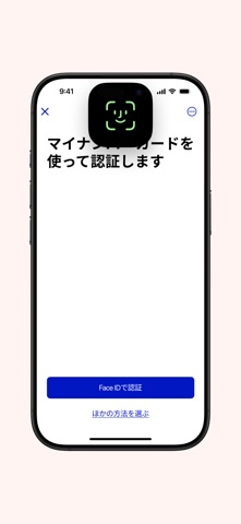
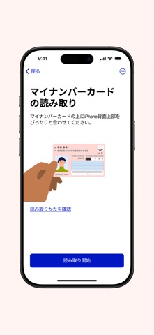
デジタル庁が提供する「マイナアプリ」は、マイナンバーカードを使った本人確認や、マイナンバーカードの機能のスマートフォンへの追加などを行えるアプリです。 2026年夏より「マイナポータルアプリ」をアップデートして「デジタル認証アプリ」の機能と統合し、「マイナアプリ」として提供しています。 ■ 主な機能 1. マイナンバーカードでの本人確認、情報連携 行政機関や民間事業者が提供するサービスに対して、マイナンバーカード(実物およびスマートフォン)を使った認証や署名、氏名などの情報の連携ができます。 2. スマートフォンのマイナンバーカードの設定 お持ちのマイナンバーカードの機能をスマホのなかに入れて持ち歩ける「iPhoneのマイナンバーカード」の設定ができます。 3. 行政機関からのお知らせのプッシュ通知での受取り マイナポータルに届く、行政機関等からのお知らせをプッシュ通知で受け取ることができます。
App details
What you can learn from マイナアプリ(旧マイナポータルアプリ)
Every shipping app on the App Store has gone through the same decisions you're working through right now: which screenshot goes first, what caption sits over it, which device frame to show, what color the background should be. The 5 screenshots above are マイナアプリ(旧マイナポータルアプリ)'s answers to those questions — they're public, they're real, and they made it through Apple's review.
What the numbers say: マイナアプリ(旧マイナポータルアプリ) runs a light set with one background colour (#FCF4F4) carried across every screenshot — the listing reads as a single poster when the shots sit side by side in search results. The accent colour we picked up, #0414C4, is the one to reuse for badges, arrows and highlighted words if you borrow this look. Hit Use this style to open the editor with these exact colours and drop your own screenshot in.
Notice the first screenshot in particular. It's the one users see in search results and on the product page, and it's where most apps spend their best caption and tightest design. Look at the proportion of background to phone, where the text sits, what one thing the image is trying to communicate.
Want to see how other Utilities apps approach the same problem? Browse more Utilities apps in the showcase.
Take what works into your own screenshots
Open LaunchShots and design your App Store & Google Play screenshots — pick a device frame, drop captions, ship in minutes. Free, in your browser.
Open the screenshot editor →Apps with a similar look
Closest background + accent colours among the listings we've analysed — useful when you want to see the same palette handled by a different team.